100 Page Brand Guide?

brand consistency
Braden East

For most churches, their brand guidelines could fit on a single sheet of letter-sized paper (if they have brand guidelines at all).

However, I’ve spent enough time in the design industry to know that large companies need brand guidelines which are much richer and more complex.

So, I wasn’t surprised when a tech company called Zapier released their massive, 100-page book of brand guidelines to the public.
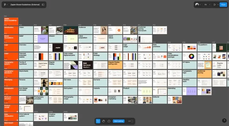
Zapier's 100 Page Brand Guidelines Book

Why so extensive? Isn't that overkill, even for a large tech company?

The reason Zapier has such an extensive brand guide is because they have an extensive brand scope.

Let me explain.

Zapuer just has one main logo and their color palette is relatively simple. The complexity comes from all of the different places that branding is going to live.

Let's say you have vacation homes in Hawaii, Alaska, and Texas, and you live in each for a few months out of the year.

You'd probably have different clothes you wear, a different time of day for your walk, and different for guests.

The number of places your brand will live determines how many guidelines you need.

If you’re printing promotional pieces, posting on social media, and creating video content, your church would probably benefit from some basic brand guidelines.

This makes sure each part of your brand gets distilled with instructions and visuals to be straightforward and easy to use (even for someone with very little design experience).

Do you know someone who needs a set of guidelines for their existing logo and branding?

Just in the month of April 2025, I’m offering a brand guidelines creation service for just $299 to any church who is happy with their look, but needs help making it more consistent.

If that sounds like you or a pastor you know, send me an email and I’ll get your church into the queue.


Related to “brand”
Why I Stopped Doing Logos (and Started Doing Something Better)
Published on:
In 2021, my wife and I moved back to our home town of Bartlesville, Oklahoma and joined the church we now call home - Hope Presbyterian Church. The church had hired a Ukrainian designer on Fiverr and got a fantastic logo design (it even won an award). But there was a problem… All they had was that logo. Their whole “brand” was limited to a gold color and a couple of webp’s. While the logo was aesthetically pleasing, it wasn’t enough to help their people “get” the mission. Each billboard, banner, and invitation card was inconsistent and time-consuming, even for the creative associate pastor. The more they tried to make their branding work in the real world, the more things got messy and out of alignment. Members with design experience were called on over and over again to come in and help “fix” designs, which always ended up being a band-aid for the real issue. What my home church went through is the result of a logo design without a true brand. They needed an easy-to-use branding toolkit with theological depth - one that would represent more than just the name of their church. A kingdom-first brand would have given their congregation ownership of the vision their leaders were casting, and would have attracted more visitors who resonated with the message they preached. And that’s why I stopped designing logos, and started developing kingdom-first brands instead.
This Will Make Your Church Branding More Timeless
Published on:
Strip everything away, give your church a generic name, and make the logo a cross. Go black and white with your color scheme. Congrats - you have a timeless brand! I’m being a little bit sarcastic, but there’s an element of truth here. Over-simplification is usually the fastest, easiest way to a truly “timeless” look. However, it’s not the only way. And for churches, it’s almost never the best way. The history of the world is timeless by definition, but definitely not simple. God’s creative and recreative work is anything but minimalistic. The way God works is simple but deep, focused but rich with meaning. So too is the story being woven together in your ministry, whether it’s 200 years old or a brand new church plant. What is God’s perspective of your church? If you want a timeless brand identity, this is the question you have to answer. Once you start narrowing it down, your logo colors and fonts become clear and easy choices. Rather than trying to become timeless by using Helvetica and no colors in your brand guidelines, you should be looking for ways to incorporate the truth of who God says you are as a congregation. Does it take more work and intentionality? Absolutely. Is it hard? Anything worth doing is.
How Much Branding Does a Church Actually Need?
Published on:
Your logo isn’t a brand, nor is the name of your church a brand. Your color palette, word mark, fonts, and church website aren’t your brand either. These things only serve to ASSOCIATE your church with the big idea that is your message. Make this association enough times with enough people, and NOW you have a brand. Think about it like this: Branding is the vehicle for your message. It’s the wrapper! The packaging won’t change the chemical make up of the burger, but it can still make the burger taste better, and turn a meal into an experience worth sharing. So, to answer the question how much branding does a church need, the answer is none. None? Right. If you don’t have that big idea clarified and nailed down, you can design the most beautiful identity system and logo in the world and not have a brand.
World-Class Design Firm Lesson - You Have to Move
Published on:
Many churches when they come to me to consider doing a rebrand say something like “We want people to see that we’re a living, active church.” What better way to show that than with motion? Video is one thing, but moving graphics combined with photos are a good middle ground that can communicate a lot more than just a static image. According to the big players in the creative industry, motion is becoming more important for all brands - not just global ones. More and more, a brand’s digital presence is expected to move, breathe, and approximate “IRL” experiences. Done right, on-brand motion graphics have a high engagement potential, without the expense of shooting and editing actual video. How do you do this well? You need to know your brand’s unique personality. P.S. This is a series of posts where I’m sharing lessons we can learn from the great design agencies of today. These are firms with a massive portfolio of incredible projects for global, billion dollar brands. Their reputation has been built on sound branding fundamentals, which means something very good for us: their approach works just as well for churches!
Related to “consistency”
How to Design Your Church Wayfinding Signage (Case Study)
Published on:
I recently helped a church in Kansas City rebrand, and this project took much longer than we anticipated! This church needed collateral designed in preparation for their official launch of the new identity. Collateral like wayfinding signs, and A LOT OF THEM. 85 signs, to be exact. If you have a church building, chances are you have these! Way-finding signs are the built-in guide to your building, both for first-time visitors and those forgetful members who could probably get lost in their own house (you know who I’m talking about). Here’s the thing: there are some HUGE blunders that are easy to make with this type of signage. So, to save you from those, I thought I would show the design process I went through with this Kansas City church and their way-finding signs. In design, way-finding falls under the category of what we call “environmental design.” Most of these signs were going to be a part of the building, so we had to treat them more like a piece of furniture than a graphic or a poster. I'll be going over each one of these in future posts, where we'll explore what that looks like through two key considerations: Color and Typography. Stay tuned!
Don’t Rebrand if Your Church Has One Thing… (Do This Instead)
Published on:
I recently reconnected with a distant cousin who was just starting a new role as a Worship Pastor in Texas. He had been immediately tasked with redesigning the church bulletin and some other collateral - a classic “worship-leader-becomes-graphic-designer” scenario. But he found something totally unexpected. More on that in a minute. See, my cousin had started with an audit of the church bulletin. It was bad. I’m talking 1990s clip-art, 10 different fonts, and a migraine-inducing layout. Then he looked at the rest of the campus. Signage looked different in every hallway, and anything designed had that general “patched together” kind of vibe. The pastors all knew this stuff needed a redesign. The church had a logo people had grown to love and brand equity that was worth preserving. But without clear guidelines in place, things had slipped into visual inconsistency - badly. So, I asked them a simple question: “Have you thought about brand guidelines?” Their response? “No, but now we’re interested!” Until that moment, they had been focusing on the immediate problems that were painful, but they were treating the symptoms, not the disease. I explained to them how a brand refresh often benefits churches in their exact position. When you refresh your branding and put together brand guidelines, you’re not looking to reinvent the wheel or start from scratch. Instead, the goal is to bring clarity and consistency to what you already have. This is about making sure everything from bulletins to digital media feel like it belongs to the same church family. A brand audit and fresh set of guidelines can be perfect for maintaining the identity people recognize while elevating your overall quality and professionalism of communication. Neither my cousin nor I had expected this, but the church hired me on the spot, and we’re getting to work together to unify and future-proof their church branding. True story! If that’s something you’re thinking about for your brand, book a call with me and we can talk more about how to represent the work God is doing in the life of your church.
How to Design Your Church Way-Finding Signage (Case Study)
Published on:
I recently helped a church in Kansas City rebrand, and this project took much longer than we anticipated! This church needed collateral designed in preparation for their official launch of the new identity. Collateral like wayfinding signs, and A LOT OF THEM. 85 signs, to be exact. If you have a church building, chances are you have these! Sample from OLD wayfinding and branding Way-finding signs are the built-in guide to your building, both for first-time visitors and those forgetful members who could probably get lost in their own house (you know who I’m talking about). Here’s the thing: there are some HUGE blunders that are easy to make with this type of signage. So, to save you from those, I thought I would show the design process I went through with this Kansas City church and their way-finding signs. In design, way-finding falls under the category of what we call “environmental design.” Most of these signs were going to be a part of the building, so we had to treat them more like a piece of furniture than a graphic or a poster. I'll be going over each one of these in future posts, where we'll explore what that looks like through two key considerations: Color and Typography. Stay tuned!
Two Strategies to Blast Through Creative Block
Published on:
Every day around mid-morning, I take a bathroom break and that’s when I write these posts - gross I know, but it’s the perfect amount of time and I have no distractions (now you won’t be able to get that image out of your mind, so you’re welcome). Context aside, when I’m motivated and inspired it’s easy, but today I had some serious creative block of the “stare vacantly at a blank page and start the same sentence five times over” variety. I have a hunch this doesn’t just happen to creatives. Most of my readers are church leaders, I’ll wager that you probably experience that wall too. If so, maybe you can benefit from the two strategies I use to overcome creative block. 1. Short term strategy Exercise is my immediate strategy for overcoming it in the short term. I’ll go home after work, grab my dumbbells, and start lifting. Something about an intense workout stimulates my creativity and writing energy. However, that only works on that day, and if I can’t get a workout in, I’m in trouble. 2. Long term strategy My long term strategy to overcome creative block is to write daily. I used to think I didn’t have time for something recreational like writing, much less every day. But I realized that as long as I put it on the other side of something I enjoy more (chess puzzles), I could force myself to take 5-15 minutes and crank out a thought. Writing became a habit I was cultivating. Something you practice with regularity and discipline becomes easier and easier, and those creative block moments get fewer and farther between. Even when it takes a bit longer to get rolling, the groove is greased and the engine is still warm from yesterday. If there’s something you know you should be doing (maybe writing, maybe calling to check in on members, maybe something else) make it a small part of your daily routine and see how much you start feeling empowered when those “block” moments hit.
← Back to all posts
Almost there!

Enter your email below to get the weekly Tend Your Brand digest.