8 Modern Budget-Friendly Fonts Churches Should Use

Braden East
I’ll admit, I fit the graphic designer stereotype.
I spend too much time oohing and ahhing over mockups, color palettes, and typefaces, and little tiny details that nobody else cares about.
One way I fit the designer stereotype is that I’m a font hoarder…
“That new typeface I bought? I know I saved it here somewhere….”
“I’ll definitely use this font at some point… unlike the other one I bought last year and never used…”
Maybe I am Michael Scott:
Oscar: “Okay, the green bar is what you spend every month on stuff you need, like a car and a house.”
Michael: “That's so cool how you have my name at the top.”
Oscar: “The red bar is what you spend on non-essentials, like magazines, entertainment. And this scary black bar is what you spend on things that no one ever, ever needs, like multiple magic sets, professional bass fishing equipment.”
Michael: “How did you do this so fast? Is this PowerPoint?”

In that spirit, I want to share eight free or inexpensive fonts that you can use in your church branding to bring it into the 21st century and give it some life without breaking the bank.
Funnel Sans and Funnel Display are modern sans-serif typefaces with both clarity and character, originally developed by NORD ID and Kristian Möller for Funnel. Funnel Sans is a functional yet personal sans-serif, featuring both square and circular shapes in its letterforms. In Funnel Display, certain parts of the stems are shifted to further enhance the sense of movement.
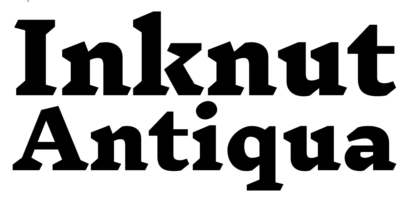
Inknut Antiqua is an Antiqua typeface for literature and long-form text. Approaching the idea of web-publishing as a modern day private press, it is designed to evoke Venetian incunabula and humanist manuscripts, but with the quirks and idiosyncrasies of the kinds of typefaces you find in this artisanal tradition.
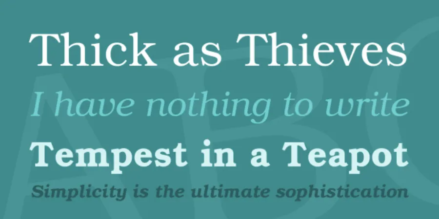
TeX Gyre Bonum can be used as a replacement for ITC Bookman (designed by Alexander Phemister, 1860, redesigned by Edward Benguiat, 1975).
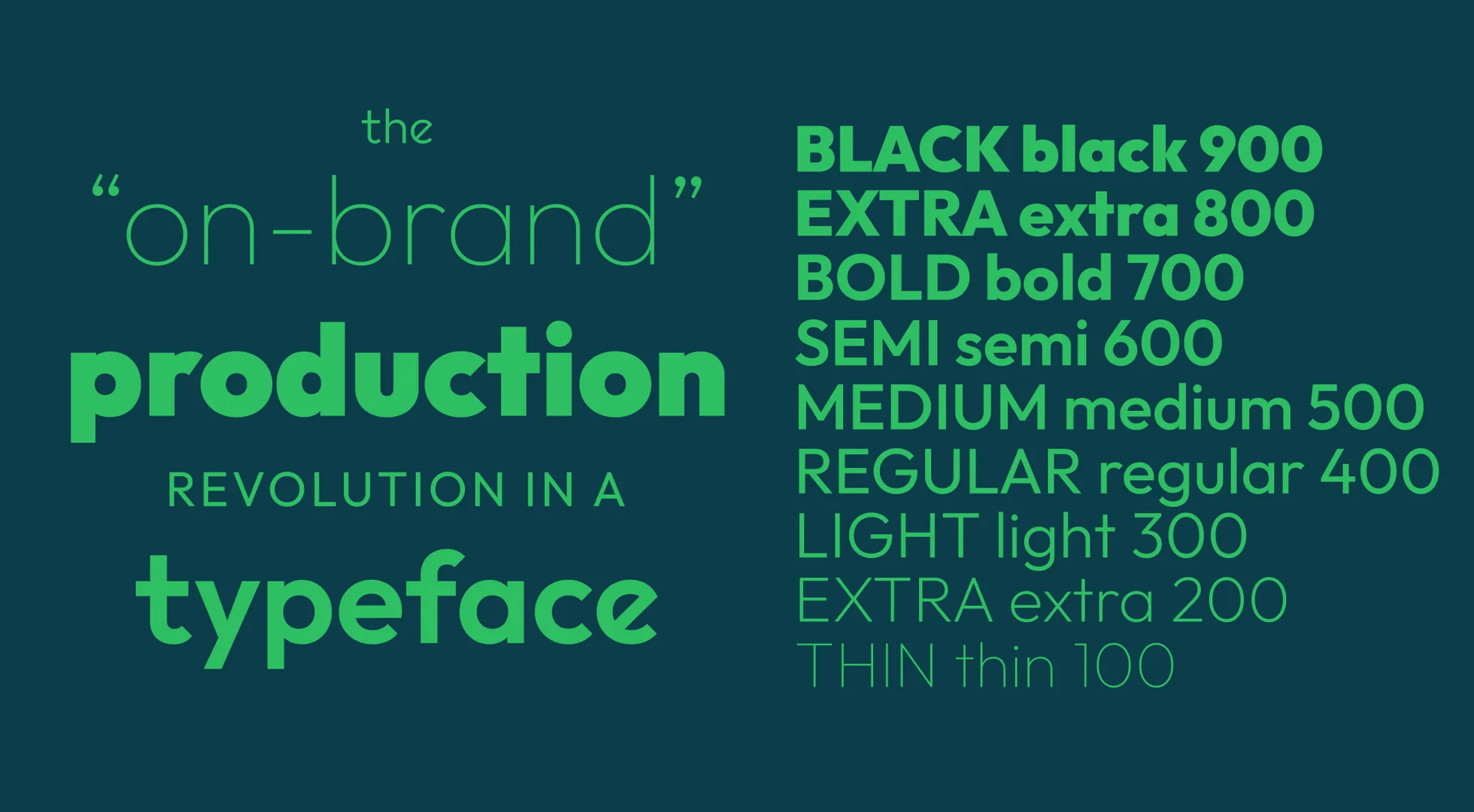
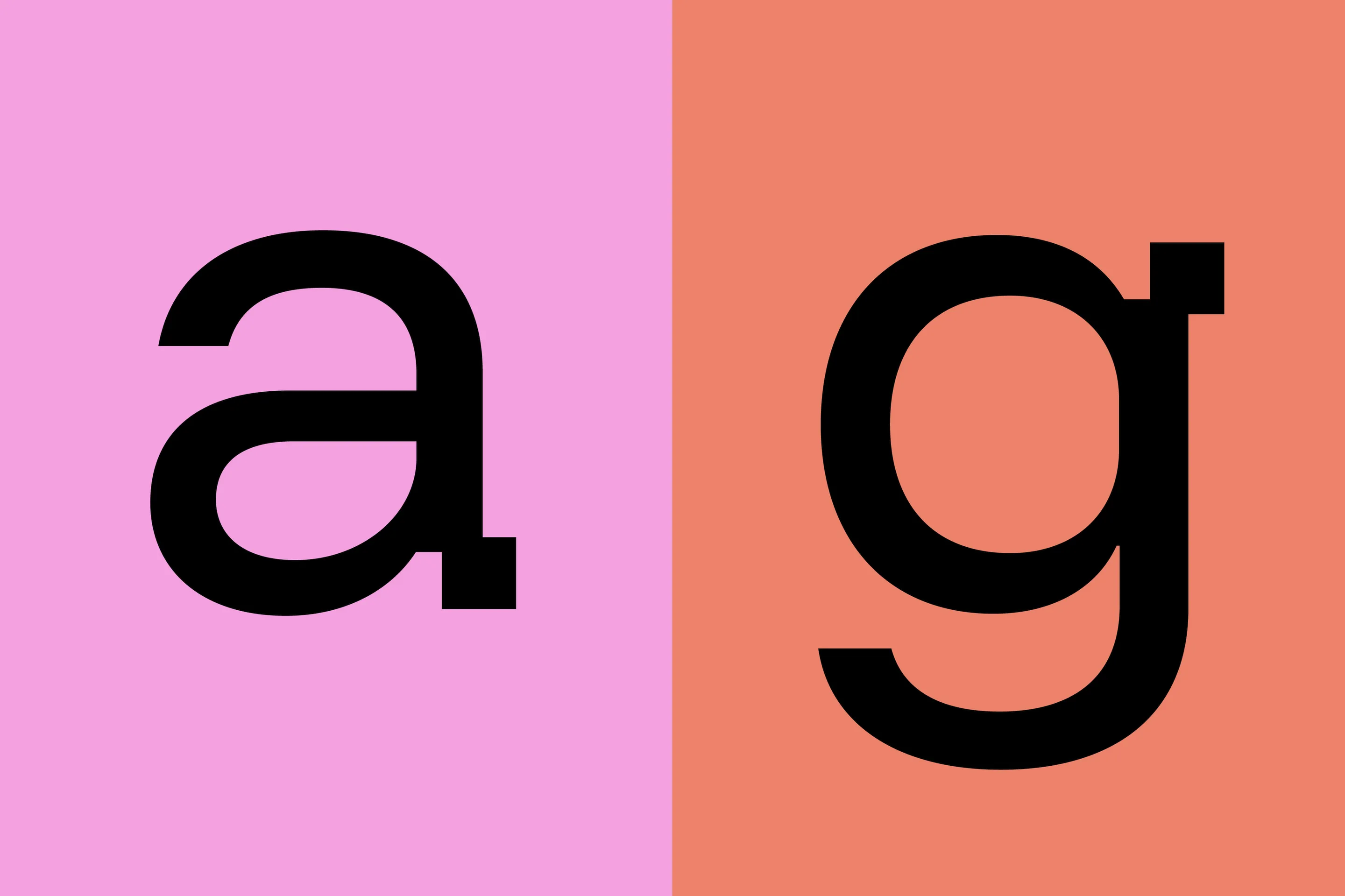
Outfit follows the forms of classic (and classy) geometric sans-serif families like Futura, but with 21st century features and modifications.
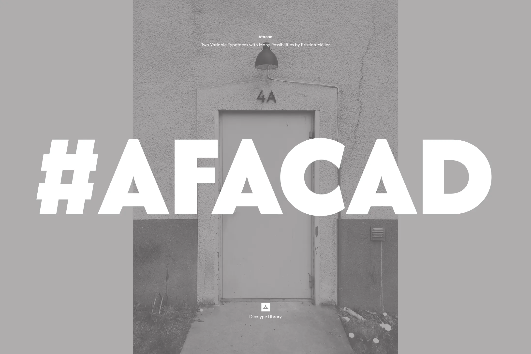
The ’Afacad typeface project’ commenced in 2017 as a personalised lettering endeavour for Slagskeppet, a Swedish housing tenant, who sought fresh house address numbering for their entrances. The letters and numerals were meticulously crafted to harmonise with the architectural proportions and materials employed by Architect Sture Elmén during the 1940s.
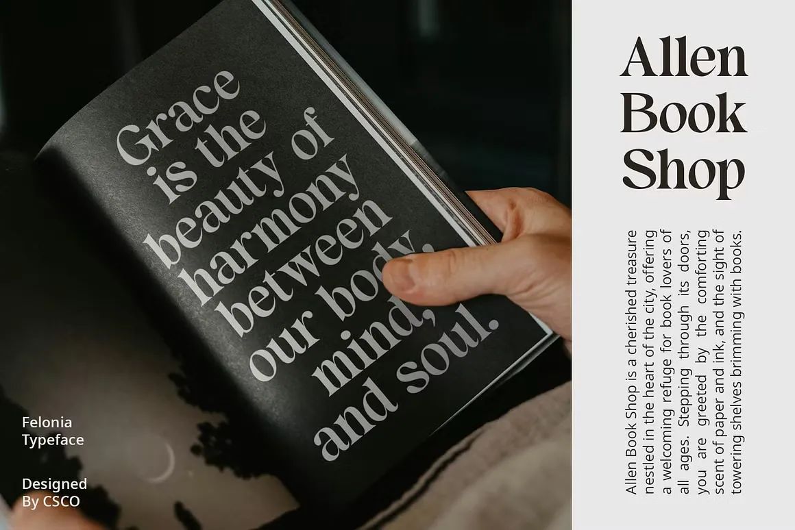
Felonia is an elegant serif font that blends retro and classic vibes, offering sophistication and a touch of nostalgia to your designs. Its timeless appeal makes it perfect for creating fresh and innovative designs.
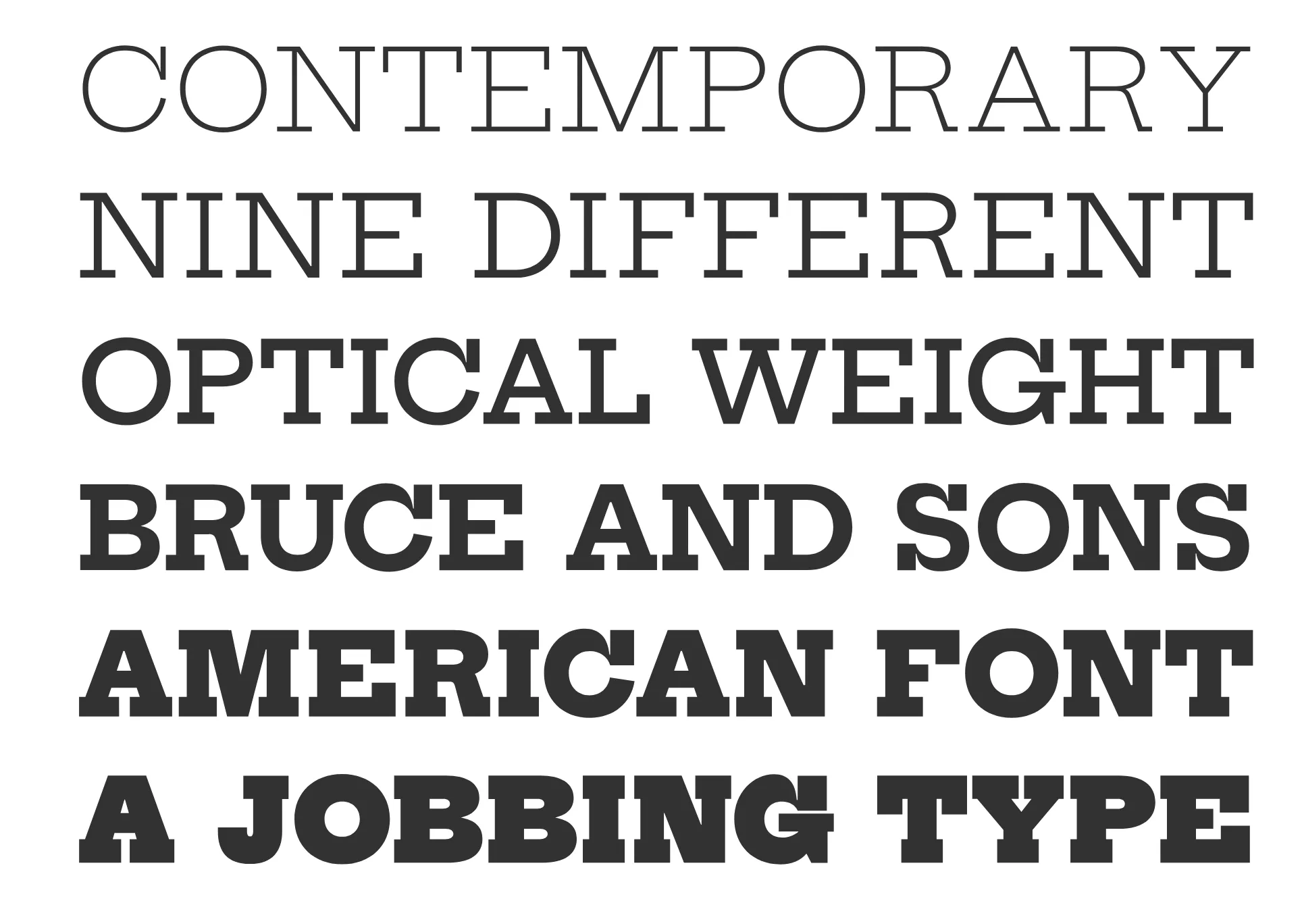
Hepta Slab is a slab-serif revival based on specimens of antique genre types from Bruce and Co., primarily Antique 307. The family is a variable font which consists of 10 weights with the extremes intended for display use and the middle weights for setting text.
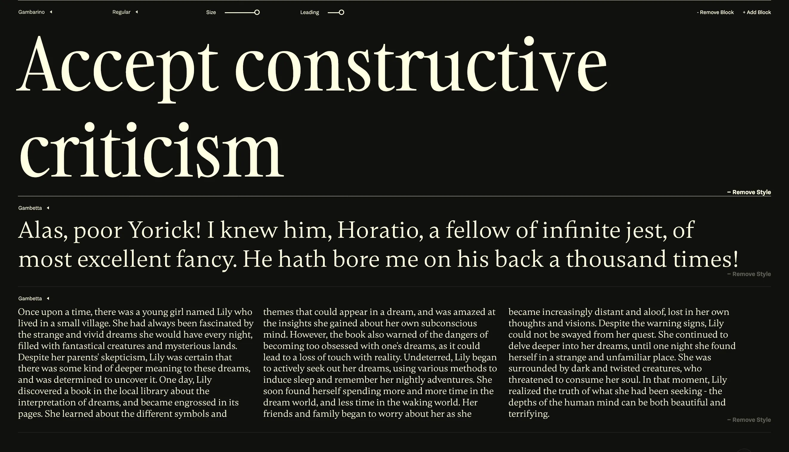
Gambarino is a condensed, single-weight serif face for headlines. Gambetta is intended for use in book design and in editorial design; the fonts come from Paul Troppmar.