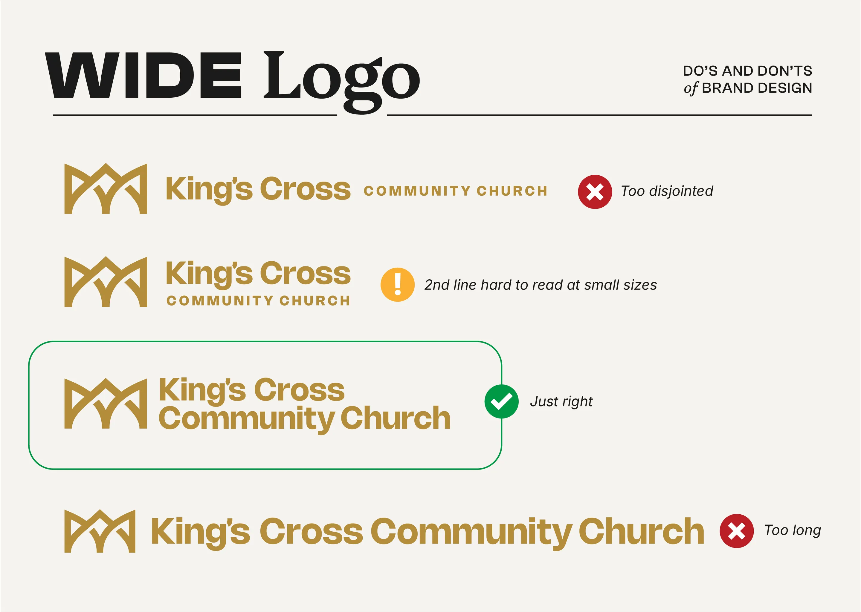
Brand Marks Your Church Needs: The Wide Logo


In the graphic design world, much of our time is spent on layout. This is because you usually have fixed content, and a fixed space where that content needs to go.
If those two variables are set in stone, then it’s up to the designer to solve the Tetris puzzle - how can I fit X content into Y box?
Sometimes this is easier said than done. As a brand designer who often continues to help churches “roll out” their new visuals following a rebrand, I want to make things as easy as possible for future Braden.
What if we get a space where the logo doesn’t fit, or looks awkward? This comes up quite a bit, and it’s something that can be solved by having an alternate verison of your logo for just such scenarios.
The need for a mark to fit into narrow spaces comes up more than you might expect.
Creating a “wide” version of your church logo means your brand can look and feel comfortable in those spaces that are too narrow for a more squarish mark.
The way you do this is pretty straightforward, with some caveats and a couple of bonus tips I’ll share at the end.
That’s it! Well, sort of… Below I’ve put an example of how to apply this in practice.

Also, if your church does have leather belts with your logo, please stop it. Get some help.
