Breathing New Life into a Church Brand: The Story of First Baptist Aurora

rebrand inspiration vision
Braden East

Let’s talk about First Baptist Aurora. This was a church that once thrived but found itself dwindling in numbers and energy. That is, until Pastor Robert stepped in with a vision to create a community where high school dropouts and doctors, recovering addicts and homeschool moms, could all worship side by side. He wanted people to feel like they truly belonged.

The church started to grow again, but there was a problem: their visual identity didn’t match the new life happening inside the walls.

So, I partnered up to help them rebrand. Two words shaped our entire process: historic and urban. We pulled colors from the church’s own brick, molding, and stained glass to create a palette that felt timeless yet fresh.

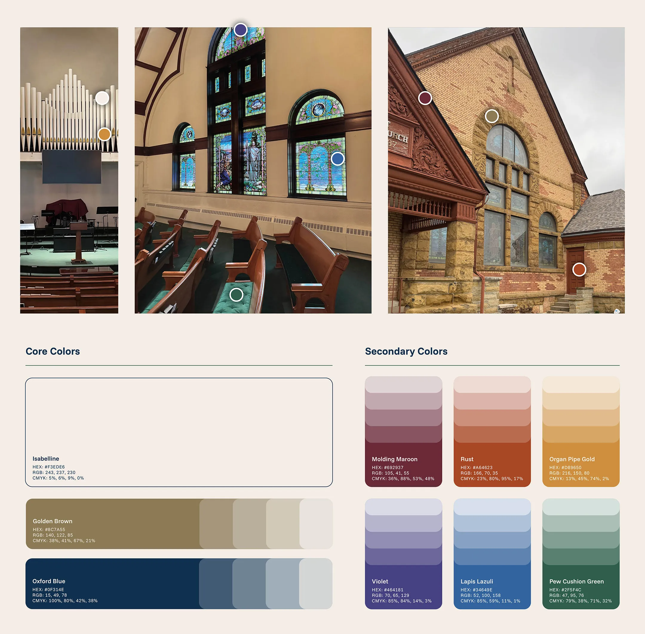
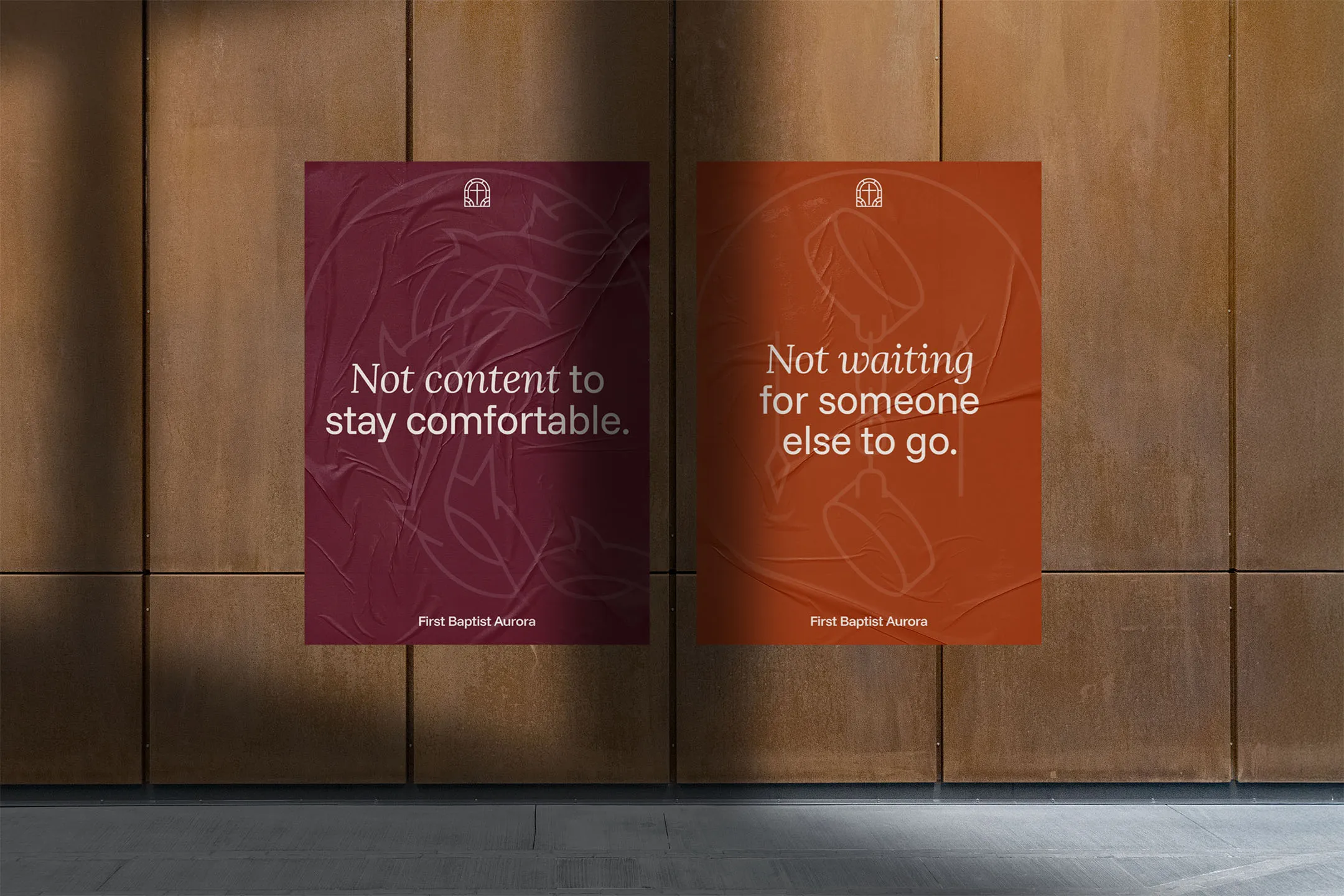
The church’s beautiful stained glass windows inspired a modern logo and sparked a key design element: the arch. We used arches everywhere, from logos and icons to social media graphics, creating a look that felt unified and deeply tied to the building’s architecture and story.

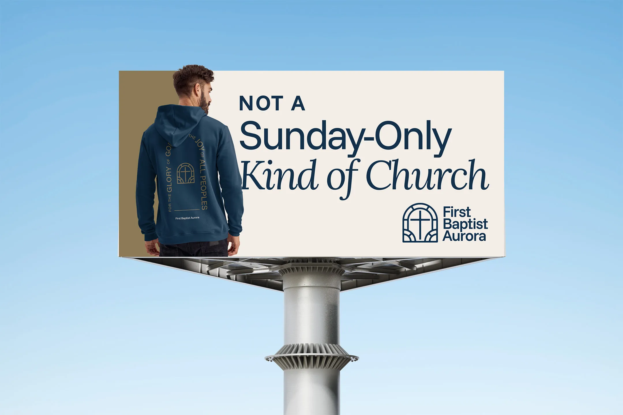
The result? A brand that bridges the old and the new. Today, First Baptist Aurora has not just a growing congregation but a clear sense of identity. Visitors connect more quickly, and the leadership has tools to keep building momentum.

Here's the takeaway for pastors: A good rebrand isn’t just about looking pretty! It’s about helping people see what God is doing in your ministry are and inviting them to be a part of it.

P.S. You can see the full case study here, including our in-depth process and more images/video.


Related to “rebrand”
Don’t Rebrand if Your Church Has One Thing… (Do This Instead)
Published on:
I recently reconnected with a distant cousin who was just starting a new role as a Worship Pastor in Texas. He had been immediately tasked with redesigning the church bulletin and some other collateral - a classic “worship-leader-becomes-graphic-designer” scenario. But he found something totally unexpected. More on that in a minute. See, my cousin had started with an audit of the church bulletin. It was bad. I’m talking 1990s clip-art, 10 different fonts, and a migraine-inducing layout. Then he looked at the rest of the campus. Signage looked different in every hallway, and anything designed had that general “patched together” kind of vibe. The pastors all knew this stuff needed a redesign. The church had a logo people had grown to love and brand equity that was worth preserving. But without clear guidelines in place, things had slipped into visual inconsistency - badly. So, I asked them a simple question: “Have you thought about brand guidelines?” Their response? “No, but now we’re interested!” Until that moment, they had been focusing on the immediate problems that were painful, but they were treating the symptoms, not the disease. I explained to them how a brand refresh often benefits churches in their exact position. When you refresh your branding and put together brand guidelines, you’re not looking to reinvent the wheel or start from scratch. Instead, the goal is to bring clarity and consistency to what you already have. This is about making sure everything from bulletins to digital media feel like it belongs to the same church family. A brand audit and fresh set of guidelines can be perfect for maintaining the identity people recognize while elevating your overall quality and professionalism of communication. Neither my cousin nor I had expected this, but the church hired me on the spot, and we’re getting to work together to unify and future-proof their church branding. True story! If that’s something you’re thinking about for your brand, book a call with me and we can talk more about how to represent the work God is doing in the life of your church.
Why It’s Insane to Rebrand with Limited Design Revisions
Published on:
Raise your hand if you’ve seen a designer offer their services like this: “$1,000 for 3 concepts and 2 revisions.” That seems reasonable enough - surely you can get something great out of 3 concepts and 2 revisions, right? Well, maybe. In the end it all comes down to the project’s risk tolerance. This can be a great fit you’re needing is a set of sermon series graphics or a tee shirt design, but what if the project is bigger, like a new logo or even a full rebranding? Now’s the time to evaluate your risk tolerance. Here’s the question you should be asking: How long do we plan to keep this logo? If the answer is just for a few years, then it doesn’t matter too much if the logo’s not quite a perfect fit. With a short-term, “band-aid” logo, missing the mark slightly is okay, because you get to take another shot later. However… If you’re wanting a timeless logo that will capture your vision and last for decades, then limited revisions is the wrong model to use. Removing the pressure of "this is our last round - we have to say yes," gives a church the freedom to think more objectively about what is going to best serve their congregation for the long haul. Without that freedom, you're probably going to end up over-time and over-budget. And the problem probably isn't the designer or you, it's the process you agreed to follow. This is why I price all my projects with unlimited revisions built in. I'd be delusional if I did this solely on the basis of my skills. I'm confident in my skills - don't get me wrong - but I'm WAY MORE confident in the process. My church rebrand process has been shaped by a decade of design experience and the unique projects I've worked on for churches all over North America.
Don't Make These 3 EXPENSIVE Church Logo Mistakes
Published on:
Is your church logo costing you money? Yes, it’s a serious question. If you’re thinking of redesigning your visuals, you probably want to do it in a way that’s cost effective and practical. That sounds easy enough, but there are some hidden traps in a new logo that can ruin your budget if you’re not careful. These are the three unexpected mistakes that can end up costing your church more than you expected, and how to avoid them. Mistake #1 - Relying on Color If there are four, three, or even two colors that your logo absolutely needs to look right, there’s a strong chance you’ll run into issues down the road. Hats with embroidered logos or a leather patch? Can’t do it. Printing t-shirts with a limited budget? Get ready to pay extra for multiple colors. This is why it’s critical to have a single-color version of your logo that doesn’t look “weird.” While it’s nice to have a version with more than one color, a logo that relies on multiple colors will end up costing you in the long run. Mistake #2 - Ignoring Context Think about where the logo is going to live. If you have a road sign that will need to be updated with the new logo, look at its shape. Is your road sign short and wide? Don’t make the logo tall and narrow. Is your church highly active on social media? Make sure the logo fits well inside a profile picture circle. Building custom signs or making special variations of your logo after the face can easily break the budget for a smaller church, so be wary of the expensive mistake of ignoring context. Mistake #3 - Doing it Yourself The expense of a DIY logo comes mainly in the form of time and future revisions. When you’ve designed something yourself or worked on it in-house without the aid of a professional, there’s a good chance it will take a very, very long time. Not only that, but I’ve seen time and time again a lack of certainty and confidence in the new logo after a rebrand. You’ll spend years wondering things like, “What if we had used a different concept instead?” “What if it had a more dimensional look?” “This reminds me of something else and now I can’t unsee it…” Avoid these mistakes, and you’ll be well on your way to saving time and money in your church rebrand.
How Do I Avoid Getting Stuck in a Rebrand?
Published on:
Earlier this year, I took my wife on our first ever off-roading excursion and we learned an important lesson. We rented a UTV side-by-side and hit the trails of Wolf Pen Gap in Arkansas. There had been above-average rainfall in the area, and it turned out that many trails were inaccessible due to high water crossings. There was one place where we attempted to cross and almost got swept away. Not only did we get into that dangerous situation, we spent hours taking wrong turns, finding dead ends, and squinting at our map. When we did finally find some exciting spots, we only had time to explore a couple of them before the rental was due back. We came out of that experience alive (and with some good photos), but we learned this: A competent guide is worth the money. If we had hired someone to show us around, we would’ve found those good trails earlier in the day, not gotten lost, and enjoyed our time more. The thing is, unless you enjoy the adventure of discovering every dead end and perilous path for yourself, hiring an expert to guide you is going to save time, and keep you out of danger. P.S. With a rebrand, you’re not just trying to find a fun spot for recreation - you’re trying to get from point A to point B - which makes pro guidance even more critical.
Related to “inspiration”
I Learned Something About Church Branding from World-Class Design Firms
Published on:
In every sport, industry, and field of study, there are “the greats.” Basketball has Michael Jordan, Lebron James, and Kobe Bryant. Theology has Jonathan Edwards, John Calvin and Augustine. Depending on what part of the world you’re from, branding and design industry has its own greats. In the US, there’s Motto, Clay, CGH, and Matchstic. In the UK, you might know Pentagram, Landor, and Wolff Olins. Every designers dream is to apprentice for one of these legendary firms. However, there’s something that separates the greats from the rest of us that can’t always be taught. Sometimes it helps to get insights from those who are a few steps ahead of you - insights those already crossing the finish line at world-record pace may have forgotten. For some of us, myself included, we need it explained to us like we’re five. These legendary firms at the pinnacle of achievement have better things to do than dumb down their processes for me to understand. All that said, I’ve been spending some time to research approaches used by the (somewhat) newer faces in the branding and design world - firms like Koto, How&How, and DESIGNSTUDIO. In the coming days, I’ll be sharing key insights that you can apply to your church branding today. See you in the next one!
The Barely-Branded Church That's Crushing It In Their Community
Published on:
I recently came across a church in Arizona called Ironwood. I’m absolutely enamored with the elegant simplicity of their brand, so I thought I would share it here as inspiration. The idenity of this church is centered around the idea that Jesus called his followers to have a soft heart and a steel spine - a rewording of the command to “be full of grace and truth” (John 1:14). How cool is that? In their branding and church culture, they committed to have tender hearts, overflowing with love, genuinely interested in people’s stories, quick to forgive, and humble enough not to take themselves too seriously. At the same time, they aimed growing spines of steel, with bold courage, unshakeable conviction, resilience in a world that pushes back, and a reverent fear of God. The symbol they chose to represent that was the native Ironwood tree, which is a slow-growing, incredibly strong and resilient species. These trees become a haven for desert life, and things come near them for life and protection. They also designed the logo to be viewed as from God’s perspective, which was a nice touch. Finally the coolest thing about Ironwood in my opinion, is that they had an actual, 80 year-old ironwood tree transplanted to the front campus. It can be seen on their map here: This is one of those brand identities that I didn’t get to work on, but wish I had. Hopefully you can also appreciate it’s elegance and effectiveness too.
Copy this Church’s Brand Strategy and Thank Me Later
Published on:
I often talk about capturing your unique vision and church identity in a brand identity. However, when people hear “brand identity” they immediately jump to thinking about the logo. Hackney Church of London is proof that a generic logo can work (and shine) when it’s part of a well-executed design system. The church worked with London-based design firm OMSE, who was clearly capable of designing a much more nuanced and complex mark, so why did they do something so plain? They explain in their case study notes: We worked with Hackney Church to design a new identity that could flex across the breadth of their activities. From formal and often sobering occasions, to joyous celebrations. {{ comp.video({ src:"/img/posts/hackney-church-logo-by-omse.mp4" }) }} Their choice of a minimalistic approach was strategic and intentional. Maximum flexibility was the highest priority - not explanatory power. If you take the time to review their rebrand case study, you’ll see how a logo doesn’t have to capture your entire vision, vibe, or identity. It just needs to be an entrance point. In other words, the brand identity is the house, and the logo is just the cornerstone. Here’s what Armin Vit, founder of the BrandNew blog had to say about Hackney Church’s new mark: In a way, it’s almost an overly generic icon that could apply to dozens of churches around the world but not only is the execution flawless in this case it also goes hand and in hand with the overall personality and vibe of the church both in its physical presence and its range of activities. What can we learn from this? Your logo doesn’t have to be so perfectly unique that it’s entirely unmistakable. In fact, it’s quite easy to paint yourself into a corner with a rigid, inflexible brand identity (speaking from personal experiences). Instead of relying on your logo alone to do the heavy lifting, copy OMSE’s approach with Hackney Church and focus on making your branding beautifully simple.
Brand Marks Your Church Needs: The Wide Logo
Published on:
In the graphic design world, much of our time is spent on layout. This is because you usually have fixed content, and a fixed space where that content needs to go. If those two variables are set in stone, then it’s up to the designer to solve the Tetris puzzle - how can I fit X content into Y box? Sometimes this is easier said than done. As a brand designer who often continues to help churches “roll out” their new visuals following a rebrand, I want to make things as easy as possible for future Braden. What if we get a space where the logo doesn’t fit, or looks awkward? This comes up quite a bit, and it’s something that can be solved by having an alternate verison of your logo for just such scenarios. The need for a mark to fit into narrow spaces comes up more than you might expect. Lanyards Banners Table runners Outdoor signs Leather belts (just seeing if you’re paying attention) Creating a “wide” version of your church logo means your brand can look and feel comfortable in those spaces that are too narrow for a more squarish mark. The way you do this is pretty straightforward, with some caveats and a couple of bonus tips I’ll share at the end. Unstack multiple lines of text into one line Move the icon to the left or right side of the mark (sometimes it can go in the middle of the words) That’s it! Well, sort of… Below I’ve put an example of how to apply this in practice. Also, if your church does have leather belts with your logo, please stop it. Get some help.
Related to “vision”
Before Your Rewrite Your Church Mission Statement, Try This
Published on:
If your church can’t seem to nail down a cohesive brand, the natural response as a pastor can be to rewrite your mission statement, come up with better wording for your values, or integrate vision casting time in leadership meetings and sermons. Those things are all good. Every church needs distinctives to call out their purposes and identity. Here’s the thing though: if you don’t feel like your congregation is “getting it,” the problem probably isn’t your distinctives. So many times, the problem is just brand execution. If you have no consistent or recognizable visual identity, you’re going to struggle giving your congregation a clear sense of who they are and who they’re called to become. A well-executed brand is an investment that multiplies. I’m talking about every letter you mail, piece of content you put on social media, every bulletin you print, and every tee your church members wear to the grocery store. Those things all have the collective power of a war horn for your members and a call to join something tangible for newcomers. Invest in a unified visual identity and brand strategy and you’ll reap a harvest.
Why the Grace Font and the Dyslexia Friendly Bible is Brilliant
Published on:
A few months ago, Crossway released The Dyslexia-Friendly Bible, featuring a new font they called “Grace.” The design team took a data-driven approach, carefully studying and testing what tiny details makes a font more accessible for dyslexic readers. This Bible also featured special design touches to make the reading experience more approachable, and less fatiguing. The team working on the design used existing studies, focus groups, and user testing to optimize things like paragraph spacing and line height (and other technical specs we designers are thinking about all the time). The end result was a beautiful product that is already changing the way thousands read and access God’s Word. This brings me the same joy as when the Scriptures are translated into a new language. Praise God! It’s also a good reminder that intentional design can make your localized vision and message accessible to a previously “unreached” people group. Are you studying what prevents your congregation and community from "getting" it?
Your Church Brand is a Discipleship Tool
Published on:
Galvanize your congregation. Build trust and unity. Can branding do that? A healthy church brand actually provides a mental framework for your members to fit their knowledge and experiences into. If you’re like me, and most other humans, you need “hooks” to hang information on. Otherwise you forget it. As your congregation participates in the life of your church, they are becoming disciples of Christ. They are being taught God’s word and how to follow it. Through branding, you can give your people more hooks to hang that knowledge on. A Christ-centered brand can help them connect the dots between their shared identity and their shared purpose. In other words, you’re drawing that connection between who they are as a local church body and the ultimate reason your church exists. Let’s look at an example. One church I worked with recently was Heritage Church in Shawnee, OK. Heritage had identified five core values or purposes that they wanted their congregation to live out each week. Through this rebrand process, we turned those core values into icons, each with a color that represented part of their vision. Those core values icons integrated into their logo and helped them teach the distinctives that made Heritage unique as a local church. We also turned the icons into a pattern that they could use on everything, even down to bookmarks. The best part was, each of their core values is more memorable and “sticky”. Every design pointed back to the brand Heritage had created around their shared identity as a church body.
“You need a vision for that”
Published on:
I was looking through a “Church Creatives” Facebook group I’m a part of and I came across this post: While the top comment here is a little snarky, he’s absolutely right: Having a well-defined visual brand all starts with defining your vision. What does your logo stand for?
← Back to all posts
Almost there!

Enter your email below to get the weekly Tend Your Brand digest.