Can You Promote Fellowship Through Interior Design?

touchpoints visitor thinking
Braden East

When God's people gather for corporate worship, we've always looked for ways to beautify the space in which we meet.

Sometimes you don’t have a choice for what your meeting space looks like. Many churches and church plants share a building with someone else. Others might own their building but just don't have the budget to start knocking down walls.

However, the design and layout of common spaces in your church building will either help or hinder people feeling welcome and at home in your church.

When my wife and I bought our first house, we were excited to host people for meals and fellowship. You can imagine that I was disappointed when I realized that the layout of our walls and floor plan made fellowship difficult.

A wall separated the kitchen from the living room, and the dining area tried to straddle the two rooms, which made it awkward to socialize while we cooked food for our guests.

Our old house 
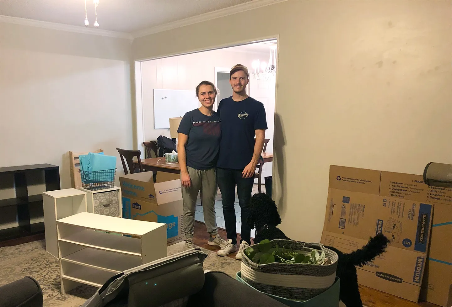
Conincidentally, we're standing where you would have to stand while talking with someone in the kitchen.

When we decided to build a house, we designed the floor plan to be open and spacious. Not being interior designers or “feng shui” experts, we were expecting that this new layout would solve our problem.

It did - but not perfectly! After all that, there are things I would still do differently to make our home as welcoming and supportive of fellowship as possible.

Our new house 
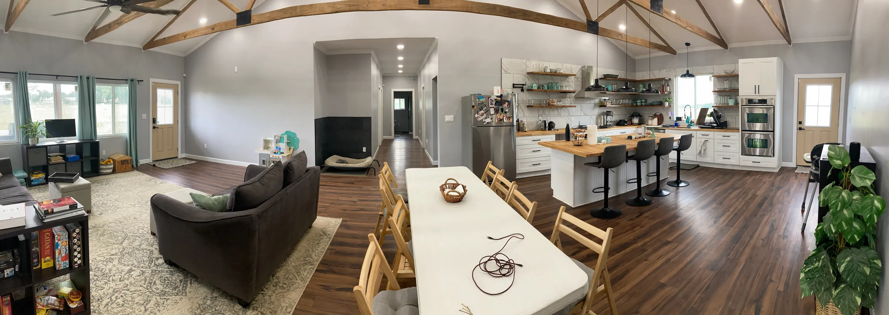
Our new house, still a work in progress.

If you own your church building and can afford it, seek out a professional for help creating a space that is beautiful and inspiring. Regardless of your situation, don’t take for granted opportunities to beautify the place you're gathering for corporate worship.

At the end of the day, there's nothing that is more welcoming than a friendly, genunine person. Inspire your congregation to be that hospitable through their environment.


Related to “touchpoints”
Does Your Church Need A Welcome Brochure? The Hard Truth
Published on:
A welcome brochure is one of the things I often find myself helping churches design, despite the fact that I never suggest or recommend it. Why don’t I encourage churches to create these? Well, because to be honest I don’t pick them up myself. If I see a stack of flyers sitting on a table when I walk in your church door for the first time, am I going to grab one? Probably not, no matter how good the design is. I’m looking for a familiar face to connect with, not a colorful piece of paper. If I want to know where to find you on Facebook I’m going to Google search it. If I’m needing to read about your beliefs, I’ll find them on your website. However… I’m a millennial. For older folks who aren’t addicted to their phones and dependent on ChatGPT/Google, a well-designed welcome brochure is often the perfect way to communicate key info and help them get familiar with your church. So it’s worth it to have a welcome brochure in some cases. The important thing to ask yourself is this: Who are you trying to reach? Is your community one that will actually engage with flyers and brochures? If not, then your efforts and money are probably better spent elsewhere.
Don’t Update Your Signs Until You Do This
Published on:
If you’re looking at getting new signs or updating your building, don’t miss this opportunity to update your branding as well! It’s one thing for a sign to look nice and be functional, but branding and design has the power to do much more than just help people find the nursery. Every bulletin, banner, and coffee cup is an opportunity to shape the culture of your church through intentional, vision-aligned branding that stands the test of time. If that’s your ultimate goal, then updating your signs without rebranding first would be a massive waste of time and money! Schedule a time to talk and I’ll walk you through what a brand refresh could look like, so you don’t have to re-do your signs AGAIN in a couple of years.
Church Way-Finding Signs: Using Typography
Published on:
For way-finding signage, there are three critical things to get right with typography: Size, Style, and Grouping. To figure out how big the font size should be on your signs, think about the furthest possible viewing distance for that sign. Will visitors be seeing it up close every time, or is it at the end of a hallway? A general rule of thumb is that the main headings on the sign should be legible from 40ft away for someone with good eyesight. This applies mostly to directional signage, and isn’t necessary for things like room labels. Now on to font style. Legibility is absolutely critical for way-finding, so you want to choose a brand-aligned font that is easy to read. For the thickness or weight of the text, lean bolder rather than lighter. In this example, we’re using Larken, the main brand typeface, for the headings. The secondary typeface, Plus Jakarta Sans, was better suited for the other information and is more legible at small sizes. Finally, consider the grouping of information and arrows in your layout. You want to make sure that you have grouped relevant information together in a way that will quickly make sense to someone who is late for Sunday School!
Church Way-Finding Signs: Choosing Color
Published on:
Let's say your brand’s hero color was a bright red. Your wayfinding signs should be red to be on-brand, right? Not so fast! Would you put a bright red couch in your living room? What about multiple bright red paintings throughout your home? Again, probably not. For environmental signage and way-finding, we have to think more like interior designers and accessibility experts than graphic designers. Earlier in the rebrand process, we had developed a brand color palette for this particular church with a dark charcoal color we called “Forge Black.” Using this darker, more neutral color as the main background was a good choice for three reasons: It wouldn’t clash with the paint, flooring, and other interior colors of the building. It wouldn’t show dirt as easily as a lighter color. It would allow for the most legibility and contrast for the text. As you can see, we did bring in the red hero color, but only in a very intentional, minimalist way. Even the logo on the signs was intentionally subdued and understated to make room for more important information, like “¿donde esta el baño?”
Related to “visitor”
Only Churches Struggle With This: The Dual Audience Dilemma
Published on:
As I’ve continued to go deeper into the branding and design industry, I’ve encountered something that is probably not just a hang-up for me, but for a lot of pastors and churches. If you do any research on marketing and branding, you’ll very quickly find lots of resources that are very focused on businesses. For example: “Speak to your ideal customer.” “Drive revenue with these marketing tips” “Create a story that makes customers keep coming back” The customer-centric, profit-driven approach can absolutely work for businesses, but for me, I’ve never felt like it applied well to the church. On one hand, you’re leading a congregation of believers who need to feel united around your vision. They need clarity, language, and visual cues that reinforce who you are as a church and where you’re going. When done well, branding can give your people something to rally around—a shared identity that goes deeper than a logo and helps every member see their role in the mission. But unlike a business, you’re not just trying to “sell” something to a customer. You’re also extending an open invitation to your community. These people are skeptics, seekers, and those who may not understand what your church is really about. For them, branding becomes a bridge. It’s the first impression that points them to Jesus Christ and communicates: This is a place for you. It signals your heart, your values, and the kind of welcome they can expect before they ever set foot inside. Where most churches struggle is trying to speak to both groups at the same time without a clear strategy. The result is confusion, inconsistency, and branding that unintentionally speaks more to insiders than outsiders… or vice versa. The approach I’ve developed in response to this problem is to make Christ the cornerstone of your brand. This seems obvious, but it’s truly countercultural when you compare it to how most agencies and designers work. I believe that a kingdom-first, vision-driven brand matters. It helps you communicate so your congregation is aligned and your community is invited, without compromise on either front.
Does Your Church Need A Welcome Brochure? The Hard Truth
Published on:
A welcome brochure is one of the things I often find myself helping churches design, despite the fact that I never suggest or recommend it. Why don’t I encourage churches to create these? Well, because to be honest I don’t pick them up myself. If I see a stack of flyers sitting on a table when I walk in your church door for the first time, am I going to grab one? Probably not, no matter how good the design is. I’m looking for a familiar face to connect with, not a colorful piece of paper. If I want to know where to find you on Facebook I’m going to Google search it. If I’m needing to read about your beliefs, I’ll find them on your website. However… I’m a millennial. For older folks who aren’t addicted to their phones and dependent on ChatGPT/Google, a well-designed welcome brochure is often the perfect way to communicate key info and help them get familiar with your church. So it’s worth it to have a welcome brochure in some cases. The important thing to ask yourself is this: Who are you trying to reach? Is your community one that will actually engage with flyers and brochures? If not, then your efforts and money are probably better spent elsewhere.
World-Class Design Firm Lesson - Be REALLY Different
Published on:
If you’re one of many (or even a few) churches in your area, branding that stands out should be at the top of your mind. A lot of pastors feel guilty upping their branding game because of their kingdom mindset. “We don’t want to just attract people from other churches because of our aesthetic.” That’s a logical concern, but it’s wrong. People from the harvest (the lost, those who aren’t attending church) are looking at your aesthetics too. When they see a church that looks and sounds the same as every other church in the community, what do you think they’re going to do? They're going to dismiss you. But what happens if you have a logo breaks the mold of the “average” church logo? What if you choose your colors and a tone of voice don’t play it safe like everyone else? You short circuit that pattern recognition many people have for churches. In the sales world they call this a “pattern interrupt.” Violate people’s expectations in a positive way (positive is key here), and you’ll disarm them, making them open to hearing the life changing news of the gospel. I want to be very clear, I’m talking about your church branding and core communications. Here’s what I’m NOT advocating your church look like on a Sunday morning. This church looked different by removing everything that would make them look Christian and simultaneously infringed on a dozen trademarks. Don’t do that! But, here’s my final thought: You’re not being inauthentic by branding yourself as different from others. You ARE different from others. God is doing a unique thing in and through your congregation. So capitalize on that!
You’re NOT “A Church for Everyone”
Published on:
How do you describe and brand your church without scaring visitors away or pretending to be something you’re not? Pastors will try, and most of the time the result is something like “We’re a church for everyone.” Or in more words, “We’re a welcoming community of people who love God and want to see the gospel reach every nation.” That’s great - so is every other Protestant church! This is a mistake I see pastors making all the time with their distinctives - stop it! What church leaders are trying to communicate (most of the time) is something like “we won’t turn you away because you’re different,” or “we’re welcoming and not judgmental.” But being hospitable and welcoming are just general marks of a Christian community, not distinctives. It’s great that you can say those things about your church, but they’re not something your congregation will rally around. Those things don’t give people a sense of unique belonging or identity, because they describe every other church. When you say, “We’re a church for everyone,” what you’re actually saying is, “We don’t know who we are.” I can hear some of you thinking “But we’re just your average church. The only thing distinctive about us is our street address!” I’m not saying you should pretend to be something you’re not. And I’m also not saying that every church should be trying to put their own spin on the gospel. Here’s my point: God is uniquely using your church to reach a specific group of people who are, by definition, not “everyone.” Rather than blurring the edges of that calling to be more inclusive or not scare people away, lean into it! Be known for your distinct church identity!
Related to “thinking”
Why God Gave Us Visual Aids (Joshua 4)
Published on:
It’s no secret that people remember images better than words. Studies show we can remember 65% of visual information after 3 days, compared to just 10% of written/spoken info. That’s a 6x increase in retention! But why does it matter for churches? Good question. Something I’ve learned is that a brand isn’t just a logo, colors, or fonts. A church brand is an opportunity to tell the story of what God has done and is doing in that local ministry. Said another way: your brand is the visual aid for people to easily remember what their church stands for, and the story God is telling there. This ties in closely to the examples we have in the Bible of when the Lord commanded that a monument be built to signify his mercy and might. In Joshua 4:1–10, God tells the Israelites to take twelve stones from the Jordan River and set them up as a memorial. This visual monument served as a lasting symbol to help future generations remember how the Lord miraculously stopped the river’s flow, allowing His people to cross on dry ground. These stones were set up intentionally as a tangible visual aid to reinforce the Israelites’ generational memory and faith. To add even more layers, God also instructs that twelve stones be used. Why twelve? To symbolize the twelve tribes who crossed over the Jordan that day. In the same way, designing an intentional brand identity with symbolism and permanence is the most powerful way to help your people remember their God-given identity as a body and look to Christ, week in and week out.
This Will Make Your Church Branding More Timeless
Published on:
Strip everything away, give your church a generic name, and make the logo a cross. Go black and white with your color scheme. Congrats - you have a timeless brand! I’m being a little bit sarcastic, but there’s an element of truth here. Over-simplification is usually the fastest, easiest way to a truly “timeless” look. However, it’s not the only way. And for churches, it’s almost never the best way. The history of the world is timeless by definition, but definitely not simple. God’s creative and recreative work is anything but minimalistic. The way God works is simple but deep, focused but rich with meaning. So too is the story being woven together in your ministry, whether it’s 200 years old or a brand new church plant. What is God’s perspective of your church? If you want a timeless brand identity, this is the question you have to answer. Once you start narrowing it down, your logo colors and fonts become clear and easy choices. Rather than trying to become timeless by using Helvetica and no colors in your brand guidelines, you should be looking for ways to incorporate the truth of who God says you are as a congregation. Does it take more work and intentionality? Absolutely. Is it hard? Anything worth doing is.
Boulder Problems and Branding
Published on:
I’m an extreme sports fan, and those who know me know that I would never pass up a chance to try one. Of course, I’m no Red Bull athlete, so it usually looks like me attempting the low-stakes version of whatever the true pros are doing. One of those sports I’ve casually enjoyed since high school is rock climbing, and believe it or not, there’s a nice analogy to branding here. In bouldering (climbing lower with no ropes above a crash mat), a route or particular climb is called a boulder problem. A beginner climber like me can climb any V1 boulder problem with ease and most V2s with moderate difficulty. Some V3 problems are too challenging at my skill level, while others are doable after a few attempts. (Don’t be too impressed - the scale goes up to V17). There was this one V3 problem giving me trouble on my last visit. I kept falling over and over, until I eventually felt so fatigued and frustrated that I gave up. Why am I sharing this story? I think it’s appropriate that they’re called “problems,” because they have a solution that takes more than brute force and raw strength to solve. They take strategy. All around me were more experienced climbers who could have showed me the trick to get past my sticking point. With their expert advice, I could have probably reached my goal with only a couple of tries. Even better, I probably could have learned tips from them for other problems too. Here’s the thing: If you want the fastest way to your goal, don’t be afraid to seek guidance from someone who’s done it before.
Two Strategies to Blast Through Creative Block
Published on:
Every day around mid-morning, I take a bathroom break and that’s when I write these posts - gross I know, but it’s the perfect amount of time and I have no distractions (now you won’t be able to get that image out of your mind, so you’re welcome). Context aside, when I’m motivated and inspired it’s easy, but today I had some serious creative block of the “stare vacantly at a blank page and start the same sentence five times over” variety. I have a hunch this doesn’t just happen to creatives. Most of my readers are church leaders, I’ll wager that you probably experience that wall too. If so, maybe you can benefit from the two strategies I use to overcome creative block. 1. Short term strategy Exercise is my immediate strategy for overcoming it in the short term. I’ll go home after work, grab my dumbbells, and start lifting. Something about an intense workout stimulates my creativity and writing energy. However, that only works on that day, and if I can’t get a workout in, I’m in trouble. 2. Long term strategy My long term strategy to overcome creative block is to write daily. I used to think I didn’t have time for something recreational like writing, much less every day. But I realized that as long as I put it on the other side of something I enjoy more (chess puzzles), I could force myself to take 5-15 minutes and crank out a thought. Writing became a habit I was cultivating. Something you practice with regularity and discipline becomes easier and easier, and those creative block moments get fewer and farther between. Even when it takes a bit longer to get rolling, the groove is greased and the engine is still warm from yesterday. If there’s something you know you should be doing (maybe writing, maybe calling to check in on members, maybe something else) make it a small part of your daily routine and see how much you start feeling empowered when those “block” moments hit.
← Back to all posts
Almost there!

Enter your email below to get the weekly Tend Your Brand digest.