How to Apply Principles of Color Selection to Your Church Brand
Published on: June 11th, 2025
If you go read online, ask ChatGPT, or just generally do color-related research, you know how big of a topic color really is. If you’re like me, it can leave you feeling a little… lost?
People have written books and given 2 hour lectures on color theory, color psychology, digital color management, and everything in between. Even just scratching the surface can feel completely overwhelming.
You might be thinking, “It feels like I should be using these principles, but how do I actually put them into practice for my church?”
Even after reading my work specifically about church brand colors, it might not be clear how to actually apply this knowledge to your specific needs.
And at end of the day, color is just one piece of the puzzle.
That’s where having a personal guide can be a total game changer. With someone to make objective recommendations and help you avoid common mistakes, not only will you save time, you’ll save the headache of having to rethink your branding decisions in a few years.
Ideally you would want this person to be a proven expert who loves the capital “C” Church and has a strong track record of branding success stories.
If you’re looking for that kind of guidance, I’ve spent countless hours meeting with church leaders and translating their gut feelings into concrete messaging and visuals. I know the struggles and hurdles pastors face when nailing down exactly how their church should look, speak, and feel.
Book a strategy call with me and I’ll talk with you one-on-one about what your goals are, the context your church is in, and how you can make your branding fit without the DIY headaches.
See you there!
Color Selection Principles: Bonus Tips
Published on: June 10th, 2025
Bonus 1: Use a color palette tool
Creating, adjusting, saving and sharing color palettes isn’t actually all that easy. That’s where a color palette website can be invaluable.
I mentioned this website up above called Coolors. When I first discovered it, I thought “where have you been all my life?!” Unlike most color websites out there, this one lets you do much more than browse and save color palettes. You can visualize your color palette in different contexts, do global adjustments to the whole palette at once, extract colors from an image, and even use a huge library of unique color names.
They didn’t sponsor me, but I really like using it. Maybe you will too.
Bonus 2: Ignore CMYK and Pantone
…unless you’re working with a pro, that is. When I create a brand guide for a client, I include CMYK and Pantones as a nice addition, fully expecting that they will never be used.
Almost all print shops and vendors these days have automatic conversion between color spaces that is usually reliable, accurate, and consistent.
Even if you’re having screen printed t-shirts made or running off thousands of flyers, Pantone and CMYK values are only helpful in very specific situations.
Long story short, HEX codes are probably all you need.
P.S. This week I’m focusing on church brand color selection principles, which I’ve gathered the hard way from years of church rebrands. If you want the complete guide, I’ve collected all of the principles into a single post here.
Color Selection Principles: Count on Tints and Shades
Published on: June 9th, 2025
Using tints and shades is a powerful way to get more mileage out of your visual identity without adding new base colors. What this means for color selection is that you don't have to worry about that exact palette working in every possible scenario.
A tint is a lighter version of the same color. Shades are darker versions of the same color.
Tint = Base color + white (lighter version)
Shade = Base color + black (darker version)
While you might not need them in everyday use (especially with a professionally designed color palette), there are situations where your standard set of base colors are going to clash or look too opinionated.
For example, a limited color palette might handicap your web designer. Because websites are interactive and display lots of information in different formats, they often call for a suite of neutral colors, ranging from dark to light.
You might also find that a particular color works well online and in print, but is too strong and vibrant for apparel. A tint or shade of that color might make for a more wearable and fashion-friendly t-shirt than the original swatch.
If your palette feels incomplete or you’re looking for good supporting colors, consider using tints or shades of your core colors to round it out.
P.S. This week I’m focusing on church brand color selection principles, which I’ve gathered the hard way from years of church rebrands. If you want the complete guide, I’ve collected all of the principles into a single post here.
Color Selection Principles: When in Doubt, Use Red
Published on: June 6th, 2025
Just use red? Can it really be that simple?
Red is historically a color used by churches of all denominations, and it checks all the boxes I’ve mentioned so far in this color selection series.
✅ It makes a bold hero color and contrasts with both white and black.
✅ Among other biblical tie-ins, red symbolizes the blood of Christ that is offered in the gospel.
✅ Almost every church building or location has some form of red that can be sampled for a close match.
There are an infinite number of shades of red that can work for a church brand identity. Even if you’re not using red as one of your core colors, see if there’s a place for it in your supporting color palette.
P.S. This week I’m focusing on church brand color selection principles, which I’ve gathered the hard way from years of church rebrands. If you want the complete guide, I’ve collected all of the principles into a single post here.
Does Your Church Need A Welcome Brochure? The Hard Truth
Published on: August 8th, 2025
A welcome brochure is one of the things I often find myself helping churches design, despite the fact that I never suggest or recommend it.
Why don’t I encourage churches to create these?
Well, because to be honest I don’t pick them up myself. If I see a stack of flyers sitting on a table when I walk in your church door for the first time, am I going to grab one? Probably not, no matter how good the design is.
I’m looking for a familiar face to connect with, not a colorful piece of paper.
If I want to know where to find you on Facebook I’m going to Google search it.
If I’m needing to read about your beliefs, I’ll find them on your website.
However… I’m a millennial. For older folks who aren’t addicted to their phones and dependent on ChatGPT/Google, a well-designed welcome brochure is often the perfect way to communicate key info and help them get familiar with your church.
So it’s worth it to have a welcome brochure in some cases.
The important thing to ask yourself is this: Who are you trying to reach? Is your community one that will actually engage with flyers and brochures? If not, then your efforts and money are probably better spent elsewhere.
Don’t Update Your Signs Until You Do This
Published on: August 4th, 2025
If you’re looking at getting new signs or updating your building, don’t miss this opportunity to update your branding as well!
It’s one thing for a sign to look nice and be functional, but branding and design has the power to do much more than just help people find the nursery.
Every bulletin, banner, and coffee cup is an opportunity to shape the culture of your church through intentional, vision-aligned branding that stands the test of time. If that’s your ultimate goal, then updating your signs without rebranding first would be a massive waste of time and money!
Schedule a time to talk and I’ll walk you through what a brand refresh could look like, so you don’t have to re-do your signs AGAIN in a couple of years.
Church Way-Finding Signs: Using Typography
Published on: August 1st, 2025
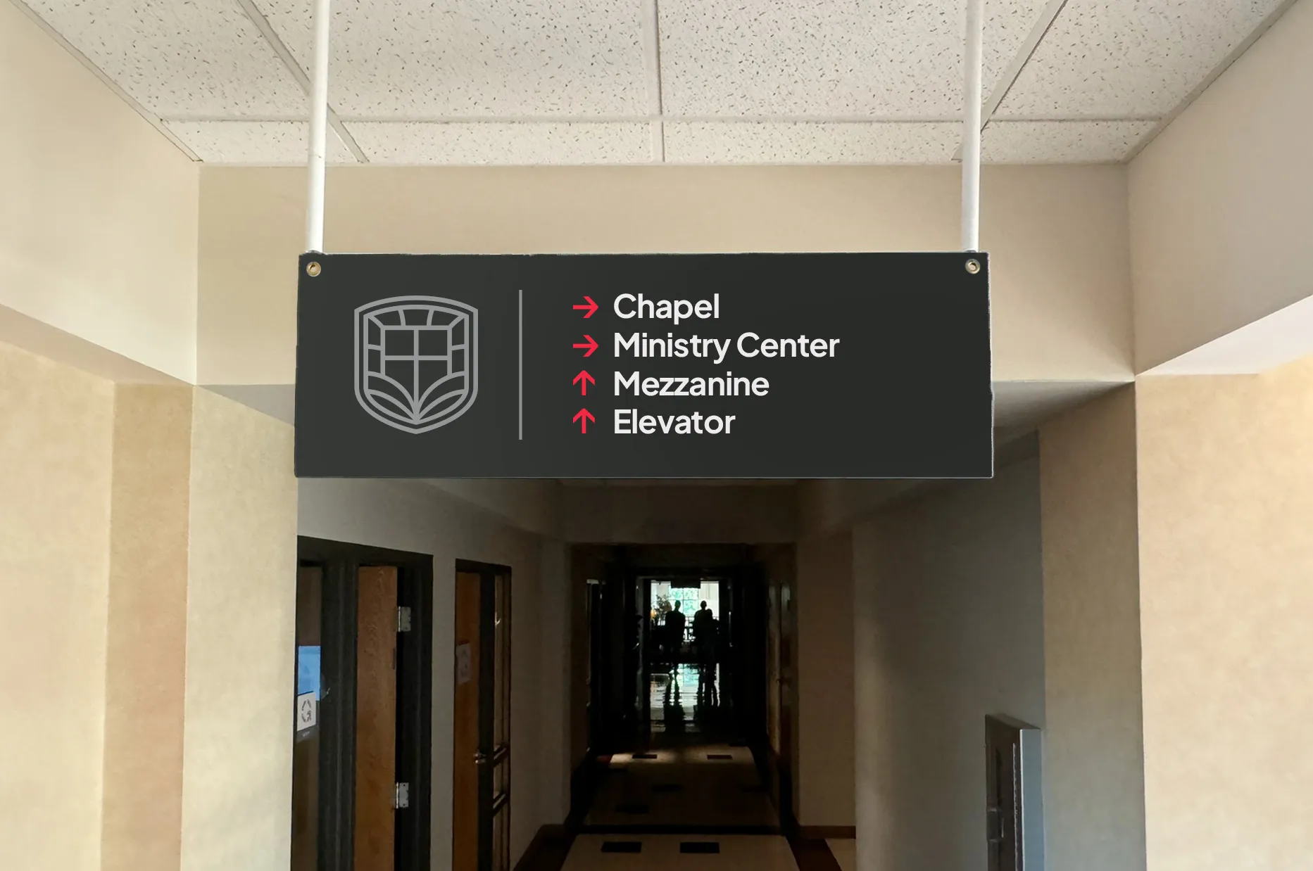
For way-finding signage, there are three critical things to get right with typography: Size, Style, and Grouping.
To figure out how big the font size should be on your signs, think about the furthest possible viewing distance for that sign. Will visitors be seeing it up close every time, or is it at the end of a hallway?
A general rule of thumb is that the main headings on the sign should be legible from 40ft away for someone with good eyesight.
This applies mostly to directional signage, and isn’t necessary for things like room labels.
Now on to font style. Legibility is absolutely critical for way-finding, so you want to choose a brand-aligned font that is easy to read. For the thickness or weight of the text, lean bolder rather than lighter.
In this example, we’re using Larken, the main brand typeface, for the headings. The secondary typeface, Plus Jakarta Sans, was better suited for the other information and is more legible at small sizes.
Finally, consider the grouping of information and arrows in your layout. You want to make sure that you have grouped relevant information together in a way that will quickly make sense to someone who is late for Sunday School!
How to Design Your Church Wayfinding Signage (Case Study)
Published on: July 30th, 2025
I recently helped a church in Kansas City rebrand, and this project took much longer than we anticipated! This church needed collateral designed in preparation for their official launch of the new identity. Collateral like wayfinding signs, and A LOT OF THEM.
85 signs, to be exact.
If you have a church building, chances are you have these!
Way-finding signs are the built-in guide to your building, both for first-time visitors and those forgetful members who could probably get lost in their own house (you know who I’m talking about).
Here’s the thing: there are some HUGE blunders that are easy to make with this type of signage.
So, to save you from those, I thought I would show the design process I went through with this Kansas City church and their way-finding signs.
In design, way-finding falls under the category of what we call “environmental design.” Most of these signs were going to be a part of the building, so we had to treat them more like a piece of furniture than a graphic or a poster.
I'll be going over each one of these in future posts, where we'll explore what that looks like through two key considerations: Color and Typography. Stay tuned!
Don’t Update Your Signs Until You Do This
Published on: August 4th, 2025
If you’re looking at getting new signs or updating your building, don’t miss this opportunity to update your branding as well!
It’s one thing for a sign to look nice and be functional, but branding and design has the power to do much more than just help people find the nursery.
Every bulletin, banner, and coffee cup is an opportunity to shape the culture of your church through intentional, vision-aligned branding that stands the test of time. If that’s your ultimate goal, then updating your signs without rebranding first would be a massive waste of time and money!
Schedule a time to talk and I’ll walk you through what a brand refresh could look like, so you don’t have to re-do your signs AGAIN in a couple of years.
Church Way-Finding Signs: Using Typography
Published on: August 1st, 2025
For way-finding signage, there are three critical things to get right with typography: Size, Style, and Grouping.
To figure out how big the font size should be on your signs, think about the furthest possible viewing distance for that sign. Will visitors be seeing it up close every time, or is it at the end of a hallway?
A general rule of thumb is that the main headings on the sign should be legible from 40ft away for someone with good eyesight.
This applies mostly to directional signage, and isn’t necessary for things like room labels.
Now on to font style. Legibility is absolutely critical for way-finding, so you want to choose a brand-aligned font that is easy to read. For the thickness or weight of the text, lean bolder rather than lighter.
In this example, we’re using Larken, the main brand typeface, for the headings. The secondary typeface, Plus Jakarta Sans, was better suited for the other information and is more legible at small sizes.
Finally, consider the grouping of information and arrows in your layout. You want to make sure that you have grouped relevant information together in a way that will quickly make sense to someone who is late for Sunday School!
How to Design Your Church Wayfinding Signage (Case Study)
Published on: July 30th, 2025
I recently helped a church in Kansas City rebrand, and this project took much longer than we anticipated! This church needed collateral designed in preparation for their official launch of the new identity. Collateral like wayfinding signs, and A LOT OF THEM.
85 signs, to be exact.
If you have a church building, chances are you have these!
Way-finding signs are the built-in guide to your building, both for first-time visitors and those forgetful members who could probably get lost in their own house (you know who I’m talking about).
Here’s the thing: there are some HUGE blunders that are easy to make with this type of signage.
So, to save you from those, I thought I would show the design process I went through with this Kansas City church and their way-finding signs.
In design, way-finding falls under the category of what we call “environmental design.” Most of these signs were going to be a part of the building, so we had to treat them more like a piece of furniture than a graphic or a poster.
I'll be going over each one of these in future posts, where we'll explore what that looks like through two key considerations: Color and Typography. Stay tuned!
How to Design Your Church Way-Finding Signage (Case Study)
Published on: June 30th, 2025
I recently helped a church in Kansas City rebrand, and this project took much longer than we anticipated! This church needed collateral designed in preparation for their official launch of the new identity. Collateral like wayfinding signs, and A LOT OF THEM.
85 signs, to be exact.
If you have a church building, chances are you have these!
Sample from OLD wayfinding and branding
Way-finding signs are the built-in guide to your building, both for first-time visitors and those forgetful members who could probably get lost in their own house (you know who I’m talking about).
Here’s the thing: there are some HUGE blunders that are easy to make with this type of signage.
So, to save you from those, I thought I would show the design process I went through with this Kansas City church and their way-finding signs.
In design, way-finding falls under the category of what we call “environmental design.” Most of these signs were going to be a part of the building, so we had to treat them more like a piece of furniture than a graphic or a poster.
I'll be going over each one of these in future posts, where we'll explore what that looks like through two key considerations: Color and Typography. Stay tuned!