Church Way-Finding Signs: Using Typography

fonts signage touchpoints
Braden East

For way-finding signage, there are three critical things to get right with typography: Size, Style, and Grouping.

To figure out how big the font size should be on your signs, think about the furthest possible viewing distance for that sign. Will visitors be seeing it up close every time, or is it at the end of a hallway?

A general rule of thumb is that the main headings on the sign should be legible from 40ft away for someone with good eyesight.

This applies mostly to directional signage, and isn’t necessary for things like room labels.

Now on to font style. Legibility is absolutely critical for way-finding, so you want to choose a brand-aligned font that is easy to read. For the thickness or weight of the text, lean bolder rather than lighter.

In this example, we’re using Larken, the main brand typeface, for the headings. The secondary typeface, Plus Jakarta Sans, was better suited for the other information and is more legible at small sizes.

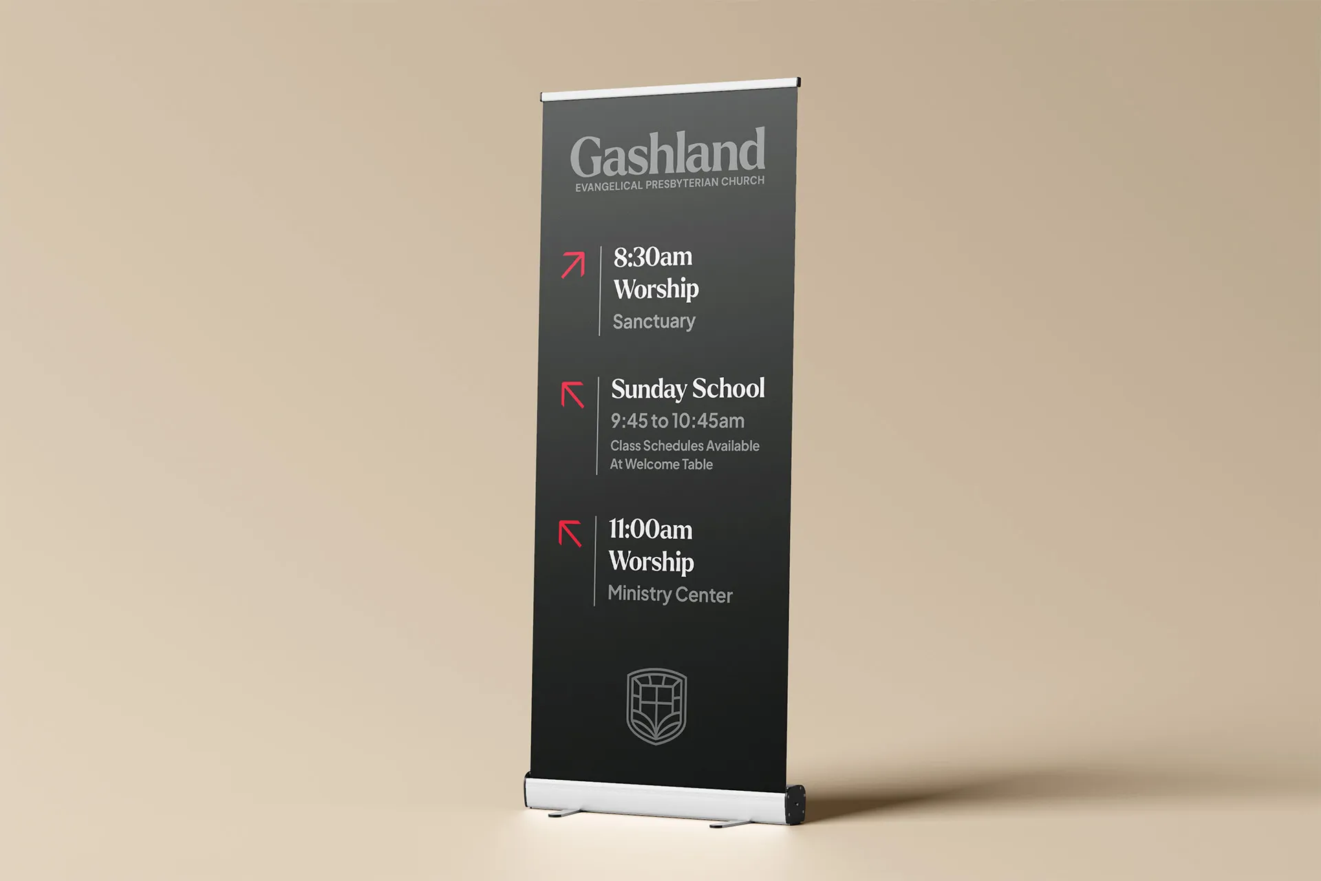
Finally, consider the grouping of information and arrows in your layout. You want to make sure that you have grouped relevant information together in a way that will quickly make sense to someone who is late for Sunday School!


Related to “fonts”
Why the Grace Font and the Dyslexia Friendly Bible is Brilliant
Published on:
A few months ago, Crossway released The Dyslexia-Friendly Bible, featuring a new font they called “Grace.” The design team took a data-driven approach, carefully studying and testing what tiny details makes a font more accessible for dyslexic readers. This Bible also featured special design touches to make the reading experience more approachable, and less fatiguing. The team working on the design used existing studies, focus groups, and user testing to optimize things like paragraph spacing and line height (and other technical specs we designers are thinking about all the time). The end result was a beautiful product that is already changing the way thousands read and access God’s Word. This brings me the same joy as when the Scriptures are translated into a new language. Praise God! It’s also a good reminder that intentional design can make your localized vision and message accessible to a previously “unreached” people group. Are you studying what prevents your congregation and community from "getting" it?
8 Modern Budget-Friendly Fonts Churches Should Use
Published on:
I’ll admit, I fit the graphic designer stereotype. I spend too much time oohing and ahhing over mockups, color palettes, and typefaces, and little tiny details that nobody else cares about. One way I fit the designer stereotype is that I’m a font hoarder… “That new typeface I bought? I know I saved it here somewhere….” “I’ll definitely use this font at some point… unlike the other one I bought last year and never used…” Maybe I am Michael Scott: Oscar: “Okay, the green bar is what you spend every month on stuff you need, like a car and a house.” Michael: “That's so cool how you have my name at the top.” Oscar: “The red bar is what you spend on non-essentials, like magazines, entertainment. And this scary black bar is what you spend on things that no one ever, ever needs, like multiple magic sets, professional bass fishing equipment.” Michael: “How did you do this so fast? Is this PowerPoint?” In that spirit, I want to share eight free or inexpensive fonts that you can use in your church branding to bring it into the 21st century and give it some life without breaking the bank. 1. Funnel Display / Funnel Sans Funnel Sans and Funnel Display are modern sans-serif typefaces with both clarity and character, originally developed by NORD ID and Kristian Möller for Funnel. Funnel Sans is a functional yet personal sans-serif, featuring both square and circular shapes in its letterforms. In Funnel Display, certain parts of the stems are shifted to further enhance the sense of movement. Get it here. 2. Inknut Antiqua Inknut Antiqua is an Antiqua typeface for literature and long-form text. Approaching the idea of web-publishing as a modern day private press, it is designed to evoke Venetian incunabula and humanist manuscripts, but with the quirks and idiosyncrasies of the kinds of typefaces you find in this artisanal tradition. Get it here. 3. TeX Gyre Bonum TeX Gyre Bonum can be used as a replacement for ITC Bookman (designed by Alexander Phemister, 1860, redesigned by Edward Benguiat, 1975). Get it here. 4. Outfit Outfit follows the forms of classic (and classy) geometric sans-serif families like Futura, but with 21st century features and modifications. Get it here. 5. Afacad The ’Afacad typeface project’ commenced in 2017 as a personalised lettering endeavour for Slagskeppet, a Swedish housing tenant, who sought fresh house address numbering for their entrances. The letters and numerals were meticulously crafted to harmonise with the architectural proportions and materials employed by Architect Sture Elmén during the 1940s. Get it here. 6. Felonia Felonia is an elegant serif font that blends retro and classic vibes, offering sophistication and a touch of nostalgia to your designs. Its timeless appeal makes it perfect for creating fresh and innovative designs. Get it here. 7. Hepta Slab Hepta Slab is a slab-serif revival based on specimens of antique genre types from Bruce and Co., primarily Antique 307. The family is a variable font which consists of 10 weights with the extremes intended for display use and the middle weights for setting text. Get it here. 8. Gambarino / Gambetta Gambarino is a condensed, single-weight serif face for headlines. Gambetta is intended for use in book design and in editorial design; the fonts come from Paul Troppmar. Get Gambarino here. Get Gambetta here.
Tending an Outdated Church Brand
Published on:
Sometimes you’re stuck with a brand you inherited from whoever came before you. If the gut feelings and associations around that brand are good, then you don’t want to throw everything out and start over from scratch. As my dad would say: If it ain’t broke, don’t fix it. That’s true… but… there comes a time when you could use a little refresh to make that brand more effective, without losing the trust and goodwill built up in the past. You need a good old Rebrand Lite™️ Color adjustments One option is to brighten up your color palette slightly, bringing a little more energy and vibrancy without losing the hues that are recognized by your congregation. Logo adjustments A second way to do a light brand refresh is to refine your existing logo. What is the core idea it represents? Is there anything that distracts from that core idea? What happens if you simplify it just slightly? If it’s multiple colors, is there a way to make it work in a single color? This is a more advanced option, but even a slight adjustment can help your logo look more clean and confident. Font adjustments There are two elements to typography: selection and application. Fonts can be tricky to navigate because there are so many bad ones out there. Rather than picking totally new fonts, think about how your existing fonts that could be used in a new creative way. If you’re pruning things that distract, and nurturing things that bear fruit, you’ll be able to make an outdated brand work for a long time! It’s not a forever solution, but hopefully these strategies can make a difference in the meantime.
When a Church Logo Isn’t Enough
Published on:
It’s easy to look at only your church logo in isolation and think “Our branding is taken care of.” Here’s the problem: Most churches aren't using their branding toolkit very well. Or worse, they don't have one at all. Their website and bulletins look like they could belong to any church. Even with their logo on it, it says nothing about their vision and identity. Having a roadmap and process is all some churches need to get through a rebrand. For others, they need someone to guide them past the traps and time-sucks that can slow them down or make them give up all together. If your church is stuck with a lacking or nonexistent branding toolkit, I can help you fix that, without all the technical headaches, delays, and uncertainty of a DIY rebrand. Not only does it save stress, having a trusted design partner makes sure that you launch the new brand sooner rather than later, and with lots of buy-in from your congregation. I have a couple of openings over the next month, so let’s talk soon to see what that could look like in your church.
Related to “signage”
Don’t Update Your Signs Until You Do This
Published on:
If you’re looking at getting new signs or updating your building, don’t miss this opportunity to update your branding as well! It’s one thing for a sign to look nice and be functional, but branding and design has the power to do much more than just help people find the nursery. Every bulletin, banner, and coffee cup is an opportunity to shape the culture of your church through intentional, vision-aligned branding that stands the test of time. If that’s your ultimate goal, then updating your signs without rebranding first would be a massive waste of time and money! Schedule a time to talk and I’ll walk you through what a brand refresh could look like, so you don’t have to re-do your signs AGAIN in a couple of years.
Church Way-Finding Signs: Choosing Color
Published on:
Let's say your brand’s hero color was a bright red. Your wayfinding signs should be red to be on-brand, right? Not so fast! Would you put a bright red couch in your living room? What about multiple bright red paintings throughout your home? Again, probably not. For environmental signage and way-finding, we have to think more like interior designers and accessibility experts than graphic designers. Earlier in the rebrand process, we had developed a brand color palette for this particular church with a dark charcoal color we called “Forge Black.” Using this darker, more neutral color as the main background was a good choice for three reasons: It wouldn’t clash with the paint, flooring, and other interior colors of the building. It wouldn’t show dirt as easily as a lighter color. It would allow for the most legibility and contrast for the text. As you can see, we did bring in the red hero color, but only in a very intentional, minimalist way. Even the logo on the signs was intentionally subdued and understated to make room for more important information, like “¿donde esta el baño?”
How to Design Your Church Wayfinding Signage (Case Study)
Published on:
I recently helped a church in Kansas City rebrand, and this project took much longer than we anticipated! This church needed collateral designed in preparation for their official launch of the new identity. Collateral like wayfinding signs, and A LOT OF THEM. 85 signs, to be exact. If you have a church building, chances are you have these! Way-finding signs are the built-in guide to your building, both for first-time visitors and those forgetful members who could probably get lost in their own house (you know who I’m talking about). Here’s the thing: there are some HUGE blunders that are easy to make with this type of signage. So, to save you from those, I thought I would show the design process I went through with this Kansas City church and their way-finding signs. In design, way-finding falls under the category of what we call “environmental design.” Most of these signs were going to be a part of the building, so we had to treat them more like a piece of furniture than a graphic or a poster. I'll be going over each one of these in future posts, where we'll explore what that looks like through two key considerations: Color and Typography. Stay tuned!
How to Design Your Church Way-Finding Signage (Case Study)
Published on:
I recently helped a church in Kansas City rebrand, and this project took much longer than we anticipated! This church needed collateral designed in preparation for their official launch of the new identity. Collateral like wayfinding signs, and A LOT OF THEM. 85 signs, to be exact. If you have a church building, chances are you have these! Sample from OLD wayfinding and branding Way-finding signs are the built-in guide to your building, both for first-time visitors and those forgetful members who could probably get lost in their own house (you know who I’m talking about). Here’s the thing: there are some HUGE blunders that are easy to make with this type of signage. So, to save you from those, I thought I would show the design process I went through with this Kansas City church and their way-finding signs. In design, way-finding falls under the category of what we call “environmental design.” Most of these signs were going to be a part of the building, so we had to treat them more like a piece of furniture than a graphic or a poster. I'll be going over each one of these in future posts, where we'll explore what that looks like through two key considerations: Color and Typography. Stay tuned!
Related to “touchpoints”
Does Your Church Need A Welcome Brochure? The Hard Truth
Published on:
A welcome brochure is one of the things I often find myself helping churches design, despite the fact that I never suggest or recommend it. Why don’t I encourage churches to create these? Well, because to be honest I don’t pick them up myself. If I see a stack of flyers sitting on a table when I walk in your church door for the first time, am I going to grab one? Probably not, no matter how good the design is. I’m looking for a familiar face to connect with, not a colorful piece of paper. If I want to know where to find you on Facebook I’m going to Google search it. If I’m needing to read about your beliefs, I’ll find them on your website. However… I’m a millennial. For older folks who aren’t addicted to their phones and dependent on ChatGPT/Google, a well-designed welcome brochure is often the perfect way to communicate key info and help them get familiar with your church. So it’s worth it to have a welcome brochure in some cases. The important thing to ask yourself is this: Who are you trying to reach? Is your community one that will actually engage with flyers and brochures? If not, then your efforts and money are probably better spent elsewhere.
Don’t Update Your Signs Until You Do This
Published on:
If you’re looking at getting new signs or updating your building, don’t miss this opportunity to update your branding as well! It’s one thing for a sign to look nice and be functional, but branding and design has the power to do much more than just help people find the nursery. Every bulletin, banner, and coffee cup is an opportunity to shape the culture of your church through intentional, vision-aligned branding that stands the test of time. If that’s your ultimate goal, then updating your signs without rebranding first would be a massive waste of time and money! Schedule a time to talk and I’ll walk you through what a brand refresh could look like, so you don’t have to re-do your signs AGAIN in a couple of years.
Church Way-Finding Signs: Choosing Color
Published on:
Let's say your brand’s hero color was a bright red. Your wayfinding signs should be red to be on-brand, right? Not so fast! Would you put a bright red couch in your living room? What about multiple bright red paintings throughout your home? Again, probably not. For environmental signage and way-finding, we have to think more like interior designers and accessibility experts than graphic designers. Earlier in the rebrand process, we had developed a brand color palette for this particular church with a dark charcoal color we called “Forge Black.” Using this darker, more neutral color as the main background was a good choice for three reasons: It wouldn’t clash with the paint, flooring, and other interior colors of the building. It wouldn’t show dirt as easily as a lighter color. It would allow for the most legibility and contrast for the text. As you can see, we did bring in the red hero color, but only in a very intentional, minimalist way. Even the logo on the signs was intentionally subdued and understated to make room for more important information, like “¿donde esta el baño?”
How to Design Your Church Wayfinding Signage (Case Study)
Published on:
I recently helped a church in Kansas City rebrand, and this project took much longer than we anticipated! This church needed collateral designed in preparation for their official launch of the new identity. Collateral like wayfinding signs, and A LOT OF THEM. 85 signs, to be exact. If you have a church building, chances are you have these! Way-finding signs are the built-in guide to your building, both for first-time visitors and those forgetful members who could probably get lost in their own house (you know who I’m talking about). Here’s the thing: there are some HUGE blunders that are easy to make with this type of signage. So, to save you from those, I thought I would show the design process I went through with this Kansas City church and their way-finding signs. In design, way-finding falls under the category of what we call “environmental design.” Most of these signs were going to be a part of the building, so we had to treat them more like a piece of furniture than a graphic or a poster. I'll be going over each one of these in future posts, where we'll explore what that looks like through two key considerations: Color and Typography. Stay tuned!
← Back to all posts
Almost there!

Enter your email below to get the weekly Tend Your Brand digest.