Color Selection Principles: Bonus Tips

colors tools
Braden East

Bonus 1: Use a color palette tool

Creating, adjusting, saving and sharing color palettes isn’t actually all that easy. That’s where a color palette website can be invaluable.

The homepage of Coolors.co

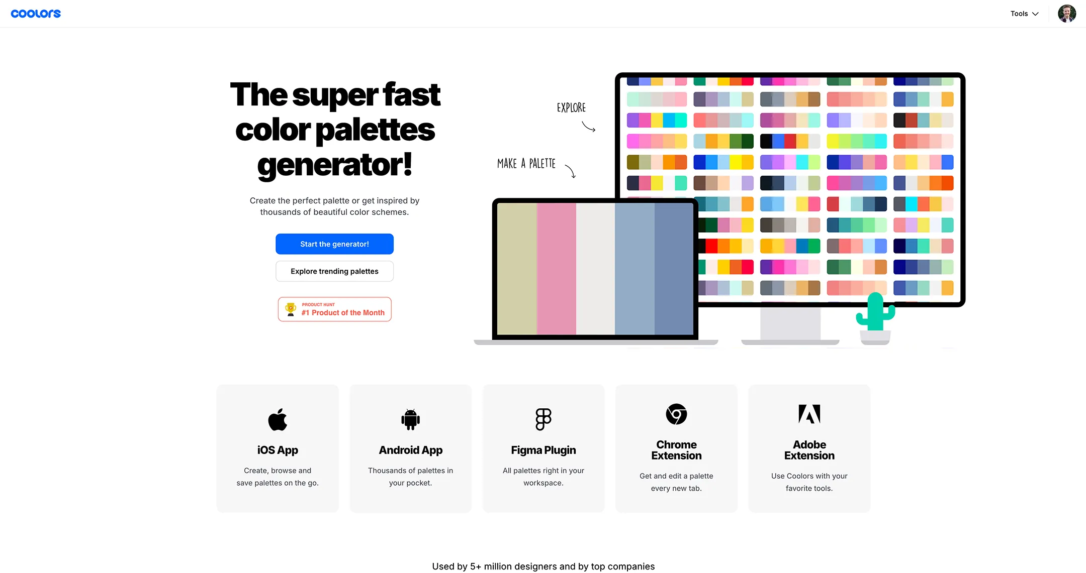
I mentioned this website up above called Coolors. When I first discovered it, I thought “where have you been all my life?!” Unlike most color websites out there, this one lets you do much more than browse and save color palettes. You can visualize your color palette in different contexts, do global adjustments to the whole palette at once, extract colors from an image, and even use a huge library of unique color names.

They didn’t sponsor me, but I really like using it. Maybe you will too.

Bonus 2: Ignore CMYK and Pantone

…unless you’re working with a pro, that is. When I create a brand guide for a client, I include CMYK and Pantones as a nice addition, fully expecting that they will never be used.

Pantone carrots

Almost all print shops and vendors these days have automatic conversion between color spaces that is usually reliable, accurate, and consistent.

Even if you’re having screen printed t-shirts made or running off thousands of flyers, Pantone and CMYK values are only helpful in very specific situations.

Long story short, HEX codes are probably all you need.

P.S. This week I’m focusing on church brand color selection principles, which I’ve gathered the hard way from years of church rebrands. If you want the complete guide, I’ve collected all of the principles into a single post here.


Related to “colors”
How to Apply Principles of Color Selection to Your Church Brand
Published on:
If you go read online, ask ChatGPT, or just generally do color-related research, you know how big of a topic color really is. If you’re like me, it can leave you feeling a little… lost? People have written books and given 2 hour lectures on color theory, color psychology, digital color management, and everything in between. Even just scratching the surface can feel completely overwhelming. You might be thinking, “It feels like I should be using these principles, but how do I actually put them into practice for my church?” Even after reading my work specifically about church brand colors, it might not be clear how to actually apply this knowledge to your specific needs. And at end of the day, color is just one piece of the puzzle. That’s where having a personal guide can be a total game changer. With someone to make objective recommendations and help you avoid common mistakes, not only will you save time, you’ll save the headache of having to rethink your branding decisions in a few years. Ideally you would want this person to be a proven expert who loves the capital “C” Church and has a strong track record of branding success stories. If you’re looking for that kind of guidance, I’ve spent countless hours meeting with church leaders and translating their gut feelings into concrete messaging and visuals. I know the struggles and hurdles pastors face when nailing down exactly how their church should look, speak, and feel. Book a strategy call with me and I’ll talk with you one-on-one about what your goals are, the context your church is in, and how you can make your branding fit without the DIY headaches. See you there!
Color Selection Principles: Count on Tints and Shades
Published on:
Using tints and shades is a powerful way to get more mileage out of your visual identity without adding new base colors. What this means for color selection is that you don't have to worry about that exact palette working in every possible scenario. A tint is a lighter version of the same color. Shades are darker versions of the same color. Tint = Base color + white (lighter version) Shade = Base color + black (darker version) While you might not need them in everyday use (especially with a professionally designed color palette), there are situations where your standard set of base colors are going to clash or look too opinionated. For example, a limited color palette might handicap your web designer. Because websites are interactive and display lots of information in different formats, they often call for a suite of neutral colors, ranging from dark to light. You might also find that a particular color works well online and in print, but is too strong and vibrant for apparel. A tint or shade of that color might make for a more wearable and fashion-friendly t-shirt than the original swatch. If your palette feels incomplete or you’re looking for good supporting colors, consider using tints or shades of your core colors to round it out. P.S. This week I’m focusing on church brand color selection principles, which I’ve gathered the hard way from years of church rebrands. If you want the complete guide, I’ve collected all of the principles into a single post here.
Color Selection Principles: When in Doubt, Use Red
Published on:
Just use red? Can it really be that simple? Red is historically a color used by churches of all denominations, and it checks all the boxes I’ve mentioned so far in this color selection series. ✅ It makes a bold hero color and contrasts with both white and black. ✅ Among other biblical tie-ins, red symbolizes the blood of Christ that is offered in the gospel. ✅ Almost every church building or location has some form of red that can be sampled for a close match. There are an infinite number of shades of red that can work for a church brand identity. Even if you’re not using red as one of your core colors, see if there’s a place for it in your supporting color palette. P.S. This week I’m focusing on church brand color selection principles, which I’ve gathered the hard way from years of church rebrands. If you want the complete guide, I’ve collected all of the principles into a single post here.
Color Selection Principles: Distinguish Core Colors from Supporting Colors
Published on:
Carefully crafting color categories can catalyze cohesion. Alliteration aside, the categories or buckets you sort your colors into will determine the overall look and feel of your church’s brand. If you try to use too many colors spread out across different channels, your visual identity can start to feel incoherent and disjointed. Core colors Keeping the visual identity unified is why we normally pick 2 to 4 “core colors,” which are the duo, trio, or quartet that glue your whole brand together. Core colors can help focus the look of the brand and make it recognizable by a particular combination of colors alone. This also means core colors must be used and guarded more carefully than other colors. Supporting colors Supporting colors are generally taken from other parts of the color spectrum. We do this to add a certain level of variety and depth to the overall brand. Having supporting colors sprinkled in throughout your brand helps prevent it from being strictly monochromatic, which can come across as flat or boring. Even if your core colors aren’t monochromatic, they can be easy to overuse, diluting their impact and handicapping their ability to grab attention. So, to sum up, distinguishing between core colors and supporting colors is all about proportions and ratios. Disproportionate use of even the perfect palette can send the wrong message, so prioritize which colors you want to stand out and maintain that balance. P.S. This week I’m focusing on church brand color selection principles, which I’ve gathered the hard way from years of church rebrands. If you want the complete guide, I’ve collected all of the principles into a single post here.
Related to “tools”
How to Get That “$10,000 Logo” Look on a Small Church Budget
Published on:
Rebranding can be a tough conversation for some churches, especially when it comes to financial costs. But if you’re like many pastors, you see the value of starting with a clear, cohesive identity that your congregation can rally around and take pride in. How do you manage budget constraints while still investing in your brand? Well, if I had to design a brand identity from scratch with only $100, here’s what I would do: I would use ChatGPT. Yes - seriously! I created this prompt based on my experiences with ChatGPT and it’s surprisingly good go through the entire rebranding process: Act as a high end creative agency that’s going to help me design a visual identity for my church. I’m going to give you my church name and our distinctives, and you’re going to ask any probing questions you need to start putting together the building blocks of our visual brand. This will be an extensive project, so don’t jump into creating images just yet. Our interaction will be conversational and rely on feedback to refine and guide your creative direction. The project should generally follow this 4 step process: 1. Discover - you’ll get a sense of where my vision for the church and generate a brand vibe report with tone of voice, brand strategy, and target audience avatars. 2. Define - you’ll create separate mood boards that we can use to choose a visual style and general direction for the brand aesthetic. 3. Develop - you’ll get input from me on any symbolism from the church’s history, things our region/city is known for, and iconic parts of our building. Then you’ll present text-based logo ideas based on that input. If any of them resonate with me, I’ll ask you to generate images of logo concepts of that idea. 4. Deploy - you’ll generate a full bespoke suite of mockups of branded social media campaigns, video thumbnails, website homepage, stationary, merch, signage, and banners. These mockups should be done one at a time, and shown to me for feedback before we move on to the next. They should be brand-aligned and use the brand elements we’ve developed so far. Paste that into ChatGPT and follow the process through to the end. Don’t be afraid to give it feedback like you would a designer. Pro tip: Buy a month of Premium for faster image generation and access to versions of ChatGPT with the most in-depth reasoning. If you’re not satisfied with the outcome, that’s okay. You’re only out $20 and you probably have a much better idea of what you don’t want in your branding. This is tremendously valuable information if you do go to hire a pro.
Try This Branding Approach for Your Next Church Event
Published on:
Something I’ve only mentioned briefly in this newsletter thus far has been AI. It seems like that’s all anyone talks about these days, so I’ve tried to steer clear, lest I add to the noise. That said, there are some things that AI is extremely good at, one of those being communication strategy. I’m convinced that if you’re not using them, you’re handicapping yourself and your ministry. AI tools are not going away, in fact they’re getting more powerful and more accessible (aka FREE) all the time. So, let’s put it to the test with an upcoming event in your church. This could be an outreach event, a members-only potluck, or a community worship night - the sky is the limit! Tell ChatGPT something like: “You’re an experienced marketer and event promoter with a specialization in working with churches. When I give you information about my church’s upcoming event, I want you to help me come up with an event name, a tagline or short memorable description, and a promotion strategy that one person could reasonably execute. Start by asking for event details and things specific to my church like brand tone of voice.” I’m continually blow away at how effective ChatGPT is at brainstorming. Whether you’re a church of 100 or 1000, AI is an indispensable tool for planning, naming, and developing messaging around events or campaigns. Try using this prompt for your next event and see what happens!
Color Selection Principles: Look for Symbolism
Published on:
Look for symbolism Just like with your church logo, you’ll want layers of meaning and depth behind your church color choices. One way to accomplish this is through symbolism. Colors are symbolic because they can bring to mind a mix of material things and abstract ideas. Here are a few examples… but before I share them with you, keep in mind that these colors are broad and have many different meanings associated with them. The symbolism I’m focusing on here is related specifically to churches, and how a church might use these for their brand colors. Don’t start using them without doing your own research as well. Okay, with that out of the way, here are some color symbolism examples: Gold Gold can communicate permanency, age, and class. It symbolizes kingship, wealth, and light. Orange Orange can communicate energy, friendliness, and youthfulness. It symbolizes flowers, fire, and sunsets. Red Red can communicate courage, warmth, and gravity. It symbolizes blood, life, love, and sometimes purity. Purple Purple can communicate spirituality, depth, and confidence. It symbolizes royal robes, heaven, and wisdom. Teal Teal can communicate balance, peace, and renewal. It symbolizes healing, water, and growth. If you want to go deeper, here’s where you can read more on color symbolism and usage (from a secular source). P.S. This week I’m focusing on church brand color selection principles, which I’ve gathered the hard way from years of church rebrands. If you want the complete guide, I’ve collected all of the principles into a single post here.
Color Selection Principles: Sample Everything
Published on:
Brand colors aren’t always black and white (wink), so this week I’m answering the following questions: How do you get buy-in and agreement on what the colors should be? How do you know which colors to use more and which to use less? How do you stay confident in your colors over years and years? Those questions all have the same answer: timeless color selection principles. I’m giving you mine, which I’ve gathered the hard way from years of church rebrands. If you want the complete guide, I’ve collected all of these principles into a single post here. Sample Everything In a vacuum, it’s easy for one person to pick colors that “look good.” But when the stakes are high and the colors have look good to more people in more contexts, suddenly things get trickier. Sampling colors from the real world can be a great starting point for palettes that feel cohesive and familiar. Palettes taken from nature, architecture, and even human features translate surprisingly well to both digital and print. Scottish tweed makers will go out into the countryside, capture a swatch of colors from their environment, and use those colors in their designs. What’s stopping us from doing the same thing? Find or take a photo of your church building, its surroundings, or something in your environment that fits the aesthetic you’re going for. Pull the image into a tool like Coolors.co and start sampling. You’ll notice that the palettes you can create will have light colors in the highlights of the image, dark colors in the shadows, and mid tones which are more vibrant or less vibrant. You’ll want at least one of each. Then, when you’re feeling good about a particular palette, you can go beyond the screen to a Home Depot or Sherwin Williams paint store. Gather swatches close to the colors in your palette, and compare them in different real-life environments. If you follow these steps for sampling, it’s hard to go wrong.
← Back to all posts
Almost there!

Enter your email below to get the weekly Tend Your Brand digest.