Color Selection Principles: Count on Tints and Shades

Braden East
Using tints and shades is a powerful way to get more mileage out of your visual identity without adding new base colors. What this means for color selection is that you don't have to worry about that exact palette working in every possible scenario.
A tint is a lighter version of the same color. Shades are darker versions of the same color.
While you might not need them in everyday use (especially with a professionally designed color palette), there are situations where your standard set of base colors are going to clash or look too opinionated.
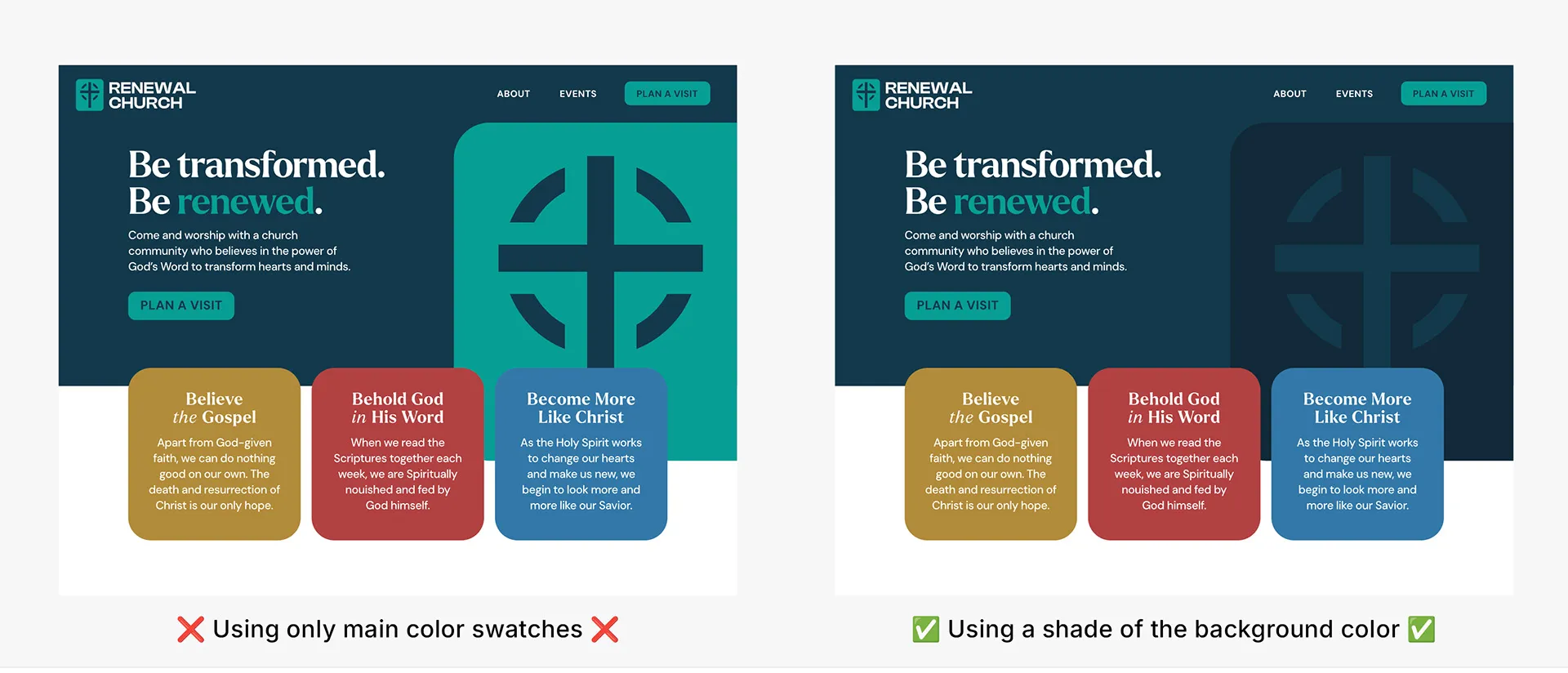
For example, a limited color palette might handicap your web designer. Because websites are interactive and display lots of information in different formats, they often call for a suite of neutral colors, ranging from dark to light.
You might also find that a particular color works well online and in print, but is too strong and vibrant for apparel. A tint or shade of that color might make for a more wearable and fashion-friendly t-shirt than the original swatch.
If your palette feels incomplete or you’re looking for good supporting colors, consider using tints or shades of your core colors to round it out.
P.S. This week I’m focusing on church brand color selection principles, which I’ve gathered the hard way from years of church rebrands. If you want the complete guide, I’ve collected all of the principles into a single post here.