Color Selection Principles: Distinguish Core Colors from Supporting Colors

Braden East
Carefully crafting color categories can catalyze cohesion.

Alliteration aside, the categories or buckets you sort your colors into will determine the overall look and feel of your church’s brand. If you try to use too many colors spread out across different channels, your visual identity can start to feel incoherent and disjointed.
Keeping the visual identity unified is why we normally pick 2 to 4 “core colors,” which are the duo, trio, or quartet that glue your whole brand together. Core colors can help focus the look of the brand and make it recognizable by a particular combination of colors alone.
This also means core colors must be used and guarded more carefully than other colors.
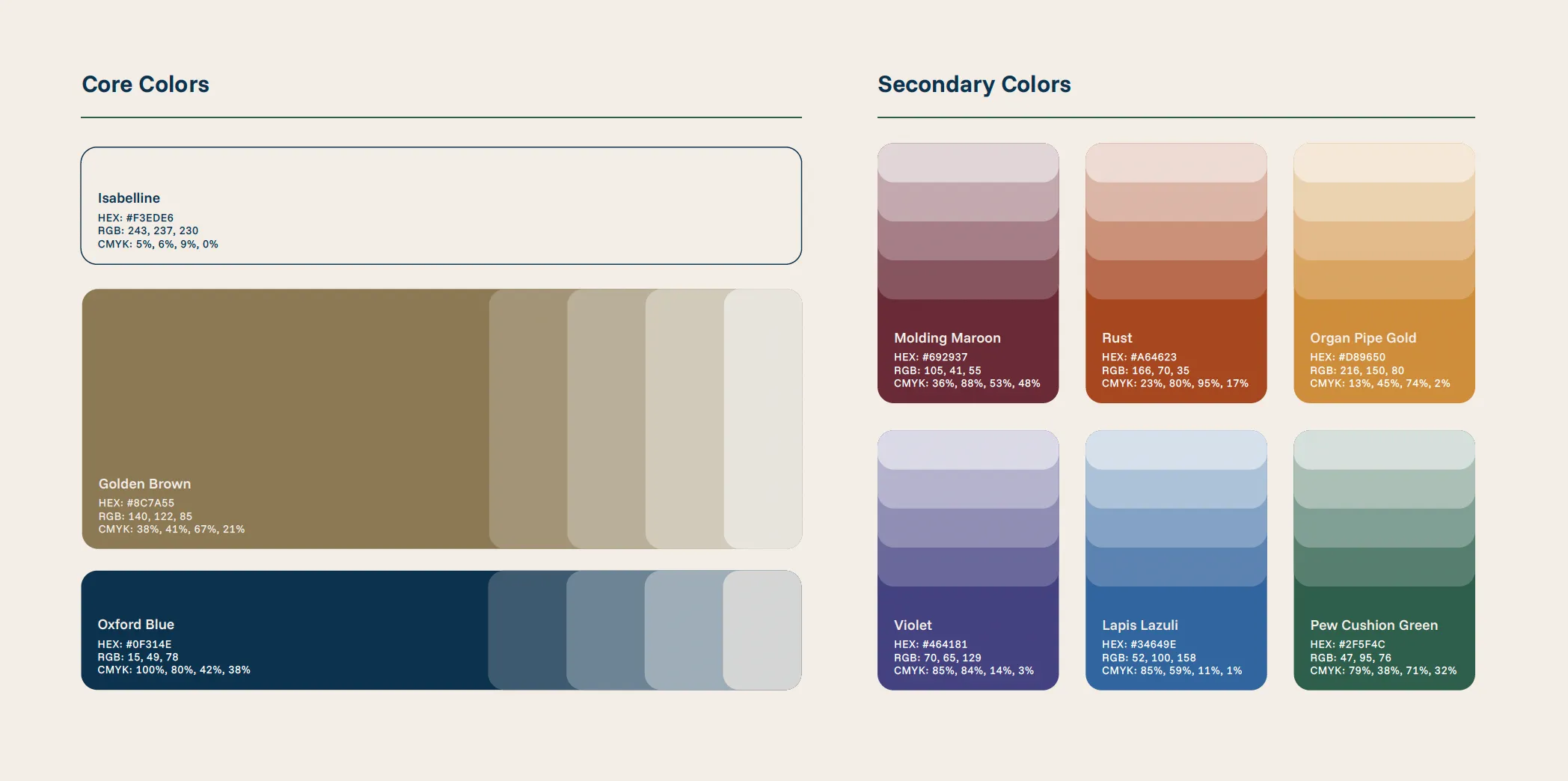
Supporting colors are generally taken from other parts of the color spectrum. We do this to add a certain level of variety and depth to the overall brand.
Having supporting colors sprinkled in throughout your brand helps prevent it from being strictly monochromatic, which can come across as flat or boring. Even if your core colors aren’t monochromatic, they can be easy to overuse, diluting their impact and handicapping their ability to grab attention.
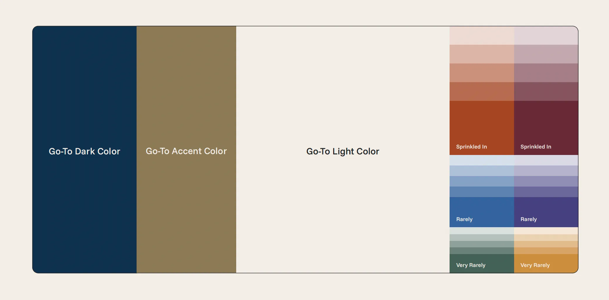
So, to sum up, distinguishing between core colors and supporting colors is all about proportions and ratios. Disproportionate use of even the perfect palette can send the wrong message, so prioritize which colors you want to stand out and maintain that balance.
P.S. This week I’m focusing on church brand color selection principles, which I’ve gathered the hard way from years of church rebrands. If you want the complete guide, I’ve collected all of the principles into a single post here.