Color Selection Principles: Look for Symbolism

Braden East
Just like with your church logo, you’ll want layers of meaning and depth behind your church color choices.
One way to accomplish this is through symbolism. Colors are symbolic because they can bring to mind a mix of material things and abstract ideas.
Here are a few examples… but before I share them with you, keep in mind that these colors are broad and have many different meanings associated with them.
The symbolism I’m focusing on here is related specifically to churches, and how a church might use these for their brand colors. Don’t start using them without doing your own research as well.
Okay, with that out of the way, here are some color symbolism examples:
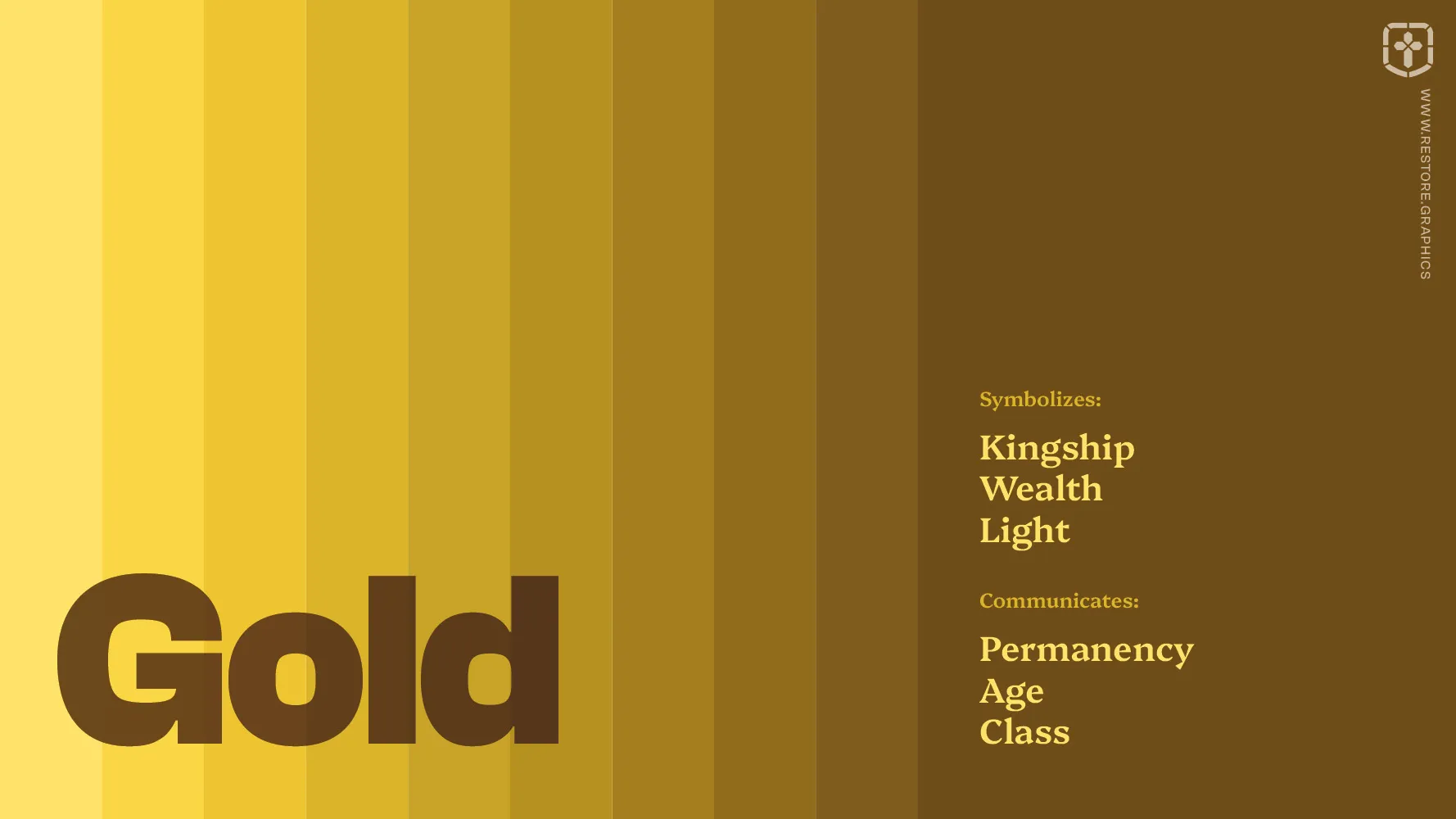
Gold can communicate permanency, age, and class. It symbolizes kingship, wealth, and light.
Orange can communicate energy, friendliness, and youthfulness. It symbolizes flowers, fire, and sunsets.

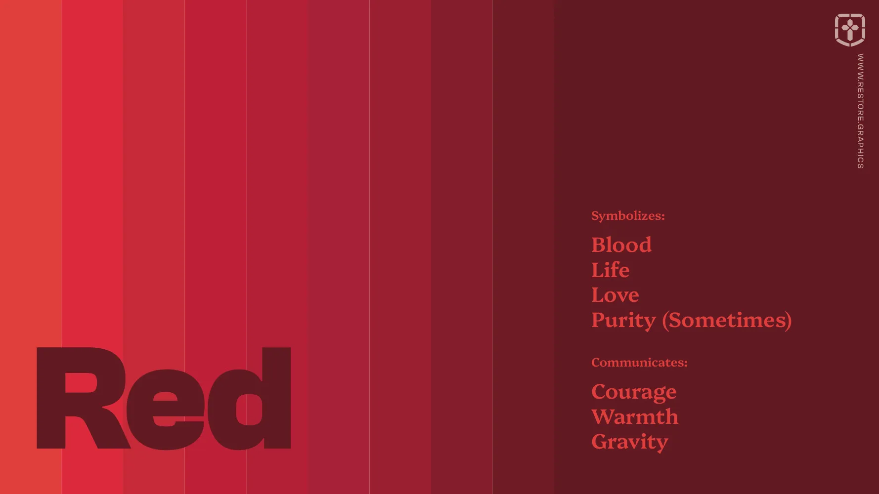
Red can communicate courage, warmth, and gravity. It symbolizes blood, life, love, and sometimes purity.
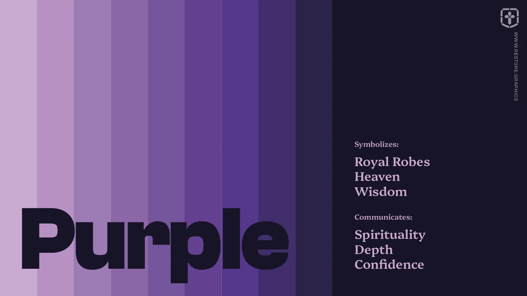
Purple can communicate spirituality, depth, and confidence. It symbolizes royal robes, heaven, and wisdom.
Teal can communicate balance, peace, and renewal. It symbolizes healing, water, and growth.

If you want to go deeper, here’s where you can read more on color symbolism and usage (from a secular source).
P.S. This week I’m focusing on church brand color selection principles, which I’ve gathered the hard way from years of church rebrands. If you want the complete guide, I’ve collected all of the principles into a single post here.