Color Selection Principles: Sample Everything

Braden East
Brand colors aren’t always black and white (wink), so this week I’m answering the following questions:
Those questions all have the same answer: timeless color selection principles. I’m giving you mine, which I’ve gathered the hard way from years of church rebrands. If you want the complete guide, I’ve collected all of these principles into a single post here.
In a vacuum, it’s easy for one person to pick colors that “look good.” But when the stakes are high and the colors have look good to more people in more contexts, suddenly things get trickier.
Sampling colors from the real world can be a great starting point for palettes that feel cohesive and familiar. Palettes taken from nature, architecture, and even human features translate surprisingly well to both digital and print.
Scottish tweed makers will go out into the countryside, capture a swatch of colors from their environment, and use those colors in their designs.
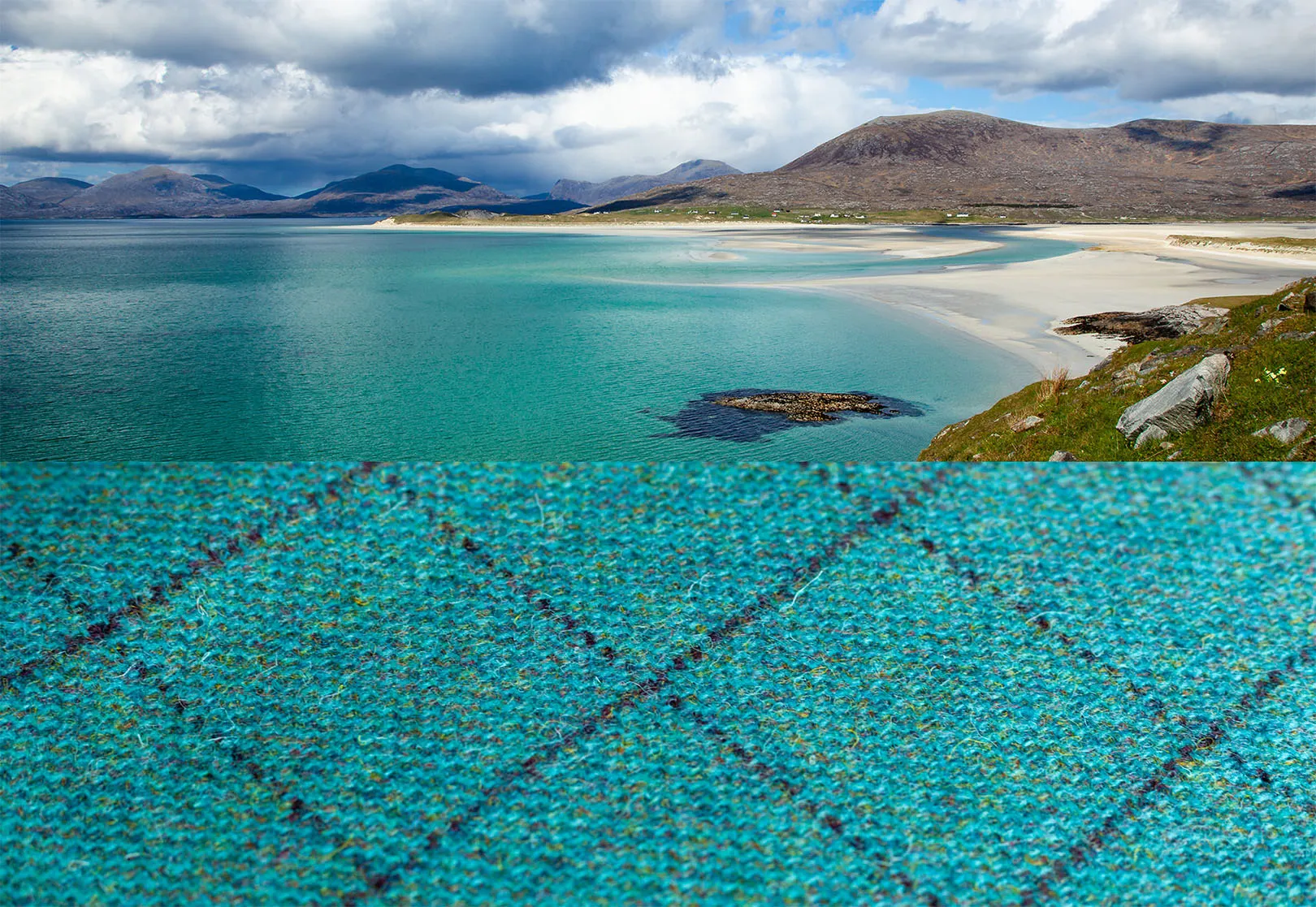
What’s stopping us from doing the same thing?
Find or take a photo of your church building, its surroundings, or something in your environment that fits the aesthetic you’re going for. Pull the image into a tool like Coolors.co and start sampling.
You’ll notice that the palettes you can create will have light colors in the highlights of the image, dark colors in the shadows, and mid tones which are more vibrant or less vibrant. You’ll want at least one of each.
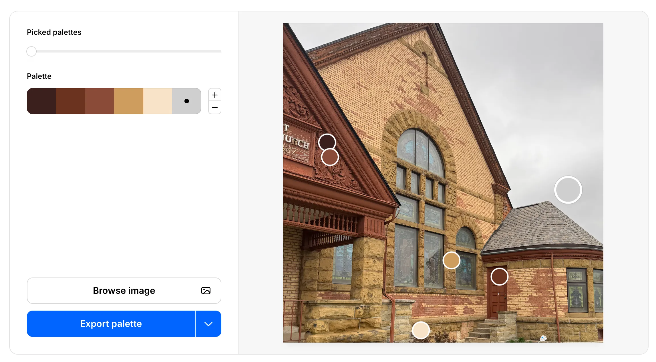
Then, when you’re feeling good about a particular palette, you can go beyond the screen to a Home Depot or Sherwin Williams paint store. Gather swatches close to the colors in your palette, and compare them in different real-life environments.
If you follow these steps for sampling, it’s hard to go wrong.