Copy this Church’s Brand Strategy and Thank Me Later

Braden East
I often talk about capturing your unique vision and church identity in a brand identity. However, when people hear “brand identity” they immediately jump to thinking about the logo.
Hackney Church of London is proof that a generic logo can work (and shine) when it’s part of a well-executed design system.
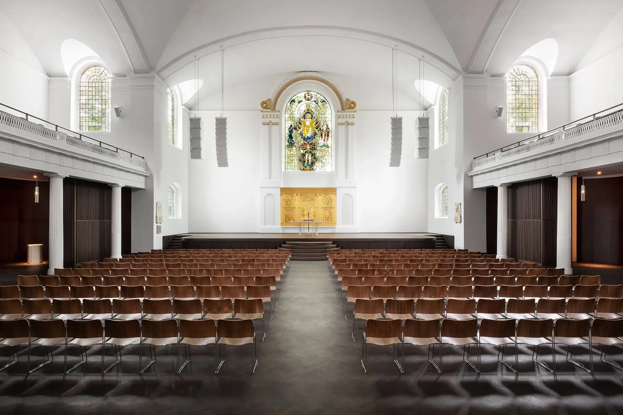
The church worked with London-based design firm OMSE, who was clearly capable of designing a much more nuanced and complex mark, so why did they do something so plain?
They explain in their case study notes:
We worked with Hackney Church to design a new identity that could flex across the breadth of their activities. From formal and often sobering occasions, to joyous celebrations.
Their choice of a minimalistic approach was strategic and intentional.
Maximum flexibility was the highest priority - not explanatory power.
If you take the time to review their rebrand case study, you’ll see how a logo doesn’t have to capture your entire vision, vibe, or identity. It just needs to be an entrance point.
In other words, the brand identity is the house, and the logo is just the cornerstone.
Here’s what Armin Vit, founder of the BrandNew blog had to say about Hackney Church’s new mark:
In a way, it’s almost an overly generic icon that could apply to dozens of churches around the world but not only is the execution flawless in this case it also goes hand and in hand with the overall personality and vibe of the church both in its physical presence and its range of activities.
What can we learn from this?
Your logo doesn’t have to be so perfectly unique that it’s entirely unmistakable. In fact, it’s quite easy to paint yourself into a corner with a rigid, inflexible brand identity (speaking from personal experiences).
Instead of relying on your logo alone to do the heavy lifting, copy OMSE’s approach with Hackney Church and focus on making your branding beautifully simple.