How Do I Avoid Getting Stuck in a Rebrand?

rebrand strategy pricing
Braden East

Earlier this year, I took my wife on our first ever off-roading excursion and we learned an important lesson.

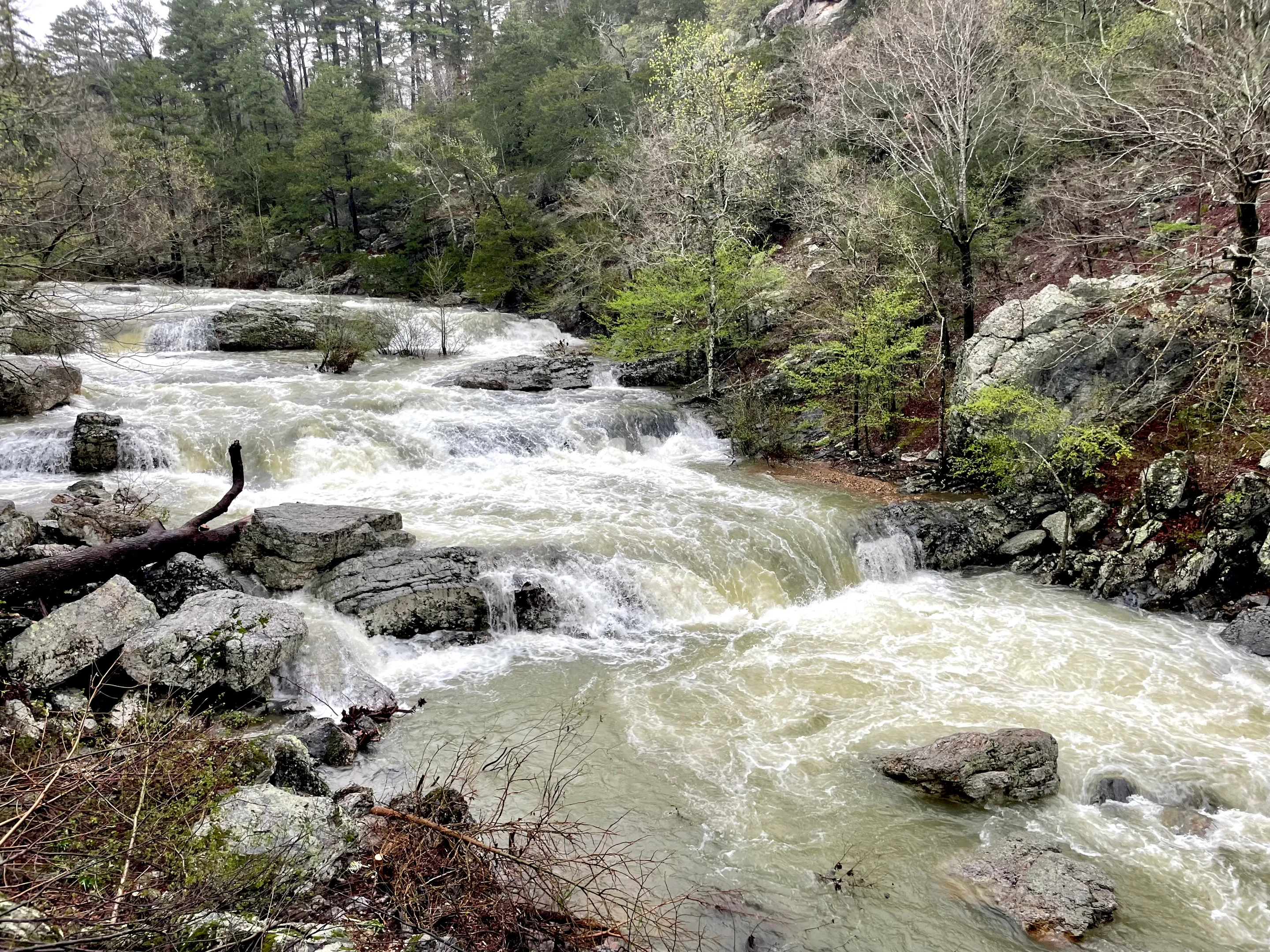
We rented a UTV side-by-side and hit the trails of Wolf Pen Gap in Arkansas. There had been above-average rainfall in the area, and it turned out that many trails were inaccessible due to high water crossings.

There was one place where we attempted to cross and almost got swept away.

Not only did we get into that dangerous situation, we spent hours taking wrong turns, finding dead ends, and squinting at our map. When we did finally find some exciting spots, we only had time to explore a couple of them before the rental was due back.

We came out of that experience alive (and with some good photos), but we learned this: A competent guide is worth the money.

If we had hired someone to show us around, we would’ve found those good trails earlier in the day, not gotten lost, and enjoyed our time more.

The thing is, unless you enjoy the adventure of discovering every dead end and perilous path for yourself, hiring an expert to guide you is going to save time, and keep you out of danger.

P.S. With a rebrand, you’re not just trying to find a fun spot for recreation - you’re trying to get from point A to point B - which makes pro guidance even more critical.


Related to “rebrand”
Why the Cracker Barrel Rebrand FAILED Miserably (It’s not what you think)
Published on:
Cracker Barrel’s catastrophic rebrand would have been hard to miss because of the public outrage and backlash it got (of course I picked the exactly WRONG time to take a break from writing this newsletter). But the reason their new logo caught so much viral hate has a direct application to church branding, so humor me while we explore it for a moment. Here’s my hot take: The new logo perfectly captured Cracker Barrel’s identity. Before you cancel me in the comments, let me convince you why this is the case. Think back to 6 months ago. If you had asked a thousand people what they thought about the Cracker Barrel logo, what response would you have gotten? Probably something along the lines of, “I mean… it’s fine I guess. Never really thought about it.” Most people would have been apathetic or ambivalent at best. Maybe a few design-conscious souls would have said “eh, there’s probably some room for improvement.” So, why did this particular rebrand trigger so much nationwide, seething outrage? Some news outlets blamed “conservatives who don’t like change” and others said it was about the people rebelling against modern minimalism and oversimplification. But consider an alternate timeline: Cracker Barrel hires design firm to help them update their existing brand Design firm looks at Cracker Barrel’s history, core customer base, and the values they were built on Design firm comes up with a cleaner and more modern take on the logo, keeping the country charm and home-grown heritage that it represents Cracker Barrel slowly rolls out the new brand, leading with context around the need to update and their unchanged values/identity In this scenario, I’d be surprised if anyone bats an eye. Maybe they notice that the billboards are easier to read, or that the menu design feels a bit more vibrant and fresh than it used to. No headlines! No mockery! Nothing! But here’s the thing: it wasn’t a new logo that upset people. Cracker Barrel’s customers felt betrayed by what the new logo represented. The new branding signaled a fundamental change in the identity of Cracker Barrel, from a quirky, homey spot for comfort food and checkers to a corporate sellout chain with politically correct messaging and token vegan options. In my opinion, the new (now cancelled) logo did TOO GOOD of a job representing what Cracker Barrel had become — a woke corporation like everyone else. This visual accuracy ended up being the downfall of the rebrand, to the detriment of the company’s stock prices and consumer confidence. Here’s the takeaway: Your church logo isn’t your brand. Your brand is the story, meaning, and gut feelings that people associate with you. Build your brand on the three pillars of a church brand: Christ, Congregation, and Community.
Refresh vs Rebrand, Which is Right for Your Church?
Published on:
“All our digital and print stuff looks inconsistent, but I don’t know where to start fixing it.” “Our logo is good, but the rest of our branding is a mess!” Sound familiar? I’ve had more and more churches lately tell me this story. If that’s you, then the odds are you don’t need a full rebrand. Normally, I see rebrands working for churches who are in a pivotal moment - one that’s going to shape the identity of their congregation for a long time. Think about your church brand like a house. When you go for a full rebrand, it’s like you’re tearing that house down to the foundation and starting over from scratch. Sometimes this is the right call, especially when there are serious structural problems or the house doesn’t serve your needs. You’re changing a big part of the structure and framing out something new. Conversely, brand refreshes are for those who have a solid foundation and structure, but need a renovation. This is the chance for a church to fix leaks, re-do the kitchen, and get a new paint job. Sometimes all brand refresh calls for is just a set of brand guidelines with a few Canva templates. Other times it’s an intentional tweaking of the logo, and a redesign of everything else. The main idea behind the refresh is bringing that rogue branding into alignment. When you consider a refresh vs a rebrand, ask yourself, do we need a rebuild, or just a minor renovation?
Don’t Update Your Signs Until You Do This
Published on:
If you’re looking at getting new signs or updating your building, don’t miss this opportunity to update your branding as well! It’s one thing for a sign to look nice and be functional, but branding and design has the power to do much more than just help people find the nursery. Every bulletin, banner, and coffee cup is an opportunity to shape the culture of your church through intentional, vision-aligned branding that stands the test of time. If that’s your ultimate goal, then updating your signs without rebranding first would be a massive waste of time and money! Schedule a time to talk and I’ll walk you through what a brand refresh could look like, so you don’t have to re-do your signs AGAIN in a couple of years.
Breathing New Life into a Church Brand: The Story of First Baptist Aurora
Published on:
Let’s talk about First Baptist Aurora. This was a church that once thrived but found itself dwindling in numbers and energy. That is, until Pastor Robert stepped in with a vision to create a community where high school dropouts and doctors, recovering addicts and homeschool moms, could all worship side by side. He wanted people to feel like they truly belonged. The church started to grow again, but there was a problem: their visual identity didn’t match the new life happening inside the walls. So, I partnered up to help them rebrand. Two words shaped our entire process: historic and urban. We pulled colors from the church’s own brick, molding, and stained glass to create a palette that felt timeless yet fresh. The church’s beautiful stained glass windows inspired a modern logo and sparked a key design element: the arch. We used arches everywhere, from logos and icons to social media graphics, creating a look that felt unified and deeply tied to the building’s architecture and story. The result? A brand that bridges the old and the new. Today, First Baptist Aurora has not just a growing congregation but a clear sense of identity. Visitors connect more quickly, and the leadership has tools to keep building momentum. Here's the takeaway for pastors: A good rebrand isn’t just about looking pretty! It’s about helping people see what God is doing in your ministry are and inviting them to be a part of it. P.S. You can see the full case study here, including our in-depth process and more images/video.
Related to “strategy”
The 3 C’s of Church Branding: Christ
Published on:
God’s narrative of redemption told through history has a clear central point: Christ. Throughout scripture we have hundreds of stories, genealogies, songs, and laws that seemingly have nothing to do with the man, Jesus of Nazareth. Still, we know that each one ultimately points to him. Lest someone accuse us of imagining layers of meaning that aren’t there, the Bible itself calls Christ the cornerstone of God’s redemptive plans for his people. So then you are no longer strangers and aliens, but you are fellow citizens with the saints and members of the household of God, built on the foundation of the apostles and prophets, Christ Jesus himself being the cornerstone, in whom the whole structure, being joined together, grows into a holy temple in the Lord. In him you also are being built together into a dwelling place for God by the Spirit. — Ephesians 2:19-22 Christ is the cornerstone of the church. So how does this relate to church branding? Just like the ultimate and universally profound story God is telling in history, he is telling a nested story in your local congregation. Our job with branding and communications is to shine a light on how that micro-story plays a part in God’s macro-story. Making Christ the cornerstone of your communications means finding a memorable, own-able way to highlight God’s local work in your congregation to his global plans and purposes. Done right, every syllable and visual in your brand points back to the cross of Christ and the good news of the gospel. This means everything from your website headline to your logo should tell the same story, grounding your church in God’s archetypal story of redemption through Jesus. That’s why the first (and most critical) “C” of a kingdom-first brand is Christ.
Why I Stopped Doing Logos (and Started Doing Something Better)
Published on:
In 2021, my wife and I moved back to our home town of Bartlesville, Oklahoma and joined the church we now call home - Hope Presbyterian Church. The church had hired a Ukrainian designer on Fiverr and got a fantastic logo design (it even won an award). But there was a problem… All they had was that logo. Their whole “brand” was limited to a gold color and a couple of webp’s. While the logo was aesthetically pleasing, it wasn’t enough to help their people “get” the mission. Each billboard, banner, and invitation card was inconsistent and time-consuming, even for the creative associate pastor. The more they tried to make their branding work in the real world, the more things got messy and out of alignment. Members with design experience were called on over and over again to come in and help “fix” designs, which always ended up being a band-aid for the real issue. What my home church went through is the result of a logo design without a true brand. They needed an easy-to-use branding toolkit with theological depth - one that would represent more than just the name of their church. A kingdom-first brand would have given their congregation ownership of the vision their leaders were casting, and would have attracted more visitors who resonated with the message they preached. And that’s why I stopped designing logos, and started developing kingdom-first brands instead.
Only Churches Struggle With This: The Dual Audience Dilemma
Published on:
As I’ve continued to go deeper into the branding and design industry, I’ve encountered something that is probably not just a hang-up for me, but for a lot of pastors and churches. If you do any research on marketing and branding, you’ll very quickly find lots of resources that are very focused on businesses. For example: “Speak to your ideal customer.” “Drive revenue with these marketing tips” “Create a story that makes customers keep coming back” The customer-centric, profit-driven approach can absolutely work for businesses, but for me, I’ve never felt like it applied well to the church. On one hand, you’re leading a congregation of believers who need to feel united around your vision. They need clarity, language, and visual cues that reinforce who you are as a church and where you’re going. When done well, branding can give your people something to rally around—a shared identity that goes deeper than a logo and helps every member see their role in the mission. But unlike a business, you’re not just trying to “sell” something to a customer. You’re also extending an open invitation to your community. These people are skeptics, seekers, and those who may not understand what your church is really about. For them, branding becomes a bridge. It’s the first impression that points them to Jesus Christ and communicates: This is a place for you. It signals your heart, your values, and the kind of welcome they can expect before they ever set foot inside. Where most churches struggle is trying to speak to both groups at the same time without a clear strategy. The result is confusion, inconsistency, and branding that unintentionally speaks more to insiders than outsiders… or vice versa. The approach I’ve developed in response to this problem is to make Christ the cornerstone of your brand. This seems obvious, but it’s truly countercultural when you compare it to how most agencies and designers work. I believe that a kingdom-first, vision-driven brand matters. It helps you communicate so your congregation is aligned and your community is invited, without compromise on either front.
The Framework I Used to Help a Real Church Fix Their Branding
Published on:
A pastor scheduled a call with me last month to talk about a new congregation his church is planting next year. I can’t tell you the name right now, but it was a church who was running over 500 and was starting to struggle with shaping the culture and collective mission of that many people. If they didn’t get their branding and a visual identity in place before the plant, rebranding would have just gotten more expensive and difficult. They didn’t want to miss the opportunity but they lacked the confidence to rebrand with their internal team alone. Where do you start? To even begin a branding project, we needed to figure out the problem they were trying to solve. Did this church need to… REFRESH their existing brand? REPOSITION their identity under a new vision? or REACH OUT with their message? The church had just undergone a name church that was being announced later in the year. Their leaders were trying to cast a vision that was outward-focused and kingdom-minded. At first, this made me think it was a REACH OUT case, but the more I dug in, the more I realized what they actually needed was to REPOSITION. Why? Well, let’s look at their goals. The outward focus was a culture they wanted to create in their church body. While they ultimately wanted to reach out with their message (all churches should), they couldn’t do that effectively until they first grounded their church in a collective vision that included more than just their immediate membership. Their brand didn’t reflect the long term vision for the church, and it needed to visually align before both congregations could shift their focus to their region and community. Hopefully you can see how the REPOSITION approach was needed for this case. Instead of jumping in trying to scale up misaligned branding, we needed to build on their values and rework the brand identity from the ground up.
Related to “pricing”
Are Nice Church T-Shirts Worth It?
Published on:
T-Shirts are something everyone wears and can be a very effective form of marketing. It makes sense that tees are the first thing many churches think of when they do an outreach push. But there’s something many pastors forget: most people are very selective about their wardrobe. Just because you give someone a shirt doesn’t mean they’re going to wear it. Just because they wear it once, doesn’t mean it will become a part of their regular rotation. There are three critical aspects of apparel that have to be dialed in for someone to wear it a second time. Fit Color Material You can’t just get one or even two of these right but make compromises on the others. It’s like multiplication. 5x5x0 is still 0. But, if you take the time and spend the extra money up front on nice material, exact color, and a good fit, you will be paid back exponentially. One shirt worn regularly could be seen by tens of thousands of people over the course of a year. But… a hundred shirts in garages or on a goodwill rack are totally useless in branding. Long story short: Don’t take the cheaper route to save a couple bucks per shirt. The quality difference between a $9 tee and a $12 tee is massive. One gets worn once and then donated or turned into a garage rag. The other becomes an asset that continues to preach your message for you over months and years.
Why It’s Insane to Rebrand with Limited Design Revisions
Published on:
Raise your hand if you’ve seen a designer offer their services like this: “$1,000 for 3 concepts and 2 revisions.” That seems reasonable enough - surely you can get something great out of 3 concepts and 2 revisions, right? Well, maybe. In the end it all comes down to the project’s risk tolerance. This can be a great fit you’re needing is a set of sermon series graphics or a tee shirt design, but what if the project is bigger, like a new logo or even a full rebranding? Now’s the time to evaluate your risk tolerance. Here’s the question you should be asking: How long do we plan to keep this logo? If the answer is just for a few years, then it doesn’t matter too much if the logo’s not quite a perfect fit. With a short-term, “band-aid” logo, missing the mark slightly is okay, because you get to take another shot later. However… If you’re wanting a timeless logo that will capture your vision and last for decades, then limited revisions is the wrong model to use. Removing the pressure of "this is our last round - we have to say yes," gives a church the freedom to think more objectively about what is going to best serve their congregation for the long haul. Without that freedom, you're probably going to end up over-time and over-budget. And the problem probably isn't the designer or you, it's the process you agreed to follow. This is why I price all my projects with unlimited revisions built in. I'd be delusional if I did this solely on the basis of my skills. I'm confident in my skills - don't get me wrong - but I'm WAY MORE confident in the process. My church rebrand process has been shaped by a decade of design experience and the unique projects I've worked on for churches all over North America.
Does Your Visual Identity Suit You?
Published on:
If you have a good sense of fashion or a job that requires professional attire, you may have at one point gotten a custom-fitted suit. I’ve done this myself, and it felt great to have a jacket and pants that had been tweaked to fit my measurements. But the next level up is something I’ve never done, and that’s getting a custom-tailored suit made from scratch, with full customization of every detail. Unless you’re lucky and have a very specific body-type and build, you probably won’t find an existing garment that fits you as well as a bespoke suit would. I had a friend who got this done right after college, and I remember thinking, “Boy, I buy my shirts at TJ-Maxx, but he’s a real adult.” Here’s the application: Getting a custom-tailored suit signals personal maturity. In a similar way, getting a custom-tailored visual identity signals organizational maturity. For a visual identity to be custom-tailored means each part is carefully crafted to fit your organization. The logo is designed to represent your vision. The wordmark is tweaked and hand-picked to evoke a particular feeling. The colors are harmonized to stand out in your local context. Getting a bespoke visual identity signals organizational maturity. Bonus: If you have a custom-tailored suit with a very specific look, you probably don’t have to worry about theft - It won’t fit just anyone who tries it on.
How to Hire a Designer Objectively
Published on:
Finding a designer to hire for a project comes with unexpected and paradoxical challenges. Unless you have a personal connection to a someone specific, you’re judging your options based on a stranger’s published work. Paradoxically, you’re forced to make aesthetic judgments of their style and fit before you actually hire them to help with your aesthetics. The best designer might not be the one whose style resonates with you the most. The counterintuitive truth is, the best designer might not be the one whose style resonates with you the most. Okay, so how can you evaluate a designer more effectively? Here are a few ways off the top of my head: Success stories on similar projects Clearly defined process Familiarity with your needs Pricing The thing is, if you’re trying to just make something you like, the subjective approach works just fine. If you’re trying to make something that will solve a problem or communicate an idea to more people, objectivity is critical.
← Back to all posts
Almost there!

Enter your email below to get the weekly Tend Your Brand digest.