How to Avoid Brand Fatigue (1)

repetition over-branding touchpoints logo
Braden East

After finishing a rebrand project, I used to caution clients against using their new logo on everything, warning them about the dangers of "brand fatigue."

I've changed my perspective on this now.

It feels counterintuitive, but your brand should be 99% repetition and 1% novelty.

As a ministry leader, you'll get tired of hearing your core values long before your audience even remembers one of them. You'll be dreaming in only your brand colors before anyone even notices that there's an intentional palette.

In fact, there was a study done to see how well regular people could recall major brand logos from memory. The results were pretty shocking.
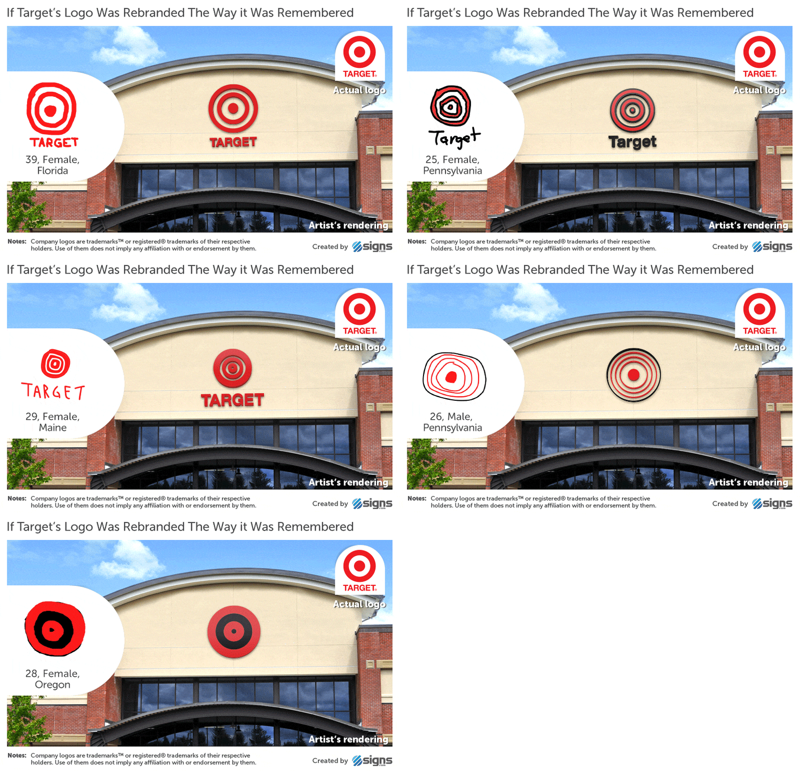
If regular people struggled to remember the TARGET logo, then your church probably doesn't have to worry about "over-branding."

That said, there's a simple principle that can help you give your church more brand "touchpoints" without going overboard and getting on anyone's nerves. I’ll talk about that in the next one.

See you there!


Related to “repetition”
How Critical is Color in Church Branding?
Published on:
Let me cut to the chase. Color is absolutely, non-negotiable critical. I wouldn’t be going out on a limb to say that color is even more important than the logo. But… which colors you choose for your church is only part of the equation. How frequently and consistently you use a color palette is what makes or breaks the brand-color association. Effective branding through color is 50% selection and 50% repetition. In other words, your color choices for your brand only matters to the extent that you use it repeatedly and consistently over time. You can organize a committee. You can get swatches from Sherwin Williams. You can look at what’s trending. You can browse Pinterest. You can research color symbolism. You can have your congregation vote. None of it matters if you don’t use your colors (or use them sporadically without patterns). This should be freeing! While selection is important, the knowledge that repetition matters more should take some of the pressure off. Picking “wrong” or “suboptimal” colors isn’t the end of the world. Just commit and use them consistently.
Do You Need “On Brand” Sermon Series Graphics?
Published on:
If you’re a church that does sermon series graphics, then you might have struggled with how far to push the envelope in those visuals. Do you download the latest free template from Free Church Media or Ministry Designs dot com? Do you design them in-house? For us creatives, it’s enticing to explore and use new visuals every few months. But I want to encourage you to curb that impulse. Here’s why: Those unbranded templates and graphics can ultimately work against your brand. But wait, they’re not permanent - what’s so bad about them? Over time, these graphics become part of your brand, whether you like it or not. Using templates that are fun, fresh, and modern might feel like a good way to keep things interesting, but over time that variety adds up into noise. Over time, too much variety accumulates into noise. Instead of your sermon graphics reinforcing your brand, they can start to pollute it. They start to appear disjointed and random when you sample them as a whole. To protect your brand, you need a common thread woven throughout. This is why brand guidelines are so important. They provide a fixed scope for visual styles. Robust brand guidelines will tell you not only what that common thread is, but how it should be integrated in different contexts. If you’re worried about your sermon graphics polluting your brand rather than reinforcing it, check your brand guidelines to see if there’s a way to bring that free template into alignment. If you don’t have brand guidelines, consider having some created. It’s a great way to get the most out of your existing logo and can help you add variety to your church’s communications, without feeling random.
Keep Your Church Brand from Being Memory-Holed
Published on:
In the age of the internet and now of ChatGPT, our memory muscles are getting weaker and weaker. I’ve felt the effects, and I’m sure you have too. Wade Stotts had a recent episode of the Wade Show with Wade where he highlighted how short and shallow our memories really are these days. Why does that matter for effective branding? Your audience has the memory of a goldfish. If your branding consists of disjointed visuals or too much information, it’s not going to stick. And if you haven’t thought through templates, words, and images that are going to help you repeat that message, your brand message will slide into one ear and out the other (My dad said that happens because there’s nothing in between to stop it). It’s an important reminder that I’ve preached and will continue to preach: Repetition is persuasion. You cannot repeat your messaging enough. You cannot integrate your branding into enough of your church’s life. It also got me thinking: How have I handicapped my own memory for creative and branding work? How could I fix it? Those are questions I’m going to be answering this year.
Celebrating 8 Years of White Sneakers
Published on:
For the last 8 years, my go-to work, church, and lifting shoes have been some variation of white Adidas sneakers. I replace them once a year because I have to: I take close to a million steps a year in those shoes. I didn’t do this intentionally, but those white Adidas have become core to the Braden East “brand.” Whether I chose it or not was irrelevant, white sneakers are now a part of how many people recognize me. Here’s the lesson I learned from this: Anything you say or do repeatedly will eventually become part of your brand. Once you understand this, you get to influence what your brand looks like, by choosing a message, choosing how you want to say it, and repeating it over time. Do anything consistently for 8 years, and I promise it will become part of your brand.
Related to “over-branding”
How to Avoid Brand Fatigue (2)
Published on:
Last time we looked at how most churches and ministries are probably not over-branding. People are forgetful and have lots of other things going on. To cultivate a brand that bears fruit, we have to cut through the noise repeatedly, with clarity and consistency. But how do we repeat ourselves without being annoying? The last thing you want to do is give people a negative feeling when they interact with your communications. The key to this is to say the same thing in different ways, over time. If your church has a tagline, or a "thread" like Mark MacDonald outlines in his book Be Known for Something, then you have your message - what to say. Now the trick is to repeat that message in different ways and in different places. Let’s say your tagline is “Alive To Christ.” First, you can put this tagline on your social media banner, website, and logo placeholder slide. These are semi-permanent places where new visitors and members will be introduced to that phrase. One Sunday a month, take 60 seconds of announcement time to explain what it means to be “Alive to Christ” and connect it to a ministry opportunity your church has in the upcoming month. If you livestream your worship services, you can even turn that clip into a social media post or a short reflection for community groups. Next you could design “A2C” mugs or a t-shirt that says “Dead to Sin” on the front and “Alive to Christ” on the back. These are just a few examples, but I think you get the idea. There a million different ways to say the same thing. Do you have a tagline or thread at your church? Reply here and let me know what yours is :)
Related to “touchpoints”
Does Your Church Need A Welcome Brochure? The Hard Truth
Published on:
A welcome brochure is one of the things I often find myself helping churches design, despite the fact that I never suggest or recommend it. Why don’t I encourage churches to create these? Well, because to be honest I don’t pick them up myself. If I see a stack of flyers sitting on a table when I walk in your church door for the first time, am I going to grab one? Probably not, no matter how good the design is. I’m looking for a familiar face to connect with, not a colorful piece of paper. If I want to know where to find you on Facebook I’m going to Google search it. If I’m needing to read about your beliefs, I’ll find them on your website. However… I’m a millennial. For older folks who aren’t addicted to their phones and dependent on ChatGPT/Google, a well-designed welcome brochure is often the perfect way to communicate key info and help them get familiar with your church. So it’s worth it to have a welcome brochure in some cases. The important thing to ask yourself is this: Who are you trying to reach? Is your community one that will actually engage with flyers and brochures? If not, then your efforts and money are probably better spent elsewhere.
Don’t Update Your Signs Until You Do This
Published on:
If you’re looking at getting new signs or updating your building, don’t miss this opportunity to update your branding as well! It’s one thing for a sign to look nice and be functional, but branding and design has the power to do much more than just help people find the nursery. Every bulletin, banner, and coffee cup is an opportunity to shape the culture of your church through intentional, vision-aligned branding that stands the test of time. If that’s your ultimate goal, then updating your signs without rebranding first would be a massive waste of time and money! Schedule a time to talk and I’ll walk you through what a brand refresh could look like, so you don’t have to re-do your signs AGAIN in a couple of years.
Church Way-Finding Signs: Using Typography
Published on:
For way-finding signage, there are three critical things to get right with typography: Size, Style, and Grouping. To figure out how big the font size should be on your signs, think about the furthest possible viewing distance for that sign. Will visitors be seeing it up close every time, or is it at the end of a hallway? A general rule of thumb is that the main headings on the sign should be legible from 40ft away for someone with good eyesight. This applies mostly to directional signage, and isn’t necessary for things like room labels. Now on to font style. Legibility is absolutely critical for way-finding, so you want to choose a brand-aligned font that is easy to read. For the thickness or weight of the text, lean bolder rather than lighter. In this example, we’re using Larken, the main brand typeface, for the headings. The secondary typeface, Plus Jakarta Sans, was better suited for the other information and is more legible at small sizes. Finally, consider the grouping of information and arrows in your layout. You want to make sure that you have grouped relevant information together in a way that will quickly make sense to someone who is late for Sunday School!
Church Way-Finding Signs: Choosing Color
Published on:
Let's say your brand’s hero color was a bright red. Your wayfinding signs should be red to be on-brand, right? Not so fast! Would you put a bright red couch in your living room? What about multiple bright red paintings throughout your home? Again, probably not. For environmental signage and way-finding, we have to think more like interior designers and accessibility experts than graphic designers. Earlier in the rebrand process, we had developed a brand color palette for this particular church with a dark charcoal color we called “Forge Black.” Using this darker, more neutral color as the main background was a good choice for three reasons: It wouldn’t clash with the paint, flooring, and other interior colors of the building. It wouldn’t show dirt as easily as a lighter color. It would allow for the most legibility and contrast for the text. As you can see, we did bring in the red hero color, but only in a very intentional, minimalist way. Even the logo on the signs was intentionally subdued and understated to make room for more important information, like “¿donde esta el baño?”
Related to “logo”
Why I Stopped Doing Logos (and Started Doing Something Better)
Published on:
In 2021, my wife and I moved back to our home town of Bartlesville, Oklahoma and joined the church we now call home - Hope Presbyterian Church. The church had hired a Ukrainian designer on Fiverr and got a fantastic logo design (it even won an award). But there was a problem… All they had was that logo. Their whole “brand” was limited to a gold color and a couple of webp’s. While the logo was aesthetically pleasing, it wasn’t enough to help their people “get” the mission. Each billboard, banner, and invitation card was inconsistent and time-consuming, even for the creative associate pastor. The more they tried to make their branding work in the real world, the more things got messy and out of alignment. Members with design experience were called on over and over again to come in and help “fix” designs, which always ended up being a band-aid for the real issue. What my home church went through is the result of a logo design without a true brand. They needed an easy-to-use branding toolkit with theological depth - one that would represent more than just the name of their church. A kingdom-first brand would have given their congregation ownership of the vision their leaders were casting, and would have attracted more visitors who resonated with the message they preached. And that’s why I stopped designing logos, and started developing kingdom-first brands instead.
Why God Gave Us Visual Aids (Joshua 4)
Published on:
It’s no secret that people remember images better than words. Studies show we can remember 65% of visual information after 3 days, compared to just 10% of written/spoken info. That’s a 6x increase in retention! But why does it matter for churches? Good question. Something I’ve learned is that a brand isn’t just a logo, colors, or fonts. A church brand is an opportunity to tell the story of what God has done and is doing in that local ministry. Said another way: your brand is the visual aid for people to easily remember what their church stands for, and the story God is telling there. This ties in closely to the examples we have in the Bible of when the Lord commanded that a monument be built to signify his mercy and might. In Joshua 4:1–10, God tells the Israelites to take twelve stones from the Jordan River and set them up as a memorial. This visual monument served as a lasting symbol to help future generations remember how the Lord miraculously stopped the river’s flow, allowing His people to cross on dry ground. These stones were set up intentionally as a tangible visual aid to reinforce the Israelites’ generational memory and faith. To add even more layers, God also instructs that twelve stones be used. Why twelve? To symbolize the twelve tribes who crossed over the Jordan that day. In the same way, designing an intentional brand identity with symbolism and permanence is the most powerful way to help your people remember their God-given identity as a body and look to Christ, week in and week out.
How Much Branding Does a Church Actually Need?
Published on:
Your logo isn’t a brand, nor is the name of your church a brand. Your color palette, word mark, fonts, and church website aren’t your brand either. These things only serve to ASSOCIATE your church with the big idea that is your message. Make this association enough times with enough people, and NOW you have a brand. Think about it like this: Branding is the vehicle for your message. It’s the wrapper! The packaging won’t change the chemical make up of the burger, but it can still make the burger taste better, and turn a meal into an experience worth sharing. So, to answer the question how much branding does a church need, the answer is none. None? Right. If you don’t have that big idea clarified and nailed down, you can design the most beautiful identity system and logo in the world and not have a brand.
The Most Important Part of a Church Logo That Everyone Gets Wrong
Published on:
For those of us with book collections, there’s just something about a well designed book cover. I’m talking kind that makes you do the chefs kiss every time you see it. Maybe one even comes to mind for you. I continue to find new books with beautiful cover designs, but there was one recently that confused me until the third or fourth time I picked it up to read. The book is called Designing Brand Identity, 6th edition by Alina Wheeler and Rob Meyerson. When I first saw the cover, I didn’t give it a second thought…. After all, I had bought the book for what was inside. It wasn’t until I saw it again from far away that I realized what the design was supposed to be: a number “6” for 6th edition. It was staring me in the face! I had the epiphany when my folks happened to be over at our house, so I showed my dad the hidden number in the design. His observation was, “That seems like bad design, shouldn’t they have made it more obvious?” It’s a good question: would the design have been better if it hadn’t been so subtle? Here’s my take: For most books, the cover only has two key pieces of information it needs to convey: the title and the author. The edition is usually a secondary or tertiary piece of info, if it’s included on the cover at all. There’s another more important function of the book cover, however. That function is to be distinct and enticing. If a book cover immediately identifies a book as different from all the other books on a shelf, it has done most of its job. This bright yellow book cover with swirling shapes did that. Here’s the application to branding: The purpose of your church logo isn’t to explain who your church is. In fact, it only matters a little if it has your church name at all. The most important thing in a logo is that it identifies you as distinct from others. If it doesn’t do that, you might as well not have a logo at all.
← Back to all posts
Almost there!

Enter your email below to get the weekly Tend Your Brand digest.