The Barely-Branded Church That's Crushing It In Their Community

inspiration symbolism
Braden East

I recently came across a church in Arizona called Ironwood. I’m absolutely enamored with the elegant simplicity of their brand, so I thought I would share it here as inspiration.

The website homepage of Ironwood Church

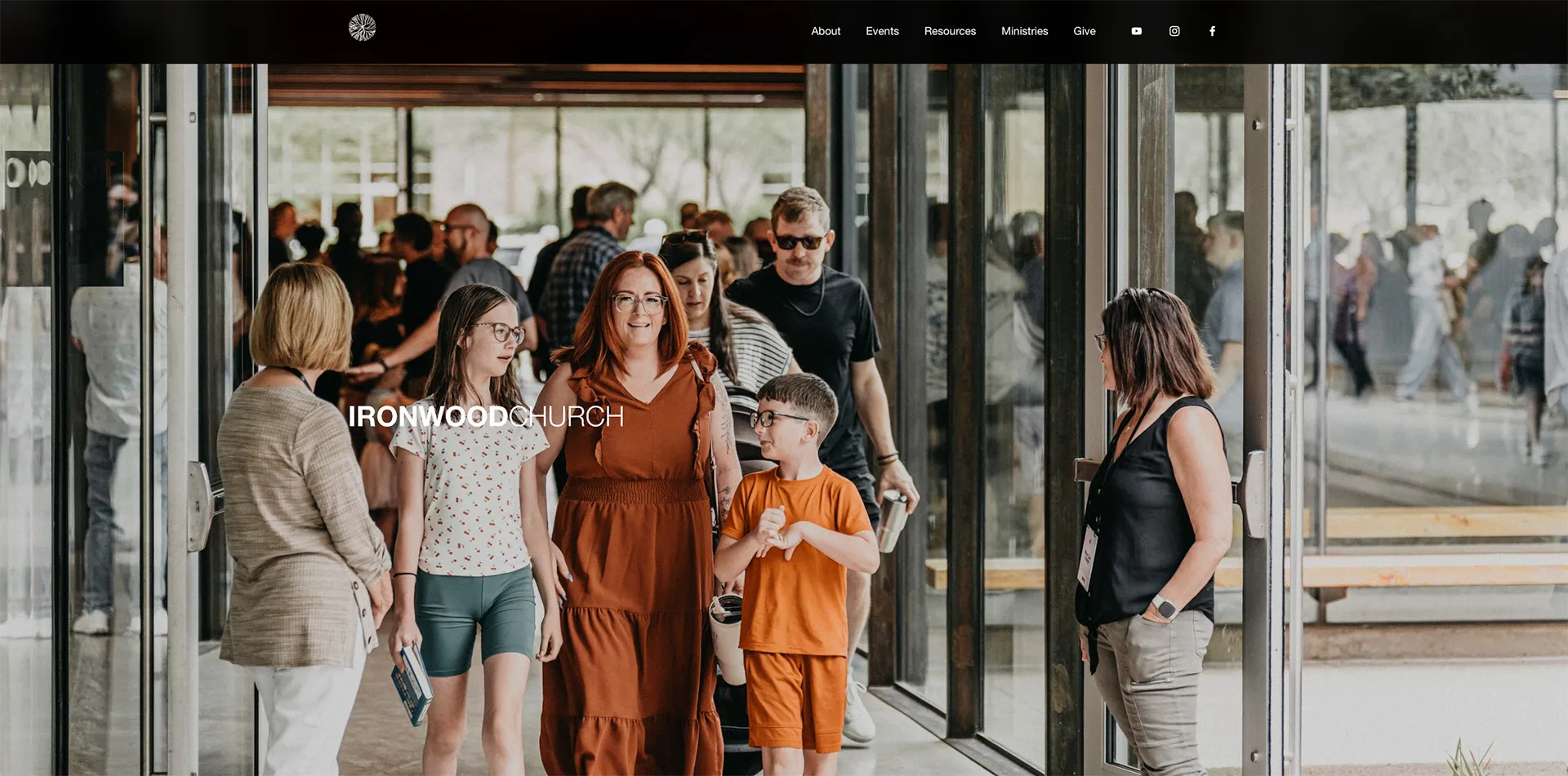
The idenity of this church is centered around the idea that Jesus called his followers to have a soft heart and a steel spine - a rewording of the command to “be full of grace and truth” (John 1:14).

How cool is that?

In their branding and church culture, they committed to have tender hearts, overflowing with love, genuinely interested in people’s stories, quick to forgive, and humble enough not to take themselves too seriously. At the same time, they aimed growing spines of steel, with bold courage, unshakeable conviction, resilience in a world that pushes back, and a reverent fear of God.

The Ironwood Church logo stamp

The symbol they chose to represent that was the native Ironwood tree, which is a slow-growing, incredibly strong and resilient species. These trees become a haven for desert life, and things come near them for life and protection.

They also designed the logo to be viewed as from God’s perspective, which was a nice touch.

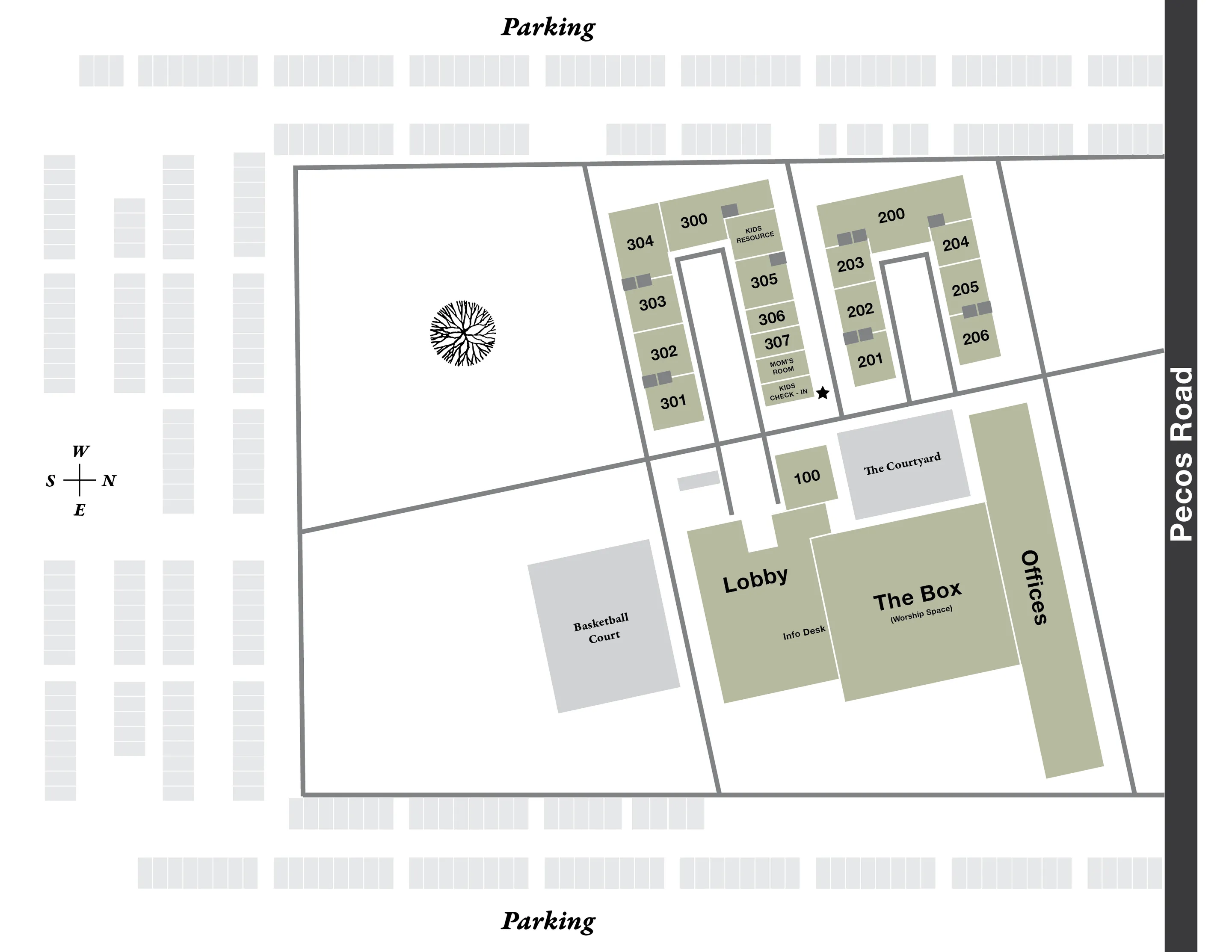
Finally the coolest thing about Ironwood in my opinion, is that they had an actual, 80 year-old ironwood tree transplanted to the front campus. It can be seen on their map here:

Campus map of Ironwood Church

This is one of those brand identities that I didn’t get to work on, but wish I had. Hopefully you can also appreciate it’s elegance and effectiveness too.


Related to “inspiration”
I Learned Something About Church Branding from World-Class Design Firms
Published on:
In every sport, industry, and field of study, there are “the greats.” Basketball has Michael Jordan, Lebron James, and Kobe Bryant. Theology has Jonathan Edwards, John Calvin and Augustine. Depending on what part of the world you’re from, branding and design industry has its own greats. In the US, there’s Motto, Clay, CGH, and Matchstic. In the UK, you might know Pentagram, Landor, and Wolff Olins. Every designers dream is to apprentice for one of these legendary firms. However, there’s something that separates the greats from the rest of us that can’t always be taught. Sometimes it helps to get insights from those who are a few steps ahead of you - insights those already crossing the finish line at world-record pace may have forgotten. For some of us, myself included, we need it explained to us like we’re five. These legendary firms at the pinnacle of achievement have better things to do than dumb down their processes for me to understand. All that said, I’ve been spending some time to research approaches used by the (somewhat) newer faces in the branding and design world - firms like Koto, How&How, and DESIGNSTUDIO. In the coming days, I’ll be sharing key insights that you can apply to your church branding today. See you in the next one!
Breathing New Life into a Church Brand: The Story of First Baptist Aurora
Published on:
Let’s talk about First Baptist Aurora. This was a church that once thrived but found itself dwindling in numbers and energy. That is, until Pastor Robert stepped in with a vision to create a community where high school dropouts and doctors, recovering addicts and homeschool moms, could all worship side by side. He wanted people to feel like they truly belonged. The church started to grow again, but there was a problem: their visual identity didn’t match the new life happening inside the walls. So, I partnered up to help them rebrand. Two words shaped our entire process: historic and urban. We pulled colors from the church’s own brick, molding, and stained glass to create a palette that felt timeless yet fresh. The church’s beautiful stained glass windows inspired a modern logo and sparked a key design element: the arch. We used arches everywhere, from logos and icons to social media graphics, creating a look that felt unified and deeply tied to the building’s architecture and story. The result? A brand that bridges the old and the new. Today, First Baptist Aurora has not just a growing congregation but a clear sense of identity. Visitors connect more quickly, and the leadership has tools to keep building momentum. Here's the takeaway for pastors: A good rebrand isn’t just about looking pretty! It’s about helping people see what God is doing in your ministry are and inviting them to be a part of it. P.S. You can see the full case study here, including our in-depth process and more images/video.
Copy this Church’s Brand Strategy and Thank Me Later
Published on:
I often talk about capturing your unique vision and church identity in a brand identity. However, when people hear “brand identity” they immediately jump to thinking about the logo. Hackney Church of London is proof that a generic logo can work (and shine) when it’s part of a well-executed design system. The church worked with London-based design firm OMSE, who was clearly capable of designing a much more nuanced and complex mark, so why did they do something so plain? They explain in their case study notes: We worked with Hackney Church to design a new identity that could flex across the breadth of their activities. From formal and often sobering occasions, to joyous celebrations. {{ comp.video({ src:"/img/posts/hackney-church-logo-by-omse.mp4" }) }} Their choice of a minimalistic approach was strategic and intentional. Maximum flexibility was the highest priority - not explanatory power. If you take the time to review their rebrand case study, you’ll see how a logo doesn’t have to capture your entire vision, vibe, or identity. It just needs to be an entrance point. In other words, the brand identity is the house, and the logo is just the cornerstone. Here’s what Armin Vit, founder of the BrandNew blog had to say about Hackney Church’s new mark: In a way, it’s almost an overly generic icon that could apply to dozens of churches around the world but not only is the execution flawless in this case it also goes hand and in hand with the overall personality and vibe of the church both in its physical presence and its range of activities. What can we learn from this? Your logo doesn’t have to be so perfectly unique that it’s entirely unmistakable. In fact, it’s quite easy to paint yourself into a corner with a rigid, inflexible brand identity (speaking from personal experiences). Instead of relying on your logo alone to do the heavy lifting, copy OMSE’s approach with Hackney Church and focus on making your branding beautifully simple.
Brand Marks Your Church Needs: The Wide Logo
Published on:
In the graphic design world, much of our time is spent on layout. This is because you usually have fixed content, and a fixed space where that content needs to go. If those two variables are set in stone, then it’s up to the designer to solve the Tetris puzzle - how can I fit X content into Y box? Sometimes this is easier said than done. As a brand designer who often continues to help churches “roll out” their new visuals following a rebrand, I want to make things as easy as possible for future Braden. What if we get a space where the logo doesn’t fit, or looks awkward? This comes up quite a bit, and it’s something that can be solved by having an alternate verison of your logo for just such scenarios. The need for a mark to fit into narrow spaces comes up more than you might expect. Lanyards Banners Table runners Outdoor signs Leather belts (just seeing if you’re paying attention) Creating a “wide” version of your church logo means your brand can look and feel comfortable in those spaces that are too narrow for a more squarish mark. The way you do this is pretty straightforward, with some caveats and a couple of bonus tips I’ll share at the end. Unstack multiple lines of text into one line Move the icon to the left or right side of the mark (sometimes it can go in the middle of the words) That’s it! Well, sort of… Below I’ve put an example of how to apply this in practice. Also, if your church does have leather belts with your logo, please stop it. Get some help.
Related to “symbolism”
Stop Sending Your Congregation Encrypted Messages
Published on:
I recently watched the movie Imitation Game with Benedict Cumberbatch. It chronicles the genius work of Alan Turing to crack the Enigma cypher during WWII. Germany was using encrypted messages to send critical instructions to its ships and submarines via radio. The Americans could intercept the messages, but couldn’t decode them fast enough. The Germans knew that a message is useless if it can’t be understood by its recipient. When you’re crafting your vision, mission, and brand, how often do you evaluate if it will be understood by your audience? Are you putting it in language they’re familiar with? Does your logo capture something they resonate with?
What Most Churches Miss With Logo Symbolism
Published on:
For most people, the word “branding” brings to mind symbolism. Brands use symbols to convey a bigger message and create an association between ideas, people, and products. There’s also a strong Biblical precedent for visual storytelling and symbolism. Moses lifted up the image of a serpent in the wilderness. The Lord’s instructions for his tabernacle were packed full of icons and symbols. The early church used the ichthys to represent their shared Christian identity. Applying this to a church communications, we focus on the logo as the main visual symbol, and most people naturally want it to represent as much transcendent meaning as possible. Here’s my hot take: All the symbols in the world can’t make up for unclear foundational ideas that underpin your church identity. Symbolism in a logo means nothing without core distinctives. How do you know what those distinctives are? You have to do a little digging. Tending your brand sometimes means breaking out the shovel and getting to the root.
← Back to all posts
Almost there!

Enter your email below to get the weekly Tend Your Brand digest.