Too Many Pastors Are Afraid to Change This (Messaging)

messaging rebrand process
Braden East

Messaging might be the trickiest part of brand-building, but it’s also the most important. While you want to stay consistent over time, there are ways to evaluate, tweak, and test your messaging so that it doesn’t become stale.

Today, I want to look at the five steps that branding experts use for messaging refinement and apply it to a church context. By the end, you should have a good idea of how to make messaging adjustments (and if you need to at all).

1. Clarify the Core

Ask yourself: “What exactly are our distinctives, and are they stated in a way people actually remember and repeat?”

Here’s a practical test: Ask 5-10 people (leaders, members, new attendees) to describe the church’s mission/values in their own words. If responses vary widely or miss the mark, your messaging might lack clarity or memorability.

2. Dual-Audience Check

I've written before about how church communication is unique because you have two audiences: a congregation and a community. Because of this, you need a way to evaluate your messaging with each.

Congregation Filter:

Community Filter:

3. Content Consistency Audit

Review 3 to 5 pieces of existing content you’ve published in the past. These can be things like your website homepage, social media bio, flyer, sermon intro, or email footer.

I recommend creating a simple scoring scale (1 - 5) so you can easily compare and evaluate each piece of content.

4. Decide on the Level of Tweak Needed

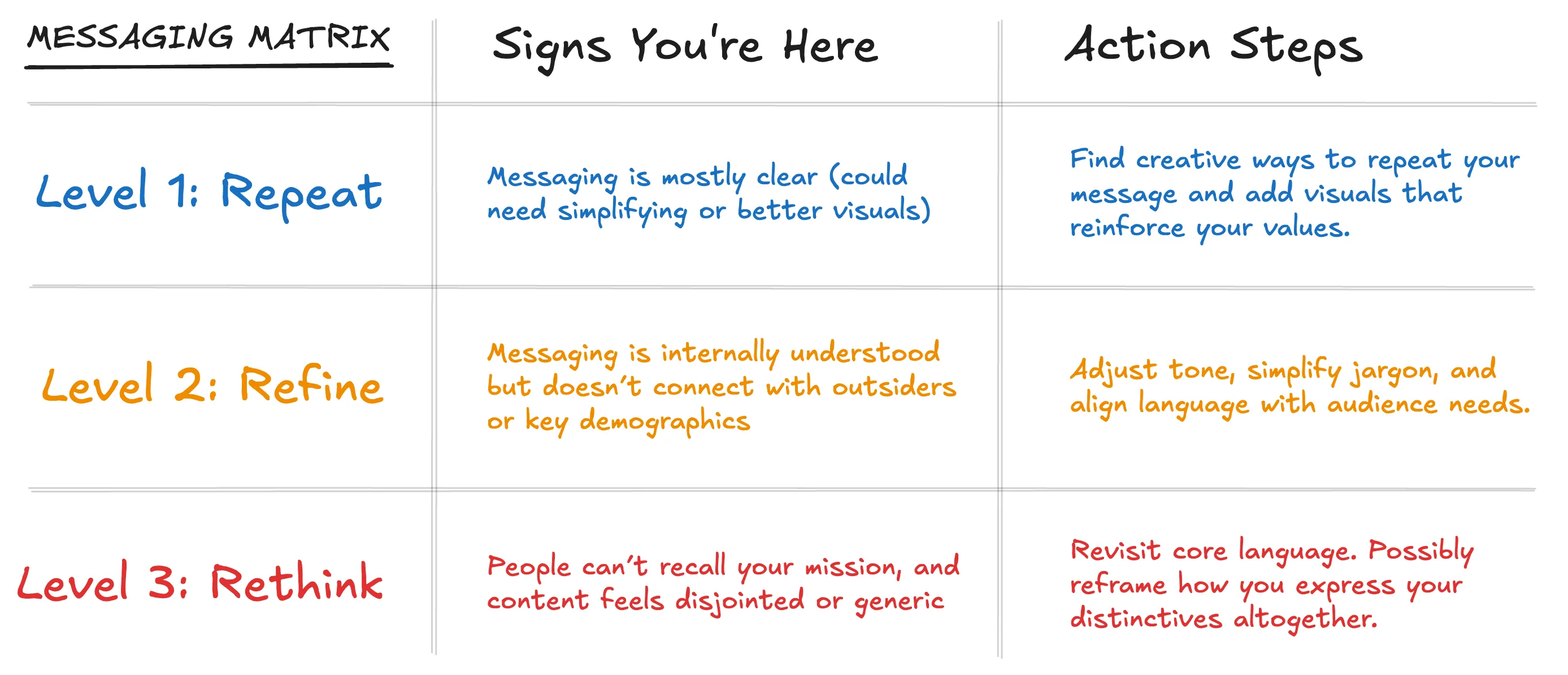
Use this matrix to figure out how much you might need to adjust course with your church's brand messaging:

Messaging Refinement Matrix

5. Small-Scale Testing

It’s nerve-racking, but there’s no better way than real-world testing to know if you’ve made a meaningful change.

Try your adjusted tagline, mission statement phrasing, or value summary in a few formats (social post, bulletin blurb, sermon series). Then, watch for engagement and organic adoption by your congregation. If people start using your new language on their own, you’re on the right track.


Related to “messaging”
How Much Branding Does a Church Actually Need?
Published on:
Your logo isn’t a brand, nor is the name of your church a brand. Your color palette, word mark, fonts, and church website aren’t your brand either. These things only serve to ASSOCIATE your church with the big idea that is your message. Make this association enough times with enough people, and NOW you have a brand. Think about it like this: Branding is the vehicle for your message. It’s the wrapper! The packaging won’t change the chemical make up of the burger, but it can still make the burger taste better, and turn a meal into an experience worth sharing. So, to answer the question how much branding does a church need, the answer is none. None? Right. If you don’t have that big idea clarified and nailed down, you can design the most beautiful identity system and logo in the world and not have a brand.
What is a Verbal Identity? And Why it Matters for Churches (Pt. 2 Tone of Voice)
Published on:
In the last post, I looked at how vocabulary contributes to a cohesive verbal identity, and can be useful for a church trying to elevate their communications. Today, we’re on to the second part of a verbal identity: tone of voice. Now with AI tools, tone of voice guidelines are even more incredibly useful. Just ask this pastor I worked with on a recent rebrand. He was writing content for a connect card they could use to gather information from visitors, and he was blown away by how helpful it was to have a brand tone of voice. “Bro, ChatGPT is crazy cool… I put in the tone description from our brand guidelines, and it gave me all kinds of good options!” Here’s the tone description he was talking about: “Our tone is bold yet humble—serious about truth, passionate about people, and always inviting others into something real. We speak with clarity, conviction, and warmth, aiming to reflect both the reverence of our faith and the relational heart of our church.” If you saw a social media post with exclamation points, emoji’s and emotional word choice, you would probably expect a passionate, informal, and loud worship service on Sunday morning. Now, what if you showed up to that church and found a conservative Presbyterian church with organ-led hymns and a serious vibe. Would you be confused? Inconsistent writing style can even leave visitors with a subtle feeling of being confused or tricked, rather than edified. In the end, looking the part is critically important, but your visuals are ultimately just the vehicle for what can only be communicated through written (or spoken) words.
What is a Verbal Identity? And Why it Matters for Churches (Pt. 1 Vocabulary)
Published on:
In a church rebrand project, I tend to focus mainly on designing the congregation’s visual identity. However, there’s a key part of branding that doesn’t always get as much attention, which I’ve started including in the church brand guides I create. That piece is a verbal identity. A consistent writing style is crucial in church communications, and I’m breaking it down into its two fundamental parts today. If the content of your bulletin reads dramatically different from the content of your website, which reads different from your social media, then your overall message won’t land with the same impact. So, let’s look at the two key facets of a verbal identity: vocabulary and tone of voice. Brand Vocabulary The words you choose to use in official church creative work and communication should be a reflection of who you are speaking to, and how you want them to view you. Here’s an example of brand vocabulary guidelines: “In our church communications, we occasionally use words like ‘y’all’ and ‘fixin’ to identify with our main demographic of ranchers and homesteaders here in rural Oklahoma. These words should not be overused in a cliche way, but should be sprinkled in to add warmth and familiarity to our written copy.” In the next post, I’ll look at the other facet of a verbal identity: tone of voice.
Should We Be Fly Fishers of Men? 🎣 
Published on:
A good friend of mine who used to be a youth pastor just opened up the first brick-and-mortar location for his fly fishing business. It got me thinking about how Jesus made his disciples to be fishers of men (Matthew 4), which, in those days, called to mind an image of casting nets. But what about using a lure? Is it appropriate to “bait” people toward the gospel by making our visuals flashier and our colors brighter in the name of more effective man-fishing? My conclusion is no. Well, usually no. Jesus’ model of evangelism and ministry was markedly NOT seeker-sensitive. If your goal with church branding is to baptize marketing trends and tactics, you’ll be surprised at how few people stick around and put down roots in your congregation. What you win them with is what you win them to. That’s why a brand based on vision and congregational identity can last for decades, while a brand based on cultural relevance and eye candy feels like a “bait and switch.” For my friend, tying flies started as a hobby on the side. He would source exotic materials and study the quirks of different fish species to create unique flies that looked more fine art than fishing gear. These things were beautiful. It’s not wrong to build beautiful buildings, design beautiful logos, or lean into an aesthetic. Those are good things, and they can help to attract people to a church. But those people should be there for what the brand represents, not the brand itself. A well-crafted and positioned brand is a beautiful, visual manifestation of your church’s identity and mission, not a flashy lure.
Related to “rebrand”
Refresh vs Rebrand, Which is Right for Your Church?
Published on:
“All our digital and print stuff looks inconsistent, but I don’t know where to start fixing it.” “Our logo is good, but the rest of our branding is a mess!” Sound familiar? I’ve had more and more churches lately tell me this story. If that’s you, then the odds are you don’t need a full rebrand. Normally, I see rebrands working for churches who are in a pivotal moment - one that’s going to shape the identity of their congregation for a long time. Think about your church brand like a house. When you go for a full rebrand, it’s like you’re tearing that house down to the foundation and starting over from scratch. Sometimes this is the right call, especially when there are serious structural problems or the house doesn’t serve your needs. You’re changing a big part of the structure and framing out something new. Conversely, brand refreshes are for those who have a solid foundation and structure, but need a renovation. This is the chance for a church to fix leaks, re-do the kitchen, and get a new paint job. Sometimes all brand refresh calls for is just a set of brand guidelines with a few Canva templates. Other times it’s an intentional tweaking of the logo, and a redesign of everything else. The main idea behind the refresh is bringing that rogue branding into alignment. When you consider a refresh vs a rebrand, ask yourself, do we need a rebuild, or just a minor renovation?
Don’t Update Your Signs Until You Do This
Published on:
If you’re looking at getting new signs or updating your building, don’t miss this opportunity to update your branding as well! It’s one thing for a sign to look nice and be functional, but branding and design has the power to do much more than just help people find the nursery. Every bulletin, banner, and coffee cup is an opportunity to shape the culture of your church through intentional, vision-aligned branding that stands the test of time. If that’s your ultimate goal, then updating your signs without rebranding first would be a massive waste of time and money! Schedule a time to talk and I’ll walk you through what a brand refresh could look like, so you don’t have to re-do your signs AGAIN in a couple of years.
Breathing New Life into a Church Brand: The Story of First Baptist Aurora
Published on:
Let’s talk about First Baptist Aurora. This was a church that once thrived but found itself dwindling in numbers and energy. That is, until Pastor Robert stepped in with a vision to create a community where high school dropouts and doctors, recovering addicts and homeschool moms, could all worship side by side. He wanted people to feel like they truly belonged. The church started to grow again, but there was a problem: their visual identity didn’t match the new life happening inside the walls. So, I partnered up to help them rebrand. Two words shaped our entire process: historic and urban. We pulled colors from the church’s own brick, molding, and stained glass to create a palette that felt timeless yet fresh. The church’s beautiful stained glass windows inspired a modern logo and sparked a key design element: the arch. We used arches everywhere, from logos and icons to social media graphics, creating a look that felt unified and deeply tied to the building’s architecture and story. The result? A brand that bridges the old and the new. Today, First Baptist Aurora has not just a growing congregation but a clear sense of identity. Visitors connect more quickly, and the leadership has tools to keep building momentum. Here's the takeaway for pastors: A good rebrand isn’t just about looking pretty! It’s about helping people see what God is doing in your ministry are and inviting them to be a part of it. P.S. You can see the full case study here, including our in-depth process and more images/video.
Don’t Rebrand if Your Church Has One Thing… (Do This Instead)
Published on:
I recently reconnected with a distant cousin who was just starting a new role as a Worship Pastor in Texas. He had been immediately tasked with redesigning the church bulletin and some other collateral - a classic “worship-leader-becomes-graphic-designer” scenario. But he found something totally unexpected. More on that in a minute. See, my cousin had started with an audit of the church bulletin. It was bad. I’m talking 1990s clip-art, 10 different fonts, and a migraine-inducing layout. Then he looked at the rest of the campus. Signage looked different in every hallway, and anything designed had that general “patched together” kind of vibe. The pastors all knew this stuff needed a redesign. The church had a logo people had grown to love and brand equity that was worth preserving. But without clear guidelines in place, things had slipped into visual inconsistency - badly. So, I asked them a simple question: “Have you thought about brand guidelines?” Their response? “No, but now we’re interested!” Until that moment, they had been focusing on the immediate problems that were painful, but they were treating the symptoms, not the disease. I explained to them how a brand refresh often benefits churches in their exact position. When you refresh your branding and put together brand guidelines, you’re not looking to reinvent the wheel or start from scratch. Instead, the goal is to bring clarity and consistency to what you already have. This is about making sure everything from bulletins to digital media feel like it belongs to the same church family. A brand audit and fresh set of guidelines can be perfect for maintaining the identity people recognize while elevating your overall quality and professionalism of communication. Neither my cousin nor I had expected this, but the church hired me on the spot, and we’re getting to work together to unify and future-proof their church branding. True story! If that’s something you’re thinking about for your brand, book a call with me and we can talk more about how to represent the work God is doing in the life of your church.
Related to “process”
Kingdom-First Branding
Published on:
After almost a decade in the design and branding industry, I’ve become convinced of something: The fastest and best way to a tangible community impact through a vision-driven church is by kingdom-first branding. Of course, not every church is ready to focus on branding… stability and trust need to come first. But if your congregation has those pre-requisites checked off, a kingdom-first brand is the most powerful way to galvanize your members and reach your community with the gospel. The idea of being kingdom-first isn’t something I came up with — it’s firmly grounded in Scripture. But seek first the kingdom of God and his righteousness, and all these things will be added to you. — Matthew 6:33 Jesus tells us to make God’s kingdom our priority, and he will provide for every need we have. Pastors have all kinds of desires for their ministries. Some want to see their church grow and multiply, so they can plant in nearby neighborhoods and cities. Some want their congregation to be more unified, healing fractures and restoring broken relationships. Some want to be known for their generosity, partnering with local organizations to serve their community. Some want to see members of their congregation discipling one another into a deeper knowledge and love for Jesus Some want to influence local and state politics, advocating for causes that align with God’s law Some simply want to resist the spiritual depravity of the culture around them I think it’s clear from scripture that God wants all of these things for every church, and much more. But these goals are not our ultimate priority. Advancing Christ’s kingdom is. So what does a kingdom-first brand actually look like? A kingdom-first brand doesn’t worry about attracting members from other churches (the kingdom doesn’t grow when we play “church musical chairs”). A kingdom-first brand avoids losing your church’s unique story in an attempt to look trendy A kingdom-first brand makes Christ the cornerstone of your communications. He is the cornerstone of the church, after all (Isaiah 28:16-17; Matthew 16:18; Mark 12:10; Ephesians 2:19-21) A kingdom-first branding approach gets to the heart of this question: how does your ministry uniquely relate to Christ, Congregation, and Community? I’ll be exploring those 3 C’s in the near future. Seek first the kingdom of God, and all these things will be added to you.
Why It’s Insane to Rebrand with Limited Design Revisions
Published on:
Raise your hand if you’ve seen a designer offer their services like this: “$1,000 for 3 concepts and 2 revisions.” That seems reasonable enough - surely you can get something great out of 3 concepts and 2 revisions, right? Well, maybe. In the end it all comes down to the project’s risk tolerance. This can be a great fit you’re needing is a set of sermon series graphics or a tee shirt design, but what if the project is bigger, like a new logo or even a full rebranding? Now’s the time to evaluate your risk tolerance. Here’s the question you should be asking: How long do we plan to keep this logo? If the answer is just for a few years, then it doesn’t matter too much if the logo’s not quite a perfect fit. With a short-term, “band-aid” logo, missing the mark slightly is okay, because you get to take another shot later. However… If you’re wanting a timeless logo that will capture your vision and last for decades, then limited revisions is the wrong model to use. Removing the pressure of "this is our last round - we have to say yes," gives a church the freedom to think more objectively about what is going to best serve their congregation for the long haul. Without that freedom, you're probably going to end up over-time and over-budget. And the problem probably isn't the designer or you, it's the process you agreed to follow. This is why I price all my projects with unlimited revisions built in. I'd be delusional if I did this solely on the basis of my skills. I'm confident in my skills - don't get me wrong - but I'm WAY MORE confident in the process. My church rebrand process has been shaped by a decade of design experience and the unique projects I've worked on for churches all over North America.
← Back to all posts
Almost there!

Enter your email below to get the weekly Tend Your Brand digest.