Where to Get Church Logo Ideas: Your Church Name

Braden East
If you have a creative streak (or if you read this publication), you might occasionally notice the design choices made by your favorite brands. Think Apple, Nike, Chase Bank, etc. A majority of brand marks for the last several decades have followed a pattern when it comes to their logos: Abstract icon to the left, word mark to the right.
However, nobody said you have to follow suit. In some cases, it’s perfectly appropriate to skip the abstract logo icon and go straight to a stylized word mark.
This is a great approach when you have a short, unique name.
That also means you’ll struggle if your church is named “First Baptist” or “Periwinkle Avenue Presbyterian Church.”
Here’s a great example of a brand that leaned into their name with a strong word mark:
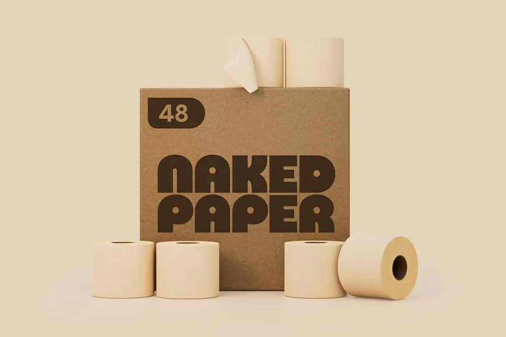
Smirk - It’s clever, no? ;)
Despite “icon-first” being the common approach to logo design in the corporate world, a well-crafted wordmark - like the one shown above - can bring a wealth of creativity and meaning to your brand, all on its own.
A second way to draw inspiration from your church’s name is to stylize and customize the first letter, also known as a monogram. Monograms have been around for centuries, so it makes sense that they would continue to be an effective means of identification.
The monogram approach also helps with brand recognition because it stands for something very concrete: your church’s name.
P.S. The tricky part about monograms is that they usually need a word mark to go with them. This puts you back at having a dualistic logo, except now the first letter of your church’s name gets repeated in the monogram and the word mark, which could be problematic.