Why the Cracker Barrel Rebrand FAILED Miserably (It’s not what you think)

story fail rebrand
Braden East

Cracker Barrel’s catastrophic rebrand would have been hard to miss because of the public outrage and backlash it got (of course I picked the exactly WRONG time to take a break from writing this newsletter).

But the reason their new logo caught so much viral hate has a direct application to church branding, so humor me while we explore it for a moment.

Here’s my hot take: The new logo perfectly captured Cracker Barrel’s identity.

Before you cancel me in the comments, let me convince you why this is the case.
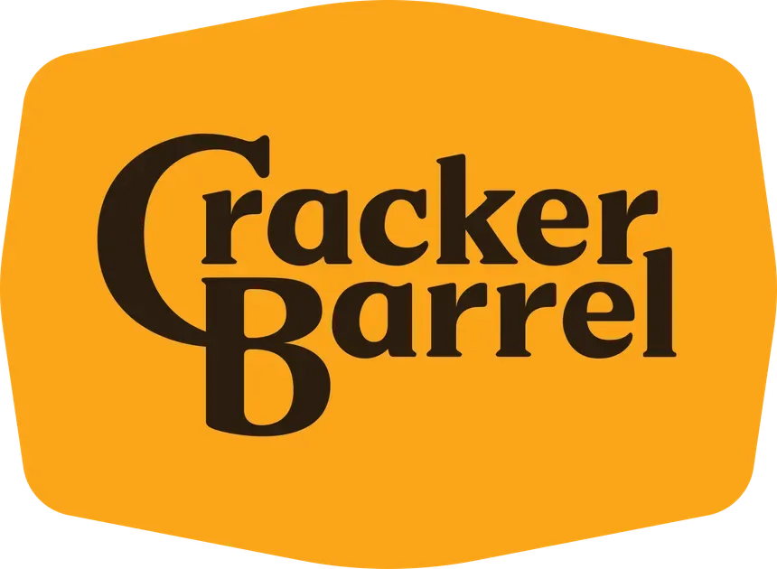
Think back to 6 months ago. If you had asked a thousand people what they thought about the Cracker Barrel logo, what response would you have gotten?

Probably something along the lines of, “I mean… it’s fine I guess. Never really thought about it.” Most people would have been apathetic or ambivalent at best. Maybe a few design-conscious souls would have said “eh, there’s probably some room for improvement.”

So, why did this particular rebrand trigger so much nationwide, seething outrage?

Some news outlets blamed “conservatives who don’t like change” and others said it was about the people rebelling against modern minimalism and oversimplification.

But consider an alternate timeline:

In this scenario, I’d be surprised if anyone bats an eye. Maybe they notice that the billboards are easier to read, or that the menu design feels a bit more vibrant and fresh than it used to.

No headlines! No mockery! Nothing!

But here’s the thing: it wasn’t a new logo that upset people.

Cracker Barrel’s customers felt betrayed by what the new logo represented.

The new branding signaled a fundamental change in the identity of Cracker Barrel, from a quirky, homey spot for comfort food and checkers to a corporate sellout chain with politically correct messaging and token vegan options.

In my opinion, the new (now cancelled) logo did TOO GOOD of a job representing what Cracker Barrel had become — a woke corporation like everyone else. This visual accuracy ended up being the downfall of the rebrand, to the detriment of the company’s stock prices and consumer confidence.

Here’s the takeaway:

Your church logo isn’t your brand.

Your brand is the story, meaning, and gut feelings that people associate with you.

Build your brand on the three pillars of a church brand: Christ, Congregation, and Community.


Related to “story”
Why Your Church Brand Matters
Published on:
I remember the moment in college that people found out I could play the drums. From that time on, whether it was filling in last minute for another drummer who was sick or forming a band from scratch with high hopes to tour someday, there were plenty of gigs I was called on play. Some of those gigs were better than others, but the best one was a Friday worship night at a medium sized church just down the road from my university. But I almost turned down the gig. Why? I had looked the church up online beforehand. When I saw their dated logo, messy website, and confusing messaging, I couldn’t help but wonder if the event was going to be handled the same way. Nothing is worse for musicians than a disorganized gig. But a good friend had asked me to play, so I said yes against my better judgment. Here’s the reason I’m sharing this story: What I found online about the church didn’t match what I experienced there. The gig went great and they were very organized. The church had unintentionally built a brand that was working against them. If I was a community member thinking about visiting the church, or a congregation member trying to relate to the mission, I would have been discouraged by the disjointed look and message being put forward. This is why your brand matters. You’re creating perceptions and feelings about your church whether you know it or not. But, show intentionality with shaping those perceptions, and those perceptions will start to turn into feelings, which turn into action.
Interview with Alex Montaño – Hard-Won Lessons from a Church Rebrand
Published on:
I recently had a blast interviewing pastor Alex Montaño about his church's rebrand in 2024. Here are some of the highlights from our conversation: Why trying to use Fiverr for the logo was a huge blunder (it wasn’t a skill issue) How to overcome initial resistance from elders What to do with a limited budget for “rolling out” the rebrand Watch the video to steal from his church’s rebrand approach... and crush it instead! 💪P.S. Share this with a pastor who might be interested in our conversation.
This 400 Member Baptist Church Didn't Have a Single Designer
Published on:
A couple of years ago, I tried to talk a church out of hiring me for a rebrand. The church had an outdated logo and the leadership had a new vision/mission statement they were beginning to push. Here’s why I hesitated: the church was running 400+ members/regular attenders and I couldn’t believe they didn’t have someone from their own congregation with design expertise. Here’s how the conversation went with the pastor (we’ll call him Jake). Braden: “So why rebrand with my help? Isn’t there anyone in your church already who is a graphic designer?” Jake: “We’ve got a couple of people with a creative background, but nobody who’s up to the task of a complete rebrand.” Braden: “Surely they could work as a team to design it?” Jake: “Here’s the thing: we don’t want to put people in a position where they’re stepping on each other’s toes. We want this to be a unifying thing for our church - not a divisive thing.” Braden: “Hmm… if you’re sure…” Jake: “Bringing in an outside expert helps us avoid those situations. Plus we know we’ll get a better result in the end that we won’t have to second-guess in a few years.” Now, a few years later, Jake is still using that brand identity to reinforce his vision and communicate effectively in their thriving church. It turns out, he wasn’t the only one who feels that way. For many church leaders, bringing in a believer with expertise and an outside perspective is the clear best choice.
This Church Almost Got Sued Over Their Logo
Published on:
Last year I had a jaw-dropping call with a church that was in some serious trouble - let’s call them Ridgeview Fellowship. The church had a good online presence, a functional logo, and a brand they had worked hard to build up over the years. They didn’t want to rebrand, but when they came to me, they felt like they had no choice. A local accounting firm that had opened nearby had a similar (almost identical) logo. The firm was threatening legal action if the church didn’t change their look. But wait, the church had been there longer? Yes. Hadn’t the church been using their logo out in the community already? Yes. Where did the church get their logo in the first place? Good question. Nobody was 100% certain, but they thought they remembered it had been designed with a small budget by someone on Fiverr. If I had to guess, I’d wager that the accounting firm went with a Fiverr designer too, and ended up with a not-so-unique mark… Here are the reverse-image search results that suggest the same thing (church logo not pictured). {{ comp.video({ src: "/img/lawsuit-reverse-image-search.mp4" }) }} Now, the firm was threatening to sue for trademark infringement. Instead of spend untold sums of money and time imbuing themselves in a lawsuit (to defend a logo they didn’t even love), the church felt like they had no choice but to rebrand. This is a sad situation, and it happens more often than you might think. Here’s the takeaway: build your visual identity around the things that make your church unique, and you won’t have to worry about someone else stealing it. Also, you might think about trademarking your church logo.
Related to “rebrand”
How to Answer Congregation Objections to Change
Published on:
I recently helped a church rebrand where part of the new identity was the dreaded 👻name change 👻. The church was looking to plant a new congregation in a nearby community in the coming year, and they needed a name that could be shared between them, which was ultimately decided to be “Christ Redeemer.” Starting from scratch with the visual brand, I had nothing to draw on that would be familiar to their congregation. At many points in the project it was a toss up whether the pure excitement or raw terror would win out. Would the elders like the new design? Would seeing the logo concepts make them rethink everything? Would it fall on me if the congregation didn’t like the new name? These were the questions racing through my mind on the Sunday that the church’s leaders presented their new direction to the church as a whole. The next day I got a text from the worship pastor: “We showed the logo teaser and it was received very well. Some people were even teary-eyed.” “That’s great!” I thought. I kept reading. “But… a question came in via email that I’d like your help responding to.” Oh boy… Here was the question: “Hoping to learn about the decision regarding having the c in Christ lower case. I would like to understand this.” This was something we anticipated. For context, here’s the new logo they presented: {{ comp.video({ src:"/img/christ-redeemer-logo-presentation.mp4" }) }} Ultimately, here is the response we landed on: Thank you so much for engaging thoughtfully with the new logo. I love that you’re paying attention to these details—it shows real care for how we represent Christ and our church. You asked about the choice to use lowercase in the wordmark. That decision was intentional. The phrase “Christ Redeemer” is incredibly powerful—it’s really the gospel in two words. When we explored placing it in all caps, the effect was visually overwhelming, almost like the design was shouting. That led us to reflect on the paradox of Jesus himself: he had all power, and yet he did not come in power the way the world expected. Instead, he came in humility, laying down his life for us. We wanted the wordmark to hold that tension: strong yet humble, bold yet quiet. Lowercasing "christ redeemer" became a subtle way of embodying that paradox. As followers of Jesus, we’re called to the same kind of paradoxical life—living is dying, losing is gaining. If you’re interested, here’s a short article that explains some of the design thinking behind lowercase wordmarks in general: Why Some Logos Work Better in Lowercase. We found it helpful as part of our own process. It’s also worth noting: this is specifically a wordmark design choice. Whenever the church’s name appears in documents, online profiles, or other written settings, it will still be written as Christ Redeemer. Of course, the most important thing is not typography, but that our lives together point people to Jesus. The logo is just one small way we hope to embody that spirit. My hope is that every time we see it, it quietly reminds us that true greatness is found in humility, and true power in servanthood. Thanks again for raising the question—I’m grateful for your heart and your care for how we bear Christ’s name. Grace and peace, Hopefully this helps reframe changes and new chapters as an opportunity for pastoral care, rather than a bullet to be dodged! Be strong and courageous. In another post, I’ll outline the specific strategy we used to craft this letter, with explanations of why each section is there.
Refresh vs Rebrand, Which is Right for Your Church?
Published on:
“All our digital and print stuff looks inconsistent, but I don’t know where to start fixing it.” “Our logo is good, but the rest of our branding is a mess!” Sound familiar? I’ve had more and more churches lately tell me this story. If that’s you, then the odds are you don’t need a full rebrand. Normally, I see rebrands working for churches who are in a pivotal moment - one that’s going to shape the identity of their congregation for a long time. Think about your church brand like a house. When you go for a full rebrand, it’s like you’re tearing that house down to the foundation and starting over from scratch. Sometimes this is the right call, especially when there are serious structural problems or the house doesn’t serve your needs. You’re changing a big part of the structure and framing out something new. Conversely, brand refreshes are for those who have a solid foundation and structure, but need a renovation. This is the chance for a church to fix leaks, re-do the kitchen, and get a new paint job. Sometimes all brand refresh calls for is just a set of brand guidelines with a few Canva templates. Other times it’s an intentional tweaking of the logo, and a redesign of everything else. The main idea behind the refresh is bringing that rogue branding into alignment. When you consider a refresh vs a rebrand, ask yourself, do we need a rebuild, or just a minor renovation?
Don’t Update Your Signs Until You Do This
Published on:
If you’re looking at getting new signs or updating your building, don’t miss this opportunity to update your branding as well! It’s one thing for a sign to look nice and be functional, but branding and design has the power to do much more than just help people find the nursery. Every bulletin, banner, and coffee cup is an opportunity to shape the culture of your church through intentional, vision-aligned branding that stands the test of time. If that’s your ultimate goal, then updating your signs without rebranding first would be a massive waste of time and money! Schedule a time to talk and I’ll walk you through what a brand refresh could look like, so you don’t have to re-do your signs AGAIN in a couple of years.
Breathing New Life into a Church Brand: The Story of First Baptist Aurora
Published on:
Let’s talk about First Baptist Aurora. This was a church that once thrived but found itself dwindling in numbers and energy. That is, until Pastor Robert stepped in with a vision to create a community where high school dropouts and doctors, recovering addicts and homeschool moms, could all worship side by side. He wanted people to feel like they truly belonged. The church started to grow again, but there was a problem: their visual identity didn’t match the new life happening inside the walls. So, I partnered up to help them rebrand. Two words shaped our entire process: historic and urban. We pulled colors from the church’s own brick, molding, and stained glass to create a palette that felt timeless yet fresh. The church’s beautiful stained glass windows inspired a modern logo and sparked a key design element: the arch. We used arches everywhere, from logos and icons to social media graphics, creating a look that felt unified and deeply tied to the building’s architecture and story. The result? A brand that bridges the old and the new. Today, First Baptist Aurora has not just a growing congregation but a clear sense of identity. Visitors connect more quickly, and the leadership has tools to keep building momentum. Here's the takeaway for pastors: A good rebrand isn’t just about looking pretty! It’s about helping people see what God is doing in your ministry are and inviting them to be a part of it. P.S. You can see the full case study here, including our in-depth process and more images/video.
← Back to all posts

Cracker Barrel’s catastrophic rebrand would have been hard to miss because of the public outrage and backlash it got (of course I picked the exactly WRONG time to take a break from writing this newsletter).

But the reason their new logo caught so much viral hate has a direct application to church branding, so humor me while we explore it for a moment.

Here’s my hot take: The new logo perfectly captured Cracker Barrel’s identity.

Before you cancel me in the comments, let me convince you why this is the case.

Think back to 6 months ago. If you had asked a thousand people what they thought about the Cracker Barrel logo, what response would you have gotten?

Probably something along the lines of, “I mean… it’s fine I guess. Never really thought about it.” Most people would have been apathetic or ambivalent at best. Maybe a few design-conscious souls would have said “eh, there’s probably some room for improvement.”

So, why did this particular rebrand trigger so much nationwide, seething outrage?

Some news outlets blamed “conservatives who don’t like change” and others said it was about the people rebelling against modern minimalism and oversimplification.

But consider an alternate timeline:

In this scenario, I’d be surprised if anyone bats an eye. Maybe they notice that the billboards are easier to read, or that the menu design feels a bit more vibrant and fresh than it used to.

No headlines! No mockery! Nothing!

But here’s the thing: it wasn’t a new logo that upset people.

Cracker Barrel’s customers felt betrayed by what the new logo represented.

The new branding signaled a fundamental change in the identity of Cracker Barrel, from a quirky, homey spot for comfort food and checkers to a corporate sellout chain with politically correct messaging and token vegan options.

In my opinion, the new (now cancelled) logo did TOO GOOD of a job representing what Cracker Barrel had become — a woke corporation like everyone else. This visual accuracy ended up being the downfall of the rebrand, to the detriment of the company’s stock prices and consumer confidence.

Here’s the takeaway:

Your church logo isn’t your brand.

Your brand is the story, meaning, and gut feelings that people associate with you.

Build your brand on the three pillars of a church brand: Christ, Congregation, and Community.